Chantilly Lace vs White Dove: The #1 Mistake Making Your “White” Look Wrong
Choosing the right white paint seems simple until you are standing in front of a wall of a thousand seemingly identical swatches. You pick one that looks perfect in the store, only to paint it on your walls and discover it looks sterile, dingy, or just completely wrong. This is one of the most common and frustrating mistakes in home design.
Two of the most popular and debated whites from Benjamin Moore are Chantilly Lace and White Dove. One promises a crisp, clean finish, while the other offers a soft, welcoming warmth. But choosing between them without understanding their core differences is a trap that can ruin the entire feel of your room.
You'll Learn About
The Deceptive Difficulty of Choosing the Perfect White Paint
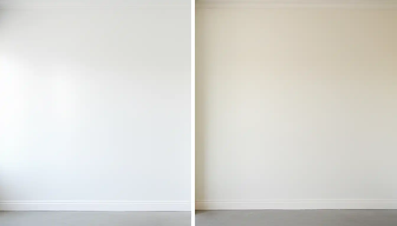
The fundamental problem is that white paint is never just white. It’s a chameleon, constantly changing its appearance based on light, surrounding colors, and even the finish you choose. What looks like a pure, bright white under the fluorescent lights of a hardware store can suddenly reveal sneaky yellow or gray undertones in your home.
This is where the battle between Chantilly Lace and White Dove begins. They represent two distinct philosophies of white, and picking the wrong one for your space is the critical mistake that leads to white paint regret. One is not inherently better than the other, but one is likely much better for your specific home.
Meet the Contenders: A Tale of Two Whites
Understanding the DNA of each color is the first step. These two whites, while both popular, are designed for very different purposes and create dramatically different atmospheres.
Benjamin Moore Chantilly Lace (OC-65): The Pure, Crisp White
Often called Benjamin Moore’s cleanest and brightest white, Chantilly Lace is renowned for having very minimal undertones. It is as close to a true, neutral white as you can get, making it a favorite for modern, minimalist, and contemporary designs. Its mission is to be bright, clean, and highly reflective.
With a high Light Reflectance Value (LRV), it excels at making spaces feel bigger and more open. Think of it as a blank canvas that allows other design elements, like artwork, furniture, and textiles, to be the stars of the show.
Benjamin Moore White Dove (OC-17): The Soft, Creamy White
White Dove is a decidedly warmer, softer white. It has creamy undertones with a hint of greige (gray-beige), which keeps it from feeling stark or clinical. This touch of warmth makes it incredibly versatile and beloved for creating cozy, inviting spaces. It’s a go-to for traditional, farmhouse, and transitional styles.
While still bright, its lower LRV compared to Chantilly Lace means it absorbs a little more light, giving it a softer appearance on the wall. It doesn’t scream “white” as much as it gently whispers it, creating a calm and welcoming atmosphere.
The Ultimate Showdown: Key Differences You Can’t Ignore
Seeing the specifications side-by-side reveals the crucial differences that will influence your decision. The LRV and undertones are the most important factors to consider.
| Feature | Benjamin Moore Chantilly Lace (OC-65) | Benjamin Moore White Dove (OC-17) |
|---|---|---|
| Light Reflectance Value (LRV) | 90.04 – 92.2 (Very High) | 83.16 – 85.4 (High) |
| Undertones | Virtually none; a very neutral, clean white that can have a subtle cool cast. | Warm with creamy, yellow, and slightly gray undertones. |
| Overall Feel | Crisp, clean, bright, modern. | Soft, warm, inviting, cozy. |
| Best For | Modern, minimalist spaces; trim and doors for a clean contrast; rooms with abundant natural light. | Traditional, farmhouse, and transitional spaces; creating a welcoming atmosphere; rooms with cooler light. |
| Pairs Well With | Cool colors like blues and grays, bold colors, and provides a stark contrast. | Warm and earthy tones, greiges, and other soft neutrals like Benjamin Moore’s Revere Pewter. |
| Potential Pitfall | Can feel sterile, stark, or cold in rooms with low or cool-toned light. | Can look yellow or dingy in rooms with very warm light or when paired with a crisper white. |
The #1 Mistake: Ignoring Your Home’s Unique Light
The single biggest mistake you can make is choosing a white paint without considering the quantity and quality of light in your room. The direction your windows face will dramatically alter how these colors appear on your walls.
North-Facing Rooms: The Cool Light Challenge
Rooms with north-facing windows receive cool, blue-toned light all day. In this environment, Chantilly Lace can appear even cooler, sometimes looking stark or slightly gray. White Dove, however, is often a perfect solution here. Its inherent warmth balances the cool light, helping the room feel cozy and bright rather than cold.
South-Facing Rooms: The Warm Light Advantage
South-facing rooms are flooded with warm, yellow-toned light. This is where Chantilly Lace shines, appearing as a brilliant, true white. The warm light prevents it from feeling clinical. Conversely, this is where White Dove can become tricky. The intense warm light can amplify its creamy undertones, making it look much more yellow than you intended.
East & West-Facing Rooms: The Chameleon Effect
These rooms experience the most dramatic shifts in light. East-facing rooms get bright, warm light in the morning and cooler light in the afternoon. West-facing rooms are darker in the morning and receive intense, warm light in the evening. In these spaces, both paints will change throughout the day, making it absolutely essential to test samples on your walls.
The Undertone Trap: The Brutal Truth Behind “White” Paint
The “undertone trap” is what happens when the subtle background colors in your “white” paint clash with the light and other elements in your room. This is the brutal truth: the very thing that gives a color its character can also be its greatest flaw in the wrong setting.
With White Dove, the trap is its warmth. People choose it for its softness, but if their trim is a stark, pure white, White Dove can suddenly look dingy or yellow by comparison. It must be paired thoughtfully with other warm elements to succeed.
With Chantilly Lace, the trap is its purity. People choose it for a clean, modern look, but in a room filled with warm wood floors and creamy upholstery, Chantilly Lace can feel jarringly cold and sterile. Its lack of warmth needs to be balanced by the decor around it.
Beyond the Walls: How Fixed Elements Dictate Your Choice
The paint on your walls does not exist in a vacuum. It must harmonize with the fixed elements of your home that you are not changing, such as flooring, countertops, and tile.
Trim, Cabinets, and Doors
A common strategy is to use Chantilly Lace for trim and White Dove for walls. This can create a beautiful, subtle contrast. However, using a bright white like Chantilly Lace for trim next to White Dove walls can highlight the yellow in White Dove, which may not be the desired effect. Many designers prefer to use White Dove for both walls and trim, but in different sheens, to create a seamless, layered look.
Flooring and Countertops
Your flooring and countertops have their own undertones. A warm oak floor will be complemented by the warmth in White Dove. A cool-toned gray tile or a stark white marble countertop, however, will often look better with the clean neutrality of Chantilly Lace. Getting this pairing wrong can make your entire color scheme feel “off.” For instance, the choice between different countertop styles, as seen in a Cambria Torquay vs Swanbridge comparison, heavily influences which white paint will look best in a kitchen.
Pairing with Other Colors
If your home features popular greige paint colors, the choice of white is critical. White Dove harmonizes beautifully with warm grays and beiges. For another comparison of popular off-whites, you can see how undertones play a critical role in the Dove Wing vs Seapearl matchup. Chantilly Lace, on the other hand, provides a crisp, clean border that works well with cooler grays and more saturated colors, creating a sharper contrast similar to the one discussed in the ultimate greige showdown between Revere Pewter vs Worldly Gray.
The Architect’s Secret: Sheen and Artificial Lighting
Many homeowners overlook two of the most powerful tools in controlling how a paint color looks: sheen and artificial light. This is often what separates an amateur paint job from a professional, designer-curated space.
How Sheen Changes Everything
The finish of your paint—from matte to high-gloss—dramatically alters its appearance. A matte finish absorbs light and hides imperfections, giving both Chantilly Lace and White Dove a softer, more chalky look. In contrast, a satin or semi-gloss finish reflects light, which will make Chantilly Lace look even brighter and can make the warm undertones in White Dove more noticeable.
The Kelvin Scale: Your Secret Weapon
The color temperature of your light bulbs, measured in Kelvins (K), can either enhance or ruin your paint choice. Warm white bulbs (around 2700K) cast a yellowish glow that will intensify the creaminess of White Dove and soften the crispness of Chantilly Lace. Cool white or daylight bulbs (4000K-5000K) emit a bluish light that will make Chantilly Lace look even crisper but can make White Dove appear washed out or dingy.
Your Foolproof Plan: How to Make the Right Decision
After understanding the theory, the solution is practical and straightforward: you must test the colors in your own space. Do not rely on small paint chips or online photos.
Get large, movable samples of both Chantilly Lace and White Dove. Paint them on poster board or use peel-and-stick samples. Place them on different walls in the room you plan to paint. Observe them in the morning, afternoon, and at night with your lights on. This is the only way to see how they will truly behave with your unique lighting and decor.
Final Verdict: Is Chantilly Lace or White Dove the Winner?
There is no universal winner in the Chantilly Lace vs. White Dove debate. The victor is the color that is best suited for your home’s specific conditions and your desired aesthetic.
Choose Benjamin Moore Chantilly Lace if you are seeking a crisp, modern, and true white. It’s the perfect choice for spaces with lots of natural light and for pairing with cool-toned decor to create a clean, gallery-like feel.
Choose Benjamin Moore White Dove if you want to create a warm, soft, and inviting atmosphere. It excels at making rooms feel cozy and works beautifully in homes with traditional or farmhouse styling, especially in spaces that need warmth to balance cool, northern light.
The real mistake is not choosing one over the other, but choosing either without doing your homework. By understanding the nuances of light, undertones, and fixed elements, you can avoid the trap of the “wrong” white and confidently select the perfect shade for a beautiful finish.