Woodlawn Blue vs Palladian Blue: A Costly Mistake to Avoid
Choosing the perfect blue-green paint seems simple until you’re standing in front of a wall that looks nothing like the swatch you picked. Two of Benjamin Moore’s most popular and notoriously deceptive colors, Woodlawn Blue and Palladian Blue, are prime examples of this frustrating problem. They appear almost identical in the can but can transform into entirely different colors on your walls, a mistake that can cost you time, money, and your sanity.
The core of the issue lies in their complex undertones and how they react to the one thing that changes in every single home: light. One wrong choice can leave your serene spa-like vision looking disappointingly minty or unexpectedly gloomy. This guide will break down the hidden differences between these two colors, ensuring you make a decision with complete confidence.
You'll Learn About
Unmasking the Undertones: The #1 Factor You’re Missing
Every paint color has hidden undertones—subtle hints of other colors that emerge under different lighting conditions. This is the single most critical factor to understand when choosing between Woodlawn Blue and Palladian Blue. Though both are blue-greens, their undertones create distinctly different moods.
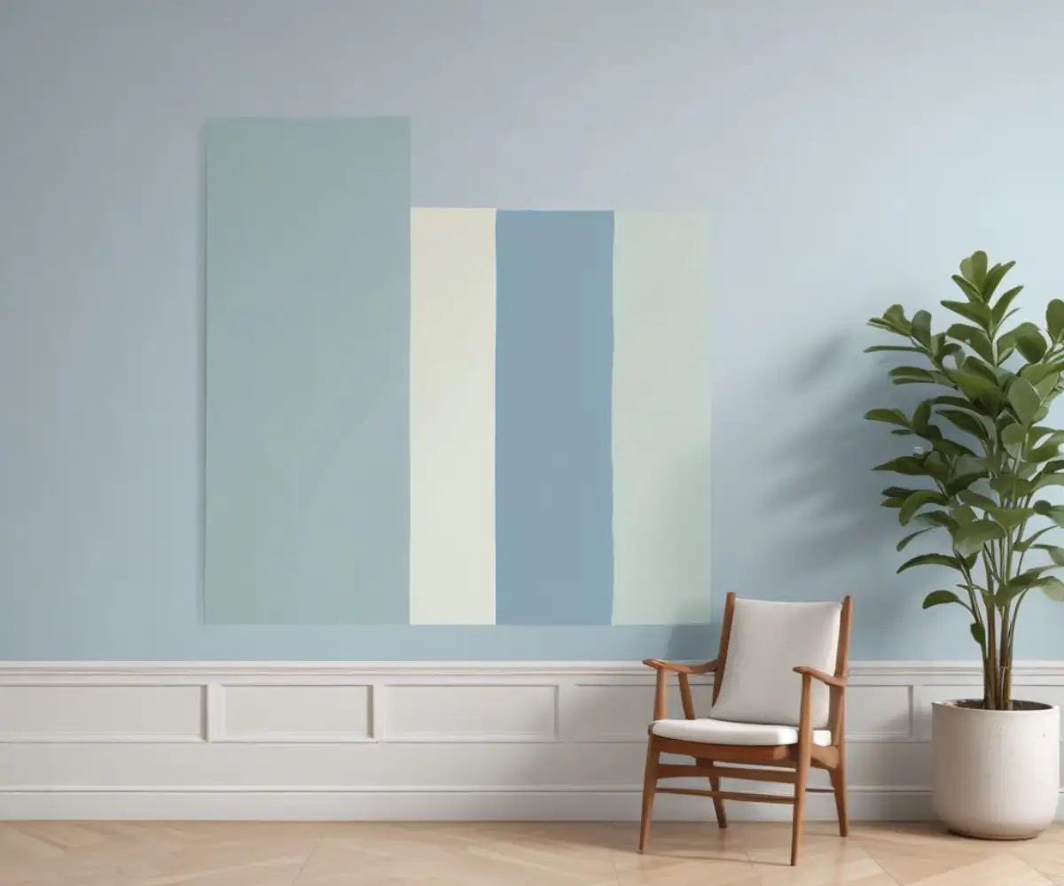
Woodlawn Blue (HC-147) is a more balanced blue-green with a noticeable gray undertone. This touch of gray gives it a softer, more muted, and sophisticated appearance. It feels more grounded and is less likely to appear overly bright, even in well-lit rooms. Its undertones are a harmonious fusion of green, turquoise, and gray.
Palladian Blue (HC-144), by contrast, leans more heavily into its green undertones. This makes it feel lighter, airier, and slightly more energetic than Woodlawn Blue. While it also has a hint of gray, the green is more prominent, giving it that classic “spa-like” or coastal vibe that so many people seek.
The Light Deception: How Your Home’s Lighting Changes Everything
The amount and type of light a room receives will drastically alter how these colors appear. A key technical aspect to consider is the Light Reflectance Value (LRV), which measures how much light a color reflects. Both colors have very similar LRVs—Woodlawn Blue at 60.65 and Palladian Blue at 60.4—meaning they reflect nearly the same amount of light. However, the *quality* of that light is what makes them look so different.
Think of your room’s light exposure as a filter:
- North-Facing Light: This light is cool and indirect. It will amplify the gray undertones in Woodlawn Blue, making it appear as a serene, soft blue-gray. In this same light, Palladian Blue‘s green can become subdued, making the color feel a bit cooler and more muted.
- South-Facing Light: Warm and bright, this light will bring out the best in both colors. It makes Palladian Blue come alive, showcasing its airy, blue-green nature perfectly. Woodlawn Blue will also look beautiful, appearing as a well-balanced and soft blue-green without washing out.
- East/West-Facing Light: These rooms experience the most dramatic shifts. The warm morning light in an east-facing room will highlight the green in Palladian Blue, while the cooler afternoon shade will bring out the blue-gray. The opposite is true for west-facing rooms, where the warm afternoon sun creates a soft, inviting glow.
Artificial lighting also plays a crucial role. Warm, yellow-toned bulbs (under 3000K) can make these colors appear muddy or too green. Cool or neutral white bulbs (3000K-4000K) are essential to preserving the true beauty and complexity of these blue-green shades.

Side-by-Side Showdown: A Feature-by-Feature Breakdown
Sometimes, a direct comparison is the best way to see the differences clearly. This table breaks down the essential characteristics of each color to help guide your decision.
| Feature | Woodlawn Blue (HC-147) | Palladian Blue (HC-144) |
|---|---|---|
| Primary Undertone | Balanced Blue-Green with notable Gray | Green with subtle Blue and Gray |
| LRV (Light Reflectance Value) | 60.65 | 60.4 |
| Overall Mood | Calm, Sophisticated, Grounded, Serene | Airy, Light, Fresh, Spa-like |
| Best For | Bedrooms, living rooms, and spaces needing a tranquil yet grounded color. Excels in north-facing rooms. | Bathrooms, kitchens, sunrooms, and spaces with abundant natural light needing an open feel. |
| Pairs Well With | Crisp whites (Chantilly Lace), creamy off-whites (White Dove), dark wood, brushed nickel, and brass. | Bright whites (Simply White), light wood tones, greiges (Revere Pewter), and polished chrome. |
Where Do They Belong? Room-by-Room Application Guide
Understanding where each color thrives can prevent a design mismatch. While both are versatile, they have rooms where they truly shine.
Woodlawn Blue: The Sophisticated Retreat
Thanks to its calming gray undertone, Woodlawn Blue is an exceptional choice for spaces designed for relaxation and focus. It creates a serene and inviting atmosphere in bedrooms and living rooms. It’s also a fantastic option for a home office where a calm, focused environment is desired. Because its green undertones prevent it from feeling too cold, it performs beautifully even in rooms with less light, like those facing north.
Palladian Blue: The Airy Oasis
Palladian Blue’s light and fresh energy makes it a natural fit for rooms where you want a bright and clean feeling. It is a go-to choice for bathrooms, transforming them into spa-like retreats. Its airy quality works wonders in kitchens and laundry rooms, making them feel larger and more open. In a sun-drenched entryway or a south-facing family room, Palladian Blue is at its absolute best, filling the space with a cheerful, coastal vibe.
The Pro Painter’s Secret: The Unskippable Testing Method
The biggest mistake homeowners make is painting a small test swatch directly onto their existing wall. The current color will influence how you perceive the new one, leading to an inaccurate impression. To test these colors correctly, you must isolate them.
Follow these professional steps for a foolproof test:
- Use Large White Poster Boards: Get two large white foam or poster boards. Paint a large sample (at least 12×12 inches) of Woodlawn Blue on one and Palladian Blue on the other. Apply two full coats to ensure true color depth.
- Move Them Around the Room: Once completely dry, move the boards to different walls within the same room. Notice how the color shifts when it’s on a wall flooded with light versus a wall in shadow.
- Observe at All Times of Day: This is non-negotiable. Look at the samples in the bright morning light, the warm afternoon sun, and with your artificial lights on in the evening. The color that looks best in all these conditions is your winner.
This method allows you to see how the color interacts with your home’s unique lighting, flooring, and furniture without any interference from your old wall color.
Beyond the Blues: Coordinating Colors and Finishes
A paint color is only as good as the palette it’s part of. Woodlawn Blue’s sophisticated nature pairs beautifully with rich, dark hardwood floors and trim painted in a crisp white like Benjamin Moore’s Chantilly Lace. For a softer look, an off-white like White Dove creates a seamless transition. It works with both brushed nickel and warm brass hardware, making it highly adaptable.
Palladian Blue’s fresh and airy vibe loves light-colored flooring like white oak and bright white trim such as Benjamin Moore’s Simply White. It coordinates wonderfully with other popular neutrals like Gray Owl and Revere Pewter. Polished chrome or nickel hardware enhances its clean, crisp feel, while unlacquered brass can add a touch of warmth.
Does the Quality of Paint Matter?
Once you’ve chosen your perfect color, the quality of the paint itself becomes paramount. Higher-quality paints have more binders and prime pigments, which results in better coverage and a richer, more durable finish that holds the color true over time. Exploring whether the paint brand really matters can save you from future headaches. Different lines within a brand, such as comparing Behr Pro vs. Premium Plus, can also offer significant differences in application and longevity.
What If the Color Still Looks Wrong?
If you’ve followed all the steps and the final color still seems off, the issue might be with the paint base or sheen. Paint is mixed into different bases (Base 1, 2, 3, etc.) depending on the depth of the color. An incorrect mix can slightly alter the final shade. Additionally, the sheen—from flat to high-gloss—can change how light reflects off the surface, subtly impacting the color’s appearance.
Final Verdict: How to Choose With 100% Confidence
The choice between Woodlawn Blue and Palladian Blue ultimately comes down to the mood you want to create and the light you have to work with. They are both beautiful colors, but they are not interchangeable.
Choose Woodlawn Blue if:
- You desire a more serene, grounded, and sophisticated atmosphere.
- Your room has tricky or low light (especially north-facing) where you need a color that won’t turn cold.
- You prefer a color that is more distinctly blue-gray with a soft, muted quality.
Choose Palladian Blue if:
- You want a light, airy, and fresh space with a coastal or spa-like feel.
- Your room is blessed with abundant natural light (especially south-facing).
- You are looking for a color with more noticeable green undertones that feels cheerful and energetic.
The only way to be certain is to follow the professional testing method. By sampling correctly and observing the colors in your own unique environment, you can move past the confusion and finally choose the perfect shade that will bring your vision to life.

