Wood Look Tile Next to Hardwood: The Design Mistake to Avoid
Pairing the rustic warmth of hardwood with the rugged durability of wood-look tile seems like a perfect match. Many homeowners seek this combination for kitchens and entryways, hoping to blend the beauty of wood with the practicality of tile. However, this popular design choice is fraught with pitfalls that can leave a home looking disjointed and inexpensive.
The core problem isn’t the concept but the execution. A poorly planned transition between these two materials can create visual chaos. Homeowners often struggle with clashing textures, awkward height differences, and the uncanny valley effect of a “close-but-not-quite” match that highlights the artificial nature of the tile.
Successfully marrying these surfaces requires a strategic approach that goes beyond simply picking two “wood” floors. It demands careful consideration of color, texture, layout, and most importantly, the transition that joins them.
You'll Learn About
Why This Combination Can Go So Wrong
Understanding the inherent challenges is the first step to avoiding a design disaster. The difficulties arise from both the visual properties and the physical nature of tile and hardwood, creating a complex puzzle for installers and homeowners alike.
The decision to keep beautiful, authentic hardwood is often a wise one, as many homeowners discover when weighing options like whether to refinish hardwood or install vinyl. Real wood adds unmatched character, but pairing it with a mimic requires precision.
The “Uncanny Valley” of Flooring Design
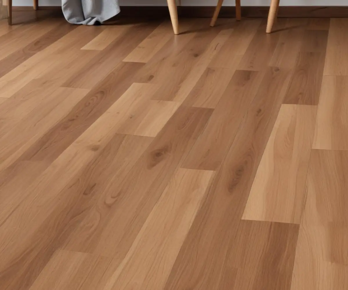
In design, a near-miss often looks worse than a deliberate contrast. When wood-look tile is too similar in color and grain to the adjacent hardwood, the eye is drawn to the subtle imperfections and differences. Instead of creating harmony, it creates a jarring effect where the tile looks like a failed imitation.
This is the uncanny valley of flooring: the closer the tile gets to mimicking the real wood without being a perfect replica, the more unsettling and “fake” it appears. This critical design principle is where many well-intentioned flooring projects fail.
Fundamental Material Differences
Hardwood and ceramic or porcelain tile are fundamentally different materials. Real wood is a natural product that breathes, expanding and contracting with changes in humidity and temperature. This movement requires an expansion gap at its perimeter.
Tile, on the other hand, is a rigid, manufactured product set in mortar. It does not expand or contract in the same way. These opposing physical properties make a seamless, gapless transition between the two materials a technical challenge that requires expert installation.
The Tripping Hazard: Height and Subfloor Issues
Perhaps the most common and dangerous issue is the difference in height. Tile installation involves a layer of thin-set mortar and often an underlayment or cement board, which can make the finished tile surface higher than the adjacent hardwood. Even a quarter-inch difference can create a noticeable and hazardous lip.
Achieving a perfectly flush transition requires meticulous subfloor preparation. This might involve building up the subfloor under the hardwood or using a thinner tile assembly. For tile installations, using the right underlayment, such as a quality crack isolation membrane, is crucial for stability and preventing cracks, but it also adds to the total height.
The Solution: A Strategic Guide to a Flawless Transition
Creating a beautiful and functional transition between wood-look tile and hardwood is achievable with careful planning. The solution lies in making deliberate, confident design choices rather than attempting a timid, seamless blend that is likely to fail.
The goal is to create a transition that feels intentional, whether through bold contrast or a meticulously planned flush seam. This elevates the design from a practical necessity to a standout feature.
To Match or To Contrast? The Most Important Decision
Your first and most critical choice is whether to attempt to match the tile to the wood or to create an intentional contrast. This decision will guide all subsequent choices, from material selection to the transition style.
The Case for High-Contrast Harmony
For most situations, creating a clear contrast is the safest and most effective design strategy. By choosing a wood-look tile that is significantly lighter or darker than the hardwood, you create a deliberate design boundary. This approach eliminates the uncanny valley effect entirely.
For example, pairing a dark, espresso-toned tile with a light, natural white oak hardwood defines the kitchen as a distinct space while complementing the living area. The stark difference feels purposeful and sophisticated, turning the floor into a key element of the room’s design.
The Danger of a “Close” Match
Attempting to find a tile that almost matches your hardwood is a recipe for disappointment. It’s nearly impossible to perfectly replicate the natural grain, undertones, and depth of real wood with a printed tile. The result is often a floor that looks cheap and highlights the artificiality of the tile.
Unless you have access to exceptionally high-quality porcelain tiles and professional design help, it is best to avoid this route. The subtle mismatches in color and pattern will become a constant source of visual friction.
Mastering the Physical Transition
Once you’ve decided on your visual strategy, the next step is planning the physical seam between the two floors. A clean, professional transition is non-negotiable for both safety and aesthetics. Hiding a poorly executed seam is impossible; it must be treated as a design element in its own right.
An improperly handled transition not only looks unprofessional but can also lead to damaged flooring edges and tripping hazards. Investing time and resources into getting this detail right is essential.
| Transition Method | Best For | Key Benefits | Potential Drawbacks |
|---|---|---|---|
| Flush Transition | Floors of the exact same height. | Creates a seamless, modern, and high-end look. Easy to clean. | Requires expert installation and perfectly level subfloors. Does not allow for expansion. |
| T-Molding | Floors of similar height with an expansion gap. | Covers the necessary expansion gap for hardwood. Relatively easy to install. | Can feel bulky and interrupt the visual flow of the flooring. |
| Reducer Strip | Floors with a slight height difference. | Provides a smooth, gentle ramp between uneven surfaces, preventing trips. | Creates a more noticeable transition line than a T-molding. |
| Feature Border | Creating a decorative, intentional separation. | Turns the transition into a stylish design element. Can use contrasting tile or metal. | Adds complexity and cost to the installation. May not suit minimalist designs. |
The Professional’s Choice: The Flush Transition
A flush transition, where the tile and hardwood meet at the exact same height with only a thin, color-matched silicone or grout line between them, is the most coveted look. It is sleek, modern, and creates an uninterrupted visual plane. However, it is also the most technically demanding to achieve.
This method requires the installer to ensure both subfloors are perfectly level. It leaves no room for error, as even a minor height discrepancy will be immediately obvious. It is essential to leave a small gap (typically 1/8 inch) between the two materials to be filled with flexible silicone caulk that matches the grout, allowing for micro-movements.
The Standard Solution: T-Molding
A T-molding is a transition strip shaped like the letter “T” that bridges the gap between two floors of similar height. It is often the go-to solution because it neatly covers the expansion gap required by hardwood flooring while overlapping the edges of both surfaces.
While practical, T-moldings can sometimes look bulky and disrupt the seamless flow you’re trying to achieve. To minimize this, choose a T-molding that perfectly matches the hardwood floor, allowing it to blend in as much as possible.
Getting the Details Right: Plank, Grout, and Layout
Beyond the primary decisions of color and transition type, several smaller details collectively have a huge impact on the final result. Overlooking these elements can undermine an otherwise well-planned project.
Plank Width and Direction
The direction you lay the tile planks can either enhance flow or create definition. Running the tile planks in the same direction as the hardwood creates a sense of continuity, making the two spaces feel connected and extending the sightlines of the home.
Alternatively, laying the tile in a different direction or pattern, such as a herringbone, can establish a clear boundary. This is effective for visually separating an open-concept kitchen from the living area without using walls. Matching the plank width of the tile to the hardwood is less critical when using a contrasting color but can be beneficial when aiming for a more blended look.
The Critical Role of Grout
Grout choice is paramount for a believable wood-look tile installation. Use the thinnest possible grout lines and a color that closely matches the darkest tone in the tile. This technique minimizes the visible grid, which is a dead giveaway that the floor is tile and not wood.
A high-contrast grout color will outline every tile, destroying the wood plank illusion. The goal is to make the grout disappear, allowing the tile’s texture and pattern to be the focus.
The Unspoken Factor: Sheen and Texture
Here is a detail that many articles overlook: the sheen and surface texture of the two materials must be compatible. A glossy, smooth tile placed next to a hand-scraped, matte-finish hardwood will always look out of place, regardless of color. The way the two surfaces reflect light is a powerful visual cue.
Aim to match the finish. If your hardwood has a low-sheen, satin finish, choose a wood-look tile with a similar matte or satin glaze. Always view samples in your home’s lighting, both during the day and at night, to see how they interact before making a final decision.
Common Scenarios and Professional Solutions
Different areas of the home present unique challenges and opportunities for this flooring combination. Applying these principles to common situations can help clarify the best approach for your specific project.
Kitchen Tile to Living Room Hardwood
This is the most frequent application. The primary driver is the need for a waterproof and highly durable surface in the kitchen. Here, a high-contrast design is often most successful. A darker slate-gray or charcoal wood-look tile can anchor the kitchen space while complementing warm-toned oak or maple in the living area.
In older homes, where flooring history can be complex, you might be dealing with unique subfloor conditions. Sometimes, what’s underneath can be a pleasant surprise, like discovering beautiful 1940s wood flooring during a renovation, which you would want to preserve and highlight.
Bathroom Tile to Hallway Hardwood
For bathrooms, moisture is the top concern. While wood-look tile is an excellent choice, the transition to a hardwood hallway must be properly waterproofed. A solid threshold, often made of marble or granite, can provide a durable and waterproof barrier that also serves as an elegant transition piece.
This is also an area where considering alternatives can be useful. For the wettest areas inside the bathroom itself, it’s worth asking, are shower panels worth it compared to tile? This thinking ensures every surface is optimized for its purpose.
Conclusion: Design with Confidence
Successfully placing wood-look tile next to hardwood is not about finding a perfect imitation. It’s about making a series of smart, intentional design choices. The key is to avoid the dreaded “uncanny valley” by either embracing a bold, stylish contrast or committing to the meticulous planning required for a perfect match.
Focus on a high-contrast color scheme, obsess over the details of the transition, and harmonize the subtle qualities of sheen and texture. By doing so, you can create a functional, beautiful, and cohesive look that adds lasting value and style to your home.