White or Off White Curtains? The #1 Mistake That Sours a Room
Choosing between white and off-white curtains seems simple. It’s a classic, safe choice that promises a clean, airy aesthetic. Yet, this decision is a hidden trap for many homeowners, leading to a space that feels subtly wrong—either sterile and cold or dingy and mismatched.
The core problem isn’t the color itself, but a fundamental misunderstanding of its properties. Failing to match the undertone of your curtains to the undertone of your walls is the single most common mistake. This subtle clash can undermine your entire design, making a room feel unintentional and visually jarring.
You'll Learn About
The Deceptive Simplicity of White
White is rarely just white. Every shade, from the most brilliant optic white to the softest ivory, carries a hidden undertone. Identifying this nearly invisible tint is the secret to creating a cohesive, professionally designed space. Get it right, and your room feels harmonious and complete. Get it wrong, and you’re left with a nagging feeling that something is “off.”
This is where the distinction between pure white and off-white becomes critical. These two categories are defined by their undertones, which dictate how they interact with the other colors in your room, especially your wall paint.
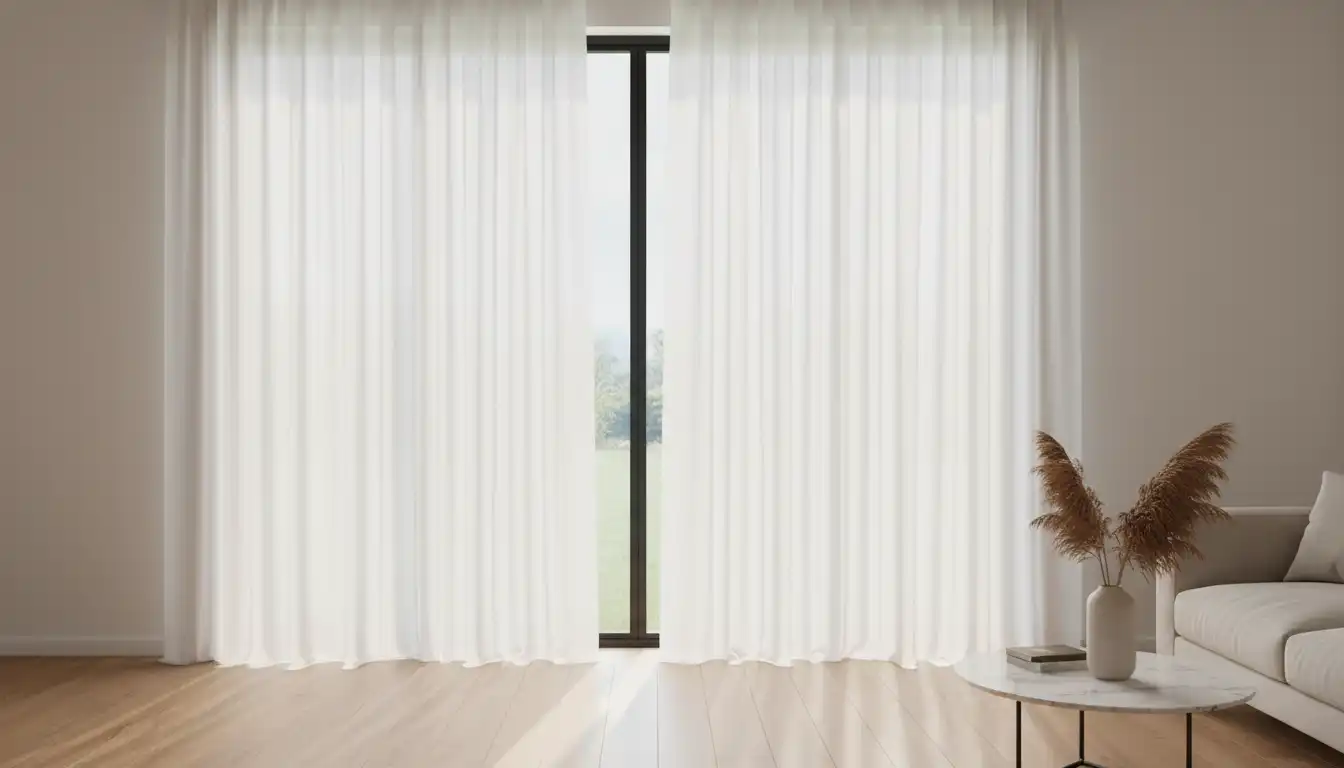
Cool Whites: Crisp, Modern, and Unforgiving
Cool, pure whites have undertones of blue, gray, or sometimes a hint of green. These are the brilliant, stark whites that feel modern, clean, and minimalist. They are designed to reflect the maximum amount of light, creating a bright, high-contrast look.
However, their crispness is also their weakness. When paired with walls that have a warm or creamy undertone, cool white curtains can look jarringly blue or gray by comparison. This makes the walls appear yellowed or dirty, and the curtains look cheap and out of place.
Warm Whites (Off-Whites): Soft, Inviting, and Versatile
Off-white shades—like ivory, cream, and linen—contain warm undertones of yellow, beige, or even a subtle pink. These colors absorb more light than cool whites, resulting in a softer, more inviting glow. They excel at creating cozy, comfortable, and traditional spaces.
The danger with off-whites arises when they are placed against cool-toned walls, such as a modern gray or a wall with blue undertones. In this context, the yellow in the off-white fabric becomes amplified, making the curtains look dated and dingy rather than intentionally warm.
Beyond the Walls: A Whole-Room Approach
Your wall color is the primary factor, but it’s not the only one. To achieve a truly harmonious design, your curtain choice must consider the entire room’s ecosystem, from the floors and furniture to the very light that fills the space.
Coordinating with Furniture and Flooring
The fixed elements in your room provide crucial clues. Warm wood floors or furniture with cherry, oak, or walnut tones naturally pair well with off-white curtains, which echo that warmth. If you’ve invested in a quality finish for your floors, it’s important not to let preventable issues like Rubio Monocoat problems detract from their beauty, a beauty that should be complemented by your window treatments.
Conversely, rooms with cooler elements like chrome fixtures, concrete floors, or black lacquered furniture call for the crispness of a pure, cool white. Mismatching here can create a subtle but persistent sense of discord.
The Overlooked Influence of Natural Light
The quality and direction of natural light dramatically alter how colors are perceived. North-facing rooms receive cool, blue-toned light throughout the day. In such a space, a stark white curtain can feel sterile and almost institutional. An off-white, however, can balance the cool light and add a touch of necessary warmth.
South-facing rooms are blessed with warm, golden light. This intense light can make an already creamy off-white curtain appear overly yellow. Here, a purer, neutral white often works best, as it will be naturally warmed by the sunlight without becoming discolored.
Fabric and Texture: The Unspoken Variable
The material of your curtains plays a significant role in how its color is expressed. The same shade of white will look entirely different in a light, airy linen versus a heavy, opaque velvet. Texture interacts with light, creating depth and shadow that can soften or sharpen a color.
A sheer linen curtain, for instance, will allow the wall color to filter through, subtly blending the two. This makes sheers more forgiving of slight undertone mismatches. The strategy of using curtains with sheers behind them offers the best of both worlds: light diffusion from the sheer layer and color definition from the main curtain panel.
| Factor | Pure White Curtains | Off-White Curtains |
|---|---|---|
| Best For Wall Colors | Cool-toned walls (gray, blue, cool pastels), pure white walls. | Warm-toned walls (cream, beige, greige, warm pastels). |
| Room Style | Modern, minimalist, Scandinavian, coastal. | Traditional, modern farmhouse, bohemian, cozy. |
| Effect on Light | Maximizes brightness, high light reflection, can feel stark. | Softens and diffuses light, creates a warm glow. |
| Pairs Best With | Cool metals (chrome, nickel), black furniture, concrete. | Warm woods, brass, gold, natural fibers. |
| Potential Pitfall | Can look sterile or cheap against warm walls. | Can look yellow or dirty against cool walls. |
Your 3-Step Guide to a Perfect Match
Choosing the right curtain is not a guessing game. By following a methodical process, you can eliminate mistakes and select your curtains with confidence, ensuring they elevate your space rather than detract from it.
Step 1: Identify Your Wall’s True Undertone
This is the most critical step. Take the paint swatch for your wall color (or paint a small sample on a white poster board) and hold it next to a simple piece of white printer paper. The contrast will instantly reveal the hidden undertones—you’ll clearly see if your wall leans warm (yellow/beige) or cool (blue/gray).
Step 2: Always Order Fabric Swatches
Never purchase curtains based on a screen image. Order swatches of your top curtain choices and bring them into the actual room. A color that looks perfect online can look completely different under the unique lighting conditions of your home.
Step 3: Test Swatches in Place and Time
Don’t just hold the swatches up for a second. Tape them to the wall next to your window frame. Observe them at different times: in the bright light of morning, the warm glow of late afternoon, and under your artificial lighting at night. The right choice will look harmonious in all conditions.
Final Touches: Hardware and Styling
Once you’ve selected the perfect curtain color, the hardware you choose will complete the look. The finish of your curtain rod should align with the other metallic finishes in your room for a cohesive design.
Hardware That Harmonizes
Cool white curtains pair beautifully with modern hardware finishes like matte black, brushed nickel, or polished chrome. These metals reinforce the crisp, clean aesthetic. Warm, off-white curtains are enhanced by the richness of hardware in gold, brass, or a versatile champagne bronze shower rod finish, which can tie a whole bathroom or bedroom look together.
Creating a Finished Look
The secret to a professionally styled room is repetition. Weave your chosen curtain color into the room through other decor elements. For off-white curtains, this might mean cream-colored throw pillows or a cozy beige rug. For pure white, crisp white matting on your artwork or a white ceramic vase can create that intentional, connected feel.
Frequently Asked Questions
Should I choose white or off-white curtains?
The choice between white and off-white curtains depends on your existing decor. Pure white curtains can create a crisp, modern look, while off-white or ivory shades tend to feel warmer and more traditional. Consider the undertones of your wall color and furnishings to ensure a harmonious look.
Do white or off-white curtains make a room look bigger?
Yes, light-colored curtains like white and off-white can make a room appear larger and more open. They reflect natural light, which brightens the space and creates an airy, expansive feeling. To maximize this effect, hang the curtains high and wide around the window frame.
What are the best fabrics for white or off-white curtains?
Popular fabric choices include cotton, linen, polyester, and blends. Cotton is a versatile and easy-to-clean option, while linen offers a more relaxed, textured look. Sheer fabrics like voile and chiffon are great for maximizing natural light, and heavier materials like velvet can provide a more luxurious feel.
How do I keep white and off-white curtains clean?
Regular maintenance is key to keeping light-colored curtains looking fresh. It is recommended to wash them every three to six months. Many fabrics are machine washable on a delicate cycle, but always check the care label first. For stains, spot-treating with a gentle cleaner can be effective.
Are white curtains a good idea for homes with children or pets?
While white curtains are stylish, they may not be the most practical choice for homes with small children or pets. Lighter colors can show dirt and stains more easily. If you have a busy household, consider more durable and stain-resistant fabrics or be prepared for more frequent cleanings.
The Final Decision: Beyond a Simple Color Choice
The choice between white and off-white curtains is a detail that has an outsized impact on the success of a room. It’s not about which color is better, but which color is right for your specific space. By understanding and matching undertones, you move beyond making a safe choice and start making a smart, intentional design decision.
This single detail, when handled correctly, is what separates an amateur-looking room from one that feels thoughtful, harmonious, and professionally designed. It proves that the biggest impact often lies in the most subtle of choices.