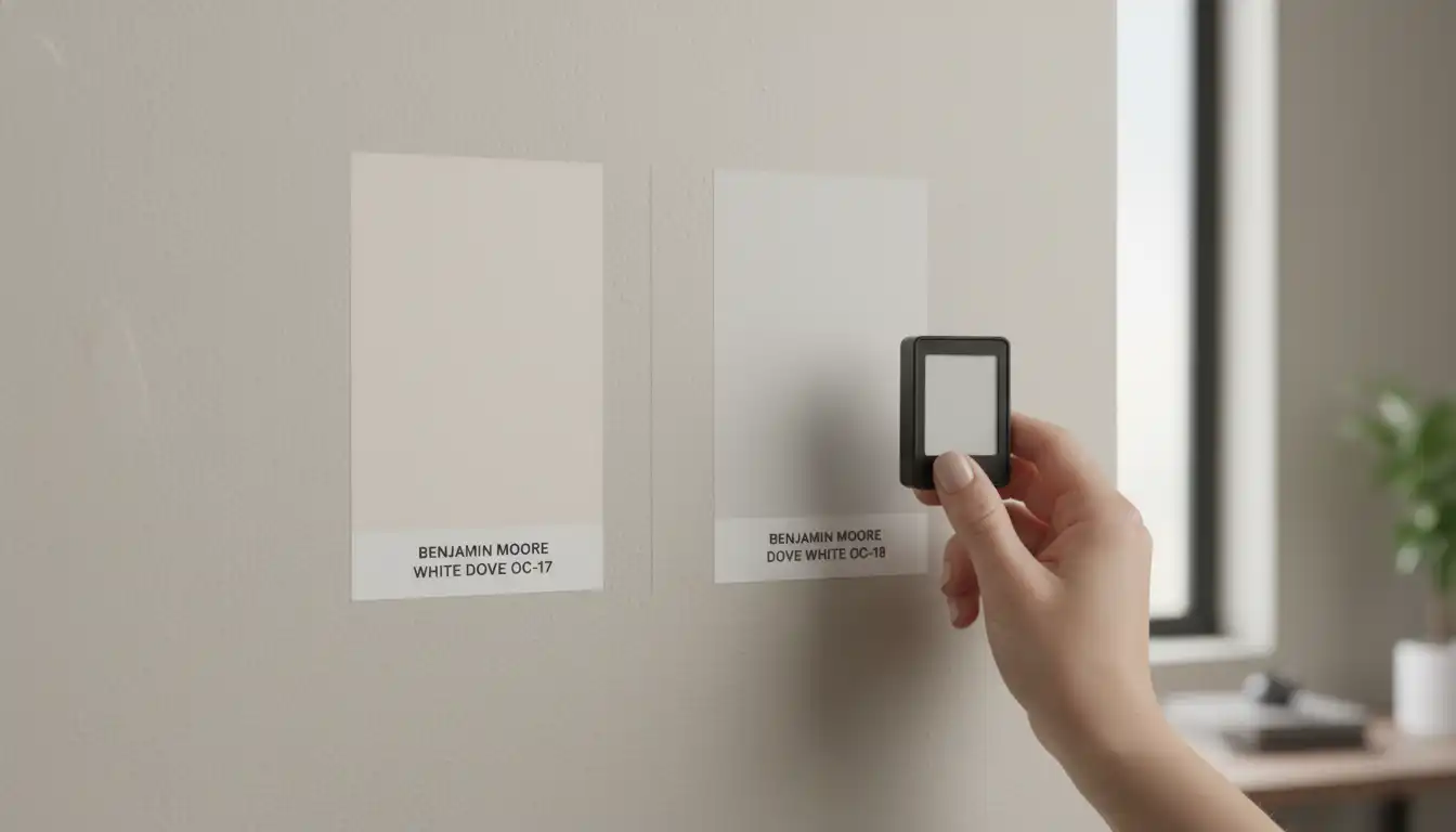
White Dove vs Dove White: The Subtle Paint Mistake Costing You a Fortune
You stand in the paint aisle, paralyzed by a wall of white. You’ve heard the designer whispers and seen the magazine spreads. You know the name you want: “Dove White.” It sounds perfect—soft, serene, timeless. But here lies the critical error, a simple misunderstanding of semantics that can lead to hundreds of dollars wasted and weeks of renovation regret. The name you’re likely looking for is Benjamin Moore’s White Dove (OC-17), an iconic, specific color. “Dove White,” on the other hand, is a generic name used by multiple brands, each with its own unique formula and undertones.
This confusion is more than just a mix-up; it’s the root of countless design frustrations. Choosing the wrong one can make your trim look dingy, your cabinets appear yellow, and your entire room feel “off” in a way you can’t quite pinpoint. This guide will demystify the difference, protect your wallet, and ensure the color you envision is the color you get.
You'll Learn About
Unmasking the Impostor: Why “Dove White” Is a Generic Gamble
The core of the problem is a branding discrepancy. Benjamin Moore’s White Dove is a singular, precisely formulated paint color, beloved by designers for its incredible versatility and sophisticated warmth. It’s a specific product with a consistent chemical makeup.
Conversely, “Dove White” is often a generic descriptor. Brands like Behr, Valspar, and others may have a color in their palette named “Dove White,” but these are not the same as Benjamin Moore’s iconic shade. Each brand’s version will have a different Light Reflectance Value (LRV), different base tones, and, most importantly, different undertones that can dramatically alter the look and feel of your space.
Benjamin Moore White Dove (OC-17): An In-Depth Look at the Real Deal
To understand why this specific color is so revered, you have to look at its composition. White Dove is not a stark, sterile white; it is a soft, warm off-white that creates a welcoming and sophisticated atmosphere.
The Undertones You Absolutely Must Understand
Every off-white has undertones, which are the subtle hints of color that emerge in different lighting conditions. White Dove’s primary undertones are a touch of gray and a hint of cream. This greige (gray + beige) base is its secret weapon. The gray prevents it from looking too yellow or creamy, while the cream stops it from feeling cold or stark. This perfect balance makes it a designer favorite for a reason.
How Light Transforms White Dove
The magic of White Dove lies in its adaptability. In a room with abundant southern-facing light, the creamy warmth will be more apparent, creating a cozy, inviting glow. In north-facing rooms, which receive cooler, bluer light, the gray undertones will step forward, making the color appear as a soft, muted white without looking dingy or shadowy.
Best Applications: Where Does It Work?
White Dove is renowned for its versatility. It’s a go-to choice for kitchen cabinets, trim, and interior walls. Its soft warmth pairs beautifully with natural materials like wood flooring and stone countertops, preventing the stark contrast that a brighter white might create. It serves as a perfect backdrop for both colorful and neutral design palettes.
The “Other” Dove Whites: A High-Stakes Comparison
Let’s get specific. How does Benjamin Moore’s White Dove stack up against a generic competitor like Behr’s Dove (HDC-MD-21)? While the names are nearly identical, the colors are not. Behr’s version often leans cooler and can appear more gray or even slightly orange in certain lighting, which can clash with warmer elements in your home.
Here’s a direct comparison to illustrate the critical differences that datasheets reveal but a simple paint chip may hide:
The Critical Data: A Head-to-Head Breakdown
| Feature | Benjamin Moore White Dove (OC-17) | Generic “Dove White” (Example: Behr HDC-MD-21) |
|---|---|---|
| LRV (Light Reflectance Value) | 83.16 (reflects a high amount of light, feels airy) | Approximately 77 (darker, reflects less light) |
| Primary Undertones | Creamy with a touch of gray (Greige) | Can vary; often has cooler gray or orange/pink hints |
| Best Use Case | Cabinets, trim, and walls in various lighting | Requires extensive testing; may appear dingy in low light |
| Pairs Best With | Warm woods, natural stones, both warm and cool palettes | Cooler palettes, modern designs with stark contrasts |
The Dangerous Allure of Color Matching
At this point, you might think, “I’ll just get White Dove color-matched in a cheaper brand.” This is one of the most common DIY painting mistakes. Each paint brand uses a proprietary base and tinting system. A competitor’s computer can scan a chip and create a similar color, but it can’t replicate the exact formula.
The result is a color that’s “close but not quite.” The undertones will be slightly off, which can lead to disastrous results. That “almost” color might flash green, pink, or blue in your home’s specific lighting, a risk you don’t take when using the original manufacturer’s product. When considering paint quality, it’s worth exploring how different lines from the same brand perform, as seen when comparing options like Behr’s Pro and Premium Plus lines.
The Ultimate Test: How Your Home’s Unique Light Changes Everything
Paint color is not static; it is a dynamic element that interacts with its environment. The direction of your windows, the color of your floors, and even the foliage outside will influence how a white paint looks on your walls.
North, South, East, West: A Game of Light
North-Facing Rooms: This light is cool and indirect. A generic, cooler “Dove White” can look flat and drab here. Benjamin Moore’s White Dove, with its underlying warmth, will balance the cool light and prevent the room from feeling sterile. It’s often recommended as one of the best whites for north-facing rooms.
South-Facing Rooms: This light is bright and warm. Here, the creamy aspect of White Dove will shine, creating a beautiful, soft glow throughout the day. A generic “Dove White” with the wrong undertones could appear surprisingly yellow or washed out in this intense light.
East & West-Facing Rooms: These rooms experience the most dramatic shifts. The light is warm in the morning (east) or afternoon (west) and cooler the rest of the day. A balanced color like White Dove is crucial here, as it adapts beautifully to these changing conditions without revealing unwanted undertones.
Pairing with Fixed Elements: The Make-or-Break Factor
Your paint choice must harmonize with your home’s permanent fixtures. Against warm oak floors, White Dove’s greige undertone creates a cohesive look. A cooler, grayer “Dove White” could clash, making the floors look overly orange.
The same is true for countertops. White Dove is a classic choice for kitchen cabinets because its softness complements both the cool veining in marble and the warmer tones in many quartz patterns. Getting this pairing wrong is a costly mistake to fix.
Beyond the Color Chip: Secrets to a Professional Finish
Choosing the right name is only the first step. Two often-overlooked factors can completely change the final appearance of your chosen color: sheen and primer.
The Overlooked Impact of Sheen
The finish you choose has a massive impact on how the color is perceived. A matte finish will absorb light, making White Dove appear softer and more muted. A satin or semi-gloss finish will reflect light, which can intensify its creamy undertones and make the color feel brighter.
For trim and cabinets, a satin or semi-gloss is typical for durability, while walls are often painted in an eggshell or matte finish. Using the same color in different sheens can create a sophisticated, layered look, but it’s important to test them together.
Why Your Primer Is Sabotaging Your Paint Job
Painting a soft off-white over a previous color without the right foundation is a recipe for failure. The old color can bleed through, altering the new color’s undertones. For a color as nuanced as White Dove, a high-quality, properly tinted primer is non-negotiable.
Ask your paint store to tint the primer to about 50% of the final color’s formula. This creates a neutral base that allows the true character of White Dove to emerge, ensuring the color you see on the sample is the color you get on your walls.
Your Foolproof Action Plan for Choosing the Perfect White
To avoid the “White Dove vs. Dove White” trap and select the right shade with confidence, follow these essential steps.
Step 1: Ditch the Tiny Paper Swatch
Never, ever make a final decision based on a small paper paint chip held under the harsh fluorescent lights of a hardware store. These chips are too small to give you a true sense of the color and its undertones.
Step 2: Invest in Large, Movable Samples
The best way to test paint is to use large, peel-and-stick samples or to paint a sizable poster board. This allows you to move the color around the room and see how it looks on different walls and next to different elements like your sofa, flooring, and window treatments.
Step 3: Test for 48 Hours
Live with your sample for at least two full days. Observe it in the bright morning light, the direct afternoon sun, and at night under your artificial lighting. This is the only way to see how the undertones will behave in your home’s unique environment. This process of comparing is crucial, whether you’re looking at different brands or trying to decide between paint suppliers like Farrell Calhoun and Sherwin Williams.
The Final Verdict: One is an Icon, The Other a Category
There is no true “White Dove vs. Dove White” competition. Benjamin Moore’s White Dove (OC-17) is a specific, iconic, and reliable paint color. “Dove White” is a generic name that represents a gamble—a color that might be close, but is never the same.
By understanding the critical difference in name, formula, and undertones, you can avoid costly repaints and frustrating design outcomes. The perfect white for your home is a foundation for your entire design, so arm yourself with knowledge, test rigorously, and choose the authentic color that has earned its stellar reputation. For those who appreciate the nuance of iconic shades, exploring the story behind colors like the famous DeVOL Mushroom paint can be equally rewarding.