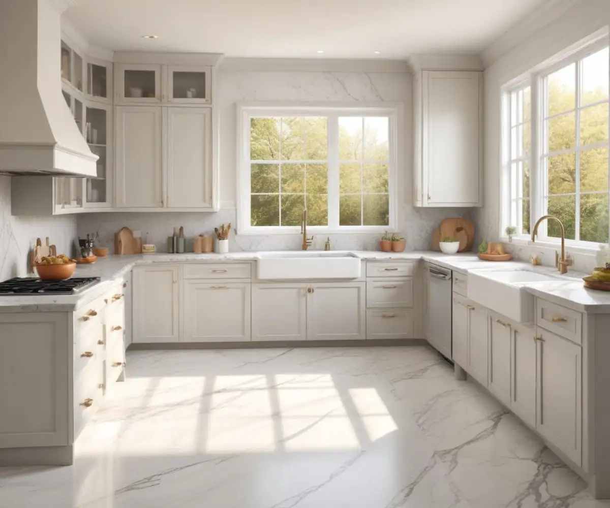
White Dove Cabinets Wall Color: Avoid This #1 Mistake for a Flawless Kitchen
You’ve chosen Benjamin Moore White Dove for your cabinets, a fantastic first step. It’s a designer favorite for a reason—it strikes a perfect balance of softness and warmth without being stark or overly creamy. The problem begins when you stand in front of a wall of paint chips, trying to find the perfect wall color. Suddenly, the serene, sophisticated kitchen you imagined feels impossible to achieve.
Many homeowners fall into a critical trap: they either match it with a white that’s too clean, making the White Dove cabinets look yellow and dingy, or they pick a color with the wrong undertone, creating a space that feels chaotic and mismatched. This leads to that sinking feeling of paint regret, costing you time, money, and the joy of your new kitchen.
The key to success lies in understanding the subtle, nuanced undertones of White Dove and leveraging them to create a harmonious color palette. This guide will break down exactly how to do that, providing actionable solutions and specific paint color recommendations to ensure your kitchen is nothing short of stunning.
You'll Learn About
Why Pairing Wall Colors with White Dove Is Deceptively Hard
Benjamin Moore’s White Dove (OC-17) isn’t a pure, sterile white. It’s a soft, warm off-white that carries subtle undertones of yellow and gray. These undertones are its greatest strength, giving it depth and character, but they are also what makes pairing it with other colors so challenging.
The primary issue arises from how these undertones interact with other colors in the room, especially under different lighting conditions. A wall color with a cool, blue undertone, for example, can clash dramatically with White Dove’s inherent warmth, amplifying its yellow tones in a very unflattering way. This is the most common mistake homeowners make—ignoring the undertone conversation between the cabinets and the walls.
The “Chameleon Effect” No One Talks About
A factor often overlooked is how dramatically light transforms White Dove. In a sun-drenched, south-facing kitchen, its warmth is pronounced, and it appears as a soft, creamy white. However, in a north-facing room with cooler, indirect light, the gray undertones can become more prominent, making the color appear more muted and sometimes even slightly gray.
This “chameleon effect” means a wall color that looks perfect in the paint store can look completely wrong in your actual kitchen. The artificial lighting in your home, from warm yellow bulbs to cool LED strips, will also play a significant role in how the final color pairing is perceived. Ignoring this is a recipe for disappointment.
The Foolproof Solution: Respect the Undertone
To create a cohesive and high-end look, the solution is to choose wall colors that either share White Dove’s warm, organic feel or provide a deliberate, sophisticated contrast that honors its undertones. This means selecting colors that have a similar “muddiness” or softness—nothing too bright, clean, or stark.
Think of it as choosing members of the same family. Colors with soft gray, green, or greige bases are natural companions because they don’t fight with White Dove’s warmth; they complement it. This strategy ensures the entire space feels intentional and professionally designed.
Top 5 Wall Colors That Make White Dove Cabinets Shine
After extensive research into designer choices and homeowner successes, five colors consistently emerge as perfect partners for White Dove cabinets. These options range from subtle neutrals to sophisticated, moody hues, each creating a distinct and beautiful atmosphere.
1. Benjamin Moore Revere Pewter (HC-172)
A legendary warm gray, or “greige,” Revere Pewter is a go-to for designers for a reason. It has enough depth to create a gentle contrast with White Dove without overwhelming it. Its warm undertones ensure a harmonious blend, creating a timeless and elegant kitchen that feels both cozy and sophisticated.
2. Benjamin Moore Edgecomb Gray (HC-173)
A slightly lighter greige than Revere Pewter, Edgecomb Gray is another perfect neutral. It’s a soft, earthy, and organic color that creates a seamless transition from the cabinets to the walls. This is an excellent choice for creating an airy, open feel while maintaining a sense of warmth and character.
3. Benjamin Moore Hale Navy (HC-154)
For those seeking a bolder, more dramatic look, Hale Navy is a stunning choice. This deep, rich navy has subtle gray undertones that prevent it from feeling too primary or bright. The high contrast with White Dove cabinets creates a crisp, classic, and luxurious aesthetic that is both timeless and modern.
4. Benjamin Moore Palladian Blue (HC-144)
If you’re aiming for a calm, serene, and coastal-inspired kitchen, Palladian Blue is an exceptional option. It’s a soft, muted blue-green that brings a breath of fresh air into the space. Its gray undertones keep it sophisticated and prevent it from clashing with the warmth of White Dove, resulting in a tranquil and spa-like environment.
5. A Unifying Approach: White Dove on Walls and Cabinets
One of the most elegant and foolproof strategies is to use White Dove on both the cabinets and the walls but in different sheens. Typically, cabinets are finished in a satin or semi-gloss for durability, while walls are done in a matte or eggshell finish. This subtle shift in sheen creates a gentle, layered contrast that is incredibly chic and makes the space feel larger and more cohesive.
Exploring Beyond the Top Picks: Greige, Green, and Gray
While the top five are proven winners, many other colors work beautifully. The key is to stick with colors that have a similar organic and slightly muted quality. Steer clear of colors that are too “clean” or have strong, competing undertones.
The Greige and Taupe Family
Greiges are a perfect match because they bridge the gap between gray and beige, mirroring the balance of gray and yellow in White Dove. Colors like Sherwin-Williams Agreeable Gray or Benjamin Moore Balboa Mist are fantastic options. Balboa Mist, in particular, is a light warm gray that offers a subtle and elegant backdrop.
For something with a bit more depth, consider a color like the grays often paired with dove gray cabinets, which share a similar muted quality. Just ensure the gray you choose has enough warmth to avoid clashing.
The World of Greens and Blues
Soft greens and blues with gray undertones are another excellent choice. These colors create a natural, earthy feel that complements White Dove beautifully. Think of colors like Benjamin Moore October Mist or Sherwin-Williams Sea Salt. These serene shades add a touch of color without overwhelming the space.
Deeper, moodier greens like Benjamin Moore Backwoods can also create a stunning, high-contrast look, similar to Hale Navy, for an English-inspired kitchen aesthetic.
The Critical White-on-White Pairing
Pairing white cabinets with white walls requires careful consideration. A common mistake is choosing a stark, cool white for the walls, like Benjamin Moore’s Decorator’s White. This will inevitably make your White Dove cabinets appear yellow. If you want a different white for the walls, you must choose one with similar warm undertones. A color like the difference between Decorator’s White and Super White highlights how critical subtle undertone differences are. Benjamin Moore’s Swiss Coffee is a slightly warmer off-white that can work, but the safest bet remains using White Dove for both, varying the sheen.
Quick Reference: Wall Color Pairing Guide
Choosing the right color can feel overwhelming. Use this table as a quick guide to understand how different color families will interact with your White Dove cabinets and the overall mood they will help create in your kitchen.
| Color Family | Recommended Paint Colors | Mood & Vibe | Best For |
|---|---|---|---|
| Warm Grays (Greige) | BM Revere Pewter, BM Edgecomb Gray, SW Agreeable Gray | Warm, Inviting, Timeless, Sophisticated | Creating a cozy yet elegant space that feels both modern and classic. |
| Soft Blues & Greens | BM Palladian Blue, SW Sea Salt, BM October Mist | Calm, Serene, Airy, Spa-like | Kitchens where you want a tranquil, coastal, or nature-inspired feel. |
| Deep, Moody Hues | BM Hale Navy, BM Kendall Charcoal, BM Backwoods | Dramatic, Luxurious, Bold, High-Contrast | Creating a focal point, adding depth, and achieving a high-end, classic look. |
| Warm Whites | BM White Dove (different sheen), BM Swiss Coffee | Cohesive, Bright, Expansive, Minimalist | Making small kitchens feel larger and achieving a seamless, layered look. |
| Cool Grays | BM Stonington Gray, BM Coventry Gray | Modern, Crisp, Neutral (Use with Caution) | Modern kitchens, but requires careful testing to ensure it doesn’t make White Dove look yellow. |
The #1 Mistake You Must Avoid
The single biggest mistake is ignoring your home’s fixed elements. Your countertops, backsplash, flooring, and even the hardware on your cabinets have their own colors and undertones. You cannot choose a wall color in isolation.
If you have cool-toned Carrara marble countertops with strong blue-gray veining, a warm greige on the walls might clash. Similarly, if your floors are a warm, red-toned cherry, a cool gray wall paint will fight with both the floors and the cabinets. Lay your paint swatches directly against your countertop, backsplash, and floor samples. View them together in your kitchen’s natural and artificial light throughout the day. This step is non-negotiable and will save you from costly repainting and disappointment.
Final Pro Tip: Test, Test, Test
Never, ever paint your kitchen based on a tiny paint chip. Purchase sample pots of your top two or three color choices. Paint large sample boards (at least 12×12 inches) and move them around the room over 24-48 hours.
Observe how the colors look in the bright morning light, the warm afternoon sun, and under your artificial kitchen lighting at night. This is the only way to be absolutely certain that the color you choose will create the beautiful, harmonious kitchen you envision.