What Color Matches Toro Red? Unlock Pro Color Secrets Now
Toro Red is a powerful, vibrant color that commands attention. Whether on a piece of equipment or as a design choice in your home, this bold hue can be incredibly effective. However, its strength is also its biggest challenge; pairing it incorrectly can overwhelm a space and create visual chaos.
Many people default to simple black or white pairings, missing out on a world of sophisticated and dynamic color schemes. The problem isn’t the color itself, but understanding how to balance its energy. This guide unlocks the professional secrets to mastering Toro Red, ensuring your color choices look intentional, harmonious, and stunning.
You'll Learn About
Understanding the Essence of Toro Red
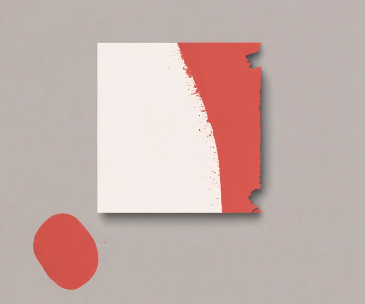
Before pairing colors, it’s crucial to understand the character of Toro Red. This isn’t just any red; it’s a specific, high-impact shade often associated with power, action, and durability. Psychologically, bright reds like this are energizing and excite the emotions, making them a potent tool in design.
Toro Red is a warm red, typically carrying subtle orange undertones. This warmth is key to identifying its best matches. Pairing it with colors that share this warm base creates harmony, while pairing it with cool-toned colors can create a dramatic, eye-catching contrast if done correctly.
The Fail-Safe Neutrals: Creating a Balanced Foundation
For those new to working with such a bold color, neutrals are the perfect starting point. They provide a stable canvas that allows Toro Red to shine without competing for attention. These pairings are timeless, sophisticated, and nearly impossible to get wrong.
Crisp White & Off-White: For a Clean, Modern Look
Pairing Toro Red with crisp white is a classic for a reason. The high contrast makes the red pop, creating a clean, energetic, and modern aesthetic. This combination feels fresh and invigorating, perfect for spaces where you want to create a sense of alertness and clarity.
For a slightly softer approach, consider off-white shades like ivory, alabaster, or beige. These warmer whites reduce the starkness of the contrast while maintaining a bright and airy feel, resulting in a more inviting and comfortable atmosphere.
Shades of Gray: The Sophisticated Choice
Gray is an incredibly versatile neutral that can dramatically alter the mood of Toro Red. A deep charcoal gray grounds the red, creating a look that is moody, dramatic, and profoundly sophisticated. This combination feels mature and luxurious, ideal for a formal living room or a statement-making office.
On the other end of the spectrum, a light, cool-toned gray provides a soft, contemporary backdrop that calms the red’s intensity. This pairing is subtle and chic, offering a more modern and less dramatic alternative to pairing with white. It allows the red to be the star without shouting for attention.
Bold Black: For Maximum Drama and Impact
When you combine Toro Red with black, you create a powerful and assertive color palette. This is a high-impact duo that exudes confidence and drama. The deepness of black makes the red appear even more vibrant and intense.
This pairing is often used in branding and design to convey strength and precision. In an interior space, it’s best used thoughtfully to avoid making the room feel too dark or heavy. Consider using black for trim, furniture legs, or in patterns to define and anchor the red elements.
Beyond the Basics: Advanced Color Pairings for Toro Red
Once you’re comfortable with neutrals, you can explore more complex and dynamic color combinations. These advanced pairings leverage color theory to create palettes that are unique, intentional, and professionally curated. These are the choices that elevate a design from good to exceptional.
Cool Blues: A Surprising and Dynamic Contrast
Navy blue is a timeless partner for red. This combination feels classic and almost nautical, creating a look that is both bold and stable. The deep, cool tones of navy provide a rich contrast to the warmth of Toro Red, resulting in a balanced and visually pleasing palette.
For a more unexpected pairing, consider lighter, dustier blues like slate blue or French blue. These muted cool tones can temper the fire of Toro Red, creating a sophisticated and surprisingly serene environment. The contrast is less stark than with navy but just as effective.
Earthy and Deep Greens: A Natural Complement
As red’s direct complement on the color wheel, green is a natural and powerful match. However, the key is to choose the right shade. Avoid bright, jarring greens that can create a “Christmas” vibe. Instead, opt for deep, sophisticated greens like forest green, olive, or emerald.
These rich, earthy greens connect the vibrant red to the natural world, grounding its energy and creating a look that feels both luxurious and organic. This combination is perfect for creating a cozy, enveloping space like a library or a den.
Practical Application: Using Toro Red in Your Space
Knowing which colors match Toro Red is only half the battle. The real art lies in applying these combinations effectively. The scale, proportion, and texture of the colors are just as important as the hues themselves. A successful design depends on a thoughtful and balanced execution.
The right application can make Toro Red feel invigorating and chic, while the wrong one can feel chaotic. Understanding basic design principles will help you wield this powerful color with confidence and precision, ensuring a polished and professional result every time.
| Matching Color | Palette Type | Creates This Mood | Best Used For |
|---|---|---|---|
| Crisp White | High-Contrast Neutral | Clean, Energetic, Modern | Walls, trim, kitchens, bathrooms |
| Charcoal Gray | Sophisticated Neutral | Dramatic, Moody, Luxurious | Accent walls, furniture, home offices |
| Beige / Taupe | Warm Neutral | Inviting, Cozy, Calm | Living rooms, bedrooms, textiles |
| Navy Blue | Cool Contrast | Classic, Stable, Confident | Furniture, cabinetry, accent decor |
| Forest Green | Complementary | Rich, Organic, Grounded | Accent walls, textiles, decor pieces |
| Black | High-Impact Neutral | Bold, Powerful, Dramatic | Trim, accents, picture frames |
The 60-30-10 Rule in Design
A foolproof way to build a balanced color scheme is the 60-30-10 rule. This classic design principle helps you distribute colors in a way that is pleasing to the eye. It ensures that one color doesn’t completely dominate the space.
Your dominant color (often a neutral) should cover about 60% of the space, typically the walls. The secondary color should take up 30%, which might include furniture or curtains. Toro Red, as a powerful accent, is perfect for the 10%, used in decor, pillows, or a single statement piece.
Considering Texture and Material
The impact of Toro Red changes dramatically based on its finish and texture. A high-gloss Toro Red surface feels sleek, modern, and energetic, while a matte or chalky finish feels softer and more rustic. Similarly, a red velvet pillow is luxurious and rich, whereas a red linen fabric is airy and casual.
Combine textures for a truly dynamic design. For a compelling industrial-chic look, pair a glossy Toro Red metal cabinet with raw concrete floors and distressed wood beams. The interplay between the sleek color and the rough textures creates a sophisticated and layered aesthetic.
Common Mistakes to Avoid When Matching Toro Red
Using a color as bold as Toro Red comes with a few potential pitfalls. Being aware of these common mistakes can help you avoid them and ensure your design is successful. Thoughtful planning can prevent the color from becoming a source of visual stress.
The most frequent errors involve overuse, ignoring lighting conditions, and creating too much visual competition. A little restraint and a bit of context go a long way. This will ensure the red enhances your space rather than detracts from it.
Avoid creating excessive visual noise by pairing Toro Red with too many other bright, competing colors without a neutral buffer. This can make a room feel jarring and unsettling, similar to the distracting hum of an attic fan vibration that creates a subtle sense of unease.
Toro Red Beyond Interiors: Branding and Equipment
The power of Toro Red extends far beyond interior design. Brands, particularly in the equipment and automotive industries, have long used this color to signify power, reliability, and high performance. The choice is intentional; red is one of the most visible colors and instantly grabs attention.
For many, the color is synonymous with the brand itself. When choosing equipment, this strong brand identity can be a deciding factor, much like performance metrics are in a Toro vs Troy-Bilt snowblower showdown. This vibrant red is also a popular choice for outdoor applications, such as a statement front door or a brightly painted shed. For those building a custom outdoor structure, exploring Tuff Shed alternatives can open up a world of color possibilities, allowing for a truly personalized look.
Embrace the Boldness of Toro Red
Toro Red is a dynamic and exciting color that should be embraced, not feared. By understanding its warm undertones and applying basic color theory, you can unlock its full potential. Start with a foundation of reliable neutrals like gray or white to build your confidence.
When you’re ready, experiment with more advanced pairings like deep greens or navy blues. Always consider the 60-30-10 rule for balance and pay close attention to texture and lighting. When used correctly, Toro Red can transform any space from ordinary to unforgettable.