Valspar Ultra White vs Pure White: The #1 Mistake to Avoid
Choosing the right white paint feels like it should be simple. You walk into the store, ask for white, and walk out. But the reality is a dizzying wall of swatches with names like “Snow Cap,” “Dove White,” and “Bistro White,” each looking deceptively similar yet threatening to completely change the feel of your room. Make the wrong choice, and your bright, airy vision can quickly turn into a sterile, clinical space or a dingy, yellowed room that feels dated the moment it dries.
This decision becomes even more complex when comparing two colors from the same brand that sound nearly identical, like Valspar Ultra White and Valspar Pure White. One wrong move can lead to painter’s regret, forcing you to either live with a color you dislike or spend more time and money repainting. This guide will illuminate the critical differences between these two popular whites, ensuring you can make a confident choice that brings your vision to life perfectly the first time.
You'll Learn About
Decoding the DNA of White Paint
Before diving into a head-to-head comparison, it’s crucial to understand the three core elements that give every white paint its unique personality: Light Reflectance Value (LRV), undertones, and sheen. Mastering these concepts is the key to predicting how a color will actually behave on your walls.
Light Reflectance Value (LRV): The Brightness Scale
LRV measures how much light a paint color reflects. The scale runs from 0 (absolute black) to 100 (pure white). A higher LRV means the color reflects more light, making a space feel brighter and potentially larger. Valspar Ultra White has a very high LRV of 93.5, placing it among the brightest whites available. A white this reflective is excellent at maximizing light in darker rooms but can sometimes feel intense or glaring in spaces with abundant sunshine.
Undertones: The Hidden Colors Within
Nearly every white paint has a subtle undertone—a hint of another color like yellow, blue, gray, or red. This is what separates a warm, cozy white from a crisp, cool one. The biggest mistake homeowners make is ignoring undertones, which can be dramatically amplified by lighting and surrounding decor. A white with a slight yellow undertone might create a welcoming glow in one room but look dingy in another.
Sheen: The Finishing Touch
Sheen refers to the finish of the paint, ranging from flat (no shine) to high-gloss. A higher sheen, like semi-gloss or satin, is more durable and easier to clean, making it ideal for trim, doors, and kitchens. A lower sheen, like eggshell or flat, has a more luxurious, velvety look and is better at hiding minor wall imperfections, making it perfect for living rooms and bedrooms.
The Contenders: A Detailed Breakdown
While both are “white,” Valspar Ultra White and Valspar Pure White are formulated to serve different purposes and create distinct atmospheres. Understanding their individual profiles is the first step in choosing the right one for your project.
Valspar Ultra White (7006-24): The Brilliant Baseline
Think of Ultra White as the purest, most brilliant white in Valspar’s lineup. It is often the untinted base paint itself, meaning it has no added colorants. This gives it a clean, crisp, and stark appearance. It is celebrated for having a true neutral base, free from strong warm or cool undertones. Under certain lighting, a very subtle hint of soft gray might appear, but its primary identity is one of undiluted brightness.
This color excels in creating sharp contrast and a modern, minimalist aesthetic. It’s a favorite for trim, ceilings, and doors because it makes adjacent wall colors “pop.” However, using it on all four walls of a room can sometimes create a sterile or clinical feeling if not balanced with warm textures and materials in the decor.
Valspar Pure White: The Softer, More Versatile Choice
The name “Pure White” can be misleading across different brands. For Valspar, Pure White is not as stark as Ultra White. It’s a more balanced, versatile white designed for broad wall applications. It carries a subtle warmth, often from a minuscule drop of yellow, gray, or red in its formula, which takes the edge off its brightness. This hint of warmth makes it a more comfortable and inviting choice for living spaces like bedrooms and family rooms.
It’s bright enough to feel fresh and clean but soft enough to avoid the harshness of a pure base white. This makes it a safer and more forgiving option for homeowners who want a classic white wall that complements a wide range of decor styles, from traditional to farmhouse modern. It provides a beautiful “gallery white” look without feeling like a sterile commercial space.
Valspar Ultra White vs. Pure White: The Head-to-Head Showdown
Choosing between these two colors comes down to understanding their key differences and how those will translate within the unique context of your home. This table breaks down their core attributes for a direct comparison.
| Feature | Valspar Ultra White (7006-24) | Valspar Pure White (Generic) |
|---|---|---|
| Light Reflectance Value (LRV) | Extremely High (approx. 93.5) | High (Typically 84-88) |
| Primary Characteristic | Stark, brilliant, crisp | Soft, versatile, inviting |
| Undertones | Neutral; may show a hint of cool gray | Subtle warmth (slight yellow/gray) |
| Best For Walls | Use with caution; can feel clinical | Excellent for any room, very livable |
| Best For Trim & Ceilings | Exceptional. Creates sharp, clean contrast. | Good, but offers a softer contrast |
| Pairs Best With | Bold colors, cool tones (grays, blues), modern decor | Warm tones, natural woods, transitional and traditional decor |
| Atmosphere Created | Modern, minimalist, high-energy | Cozy, comfortable, relaxed |
The Game Changer: How Lighting Transforms White Paint
You cannot choose a white paint based on a small swatch under the fluorescent lights of a hardware store. Light is the single most powerful factor that will influence how a white appears in your home. The same color can look completely different from one room to the next.
Natural Light’s Powerful Influence
The direction your windows face dramatically alters the quality of natural light entering a room.
- North-Facing Rooms: Receive cool, indirect blue-gray light all day. A stark, cool white like Ultra White can feel very cold and almost sterile here. A softer white like Pure White would be a better choice to counteract the cold light and add a touch of warmth.
- South-Facing Rooms: Are flooded with warm, bright yellow-toned light for most of the day. This intense light can make a warm white look too yellow. The crisp neutrality of Ultra White can balance the warmth beautifully in these spaces.
- East-Facing Rooms: Get bright, warm light in the morning that becomes cooler and more indirect in the afternoon. A versatile white like Pure White is ideal as it adapts well to both conditions.
- West-Facing Rooms: Have softer, neutral light in the morning, which turns into intense, warm, almost orange light in the late afternoon and evening. Again, a balanced white is often the best choice to handle this dramatic shift.
The Artificial Light Trap
Don’t forget to consider your light bulbs. The color temperature of your artificial lighting will take over in the evening and on cloudy days. LED bulbs come in various temperatures: “soft white” (around 2700K) casts a warm, yellow glow, while “daylight” (5000K+) casts a cool, bluish light. Test your paint swatches under your home’s artificial lighting at night to avoid any surprises.
The Ultimate Decision-Making Framework
Now that you understand the variables, follow this simple, step-by-step process to choose with confidence.
Step 1: Analyze Your Space’s DNA
Look beyond the walls. What are the fixed elements in your room? Your flooring, kitchen cabinets, countertops, and large furniture pieces all have their own undertones. Hold your white paint samples directly against these finishes. If you have warm oak floors, a starkly cool white might clash, whereas a white with a hint of warmth will create a more cohesive look. When painting cabinets, for instance, a reliable color choice is essential; comparing options like Behr vs. Valspar cabinet paint can provide clarity on durability and finish in addition to color.
Step 2: Define Your Desired Atmosphere
How do you want the room to feel? Are you aiming for a crisp, clean, and modern art gallery vibe? Valspar Ultra White is your ally. Do you want a space that feels soft, inviting, and comfortable—a cozy sanctuary? Valspar Pure White is the better path. Your emotional goal for the room is just as important as the technical specs of the paint.
Step 3: The Non-Negotiable Rule – Always Sample
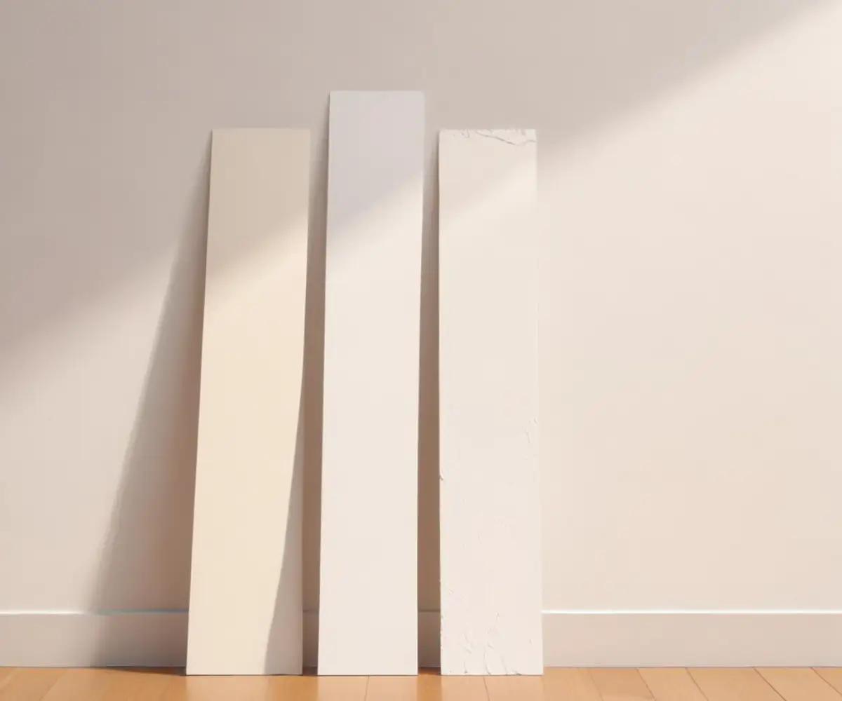
Never, ever skip this step. Purchase sample pots of both colors. Do not paint a small swatch directly on your old wall color, as it will skew your perception. Instead, paint a large poster board or a peel-and-stick sample sheet with at least two coats.
Place your large sample boards on different walls throughout the room. Move them around during the day to see how they react to changing light. Observe them in the bright morning sun, the cool afternoon shade, and under your artificial lights at night. This is the only way to know for certain how the color will truly live in your space.
The Hidden Factor: White Paint Base and Coverage
One aspect rarely discussed at the paint counter is the technical difference between a base paint and a tinted color. Valspar Ultra White is often the “Base A” or untinted base paint. While this makes it incredibly bright, it also means it has less pigment and hiding power. When painting over a darker color, an untinted white may require more coats—sometimes three or four—to achieve full, even coverage. This can be frustrating and increase the cost and labor of your project.
A color like Pure White, which has colorant added (even a small amount), often has better hiding capabilities. The added pigments contribute to the paint’s opacity, helping it cover the old wall color more effectively. If you’re making a dramatic color change from dark to white, opting for a white with even a little tint can save you significant time and effort.
Cost, Quality, and Availability
Valspar paints are primarily sold at Lowe’s, making them an accessible and budget-friendly option for many homeowners. When considering your project’s budget, it’s useful to understand the broader market. The debate over Lowe’s vs. Sherwin-Williams paint prices often comes down to balancing the cost per gallon against factors like coverage and durability, where a more expensive paint might require fewer coats, saving money in the long run.
Final Verdict: Making the Right Choice for You
The choice between Valspar Ultra White and a softer option like Pure White is not about which color is “better,” but which is right for your specific application and environment.
Choose Valspar Ultra White if:
- You are painting trim, ceilings, or doors and want the sharpest, cleanest contrast possible.
- You have a modern, minimalist home and desire a crisp, gallery-like backdrop.
- Your room has an abundance of warm, south-facing light that needs to be balanced by a neutral white.
Choose a softer Valspar Pure White if:
- You are painting the walls of a primary living space, such as a bedroom or living room, and want a comfortable, inviting atmosphere.
- Your room faces north and receives cool, gray light, requiring a touch of warmth to feel cozy.
- You want a versatile, forgiving white that works well with a wide range of decor and lighting conditions.
Ultimately, the power to choose the perfect white is in your hands. By understanding the science of color, respecting the power of light, and committing to proper sampling, you can move past the overwhelming wall of swatches and select a white that transforms your house into a home you love.