Travertine Grout Color: The #1 Secret to a Luxury Finish
You have invested in the timeless beauty of travertine tile, a natural stone that promises to elevate your home with its unique character and warmth. But a single, often overlooked detail can make the difference between a breathtaking, high-end installation and a project that looks disappointingly cheap or dated. That detail is the grout color.
Choosing the wrong grout color for travertine is a common problem that can undermine the entire aesthetic of your space. It can make the natural variations in the stone look busy, create a jarring grid-like pattern, or even make the tiles appear dirty from day one. This guide provides the solution, walking you through every critical step to ensure your grout perfectly enhances your beautiful stone.
You'll Learn About
Why Your Travertine Grout Color Is More Critical Than You Think
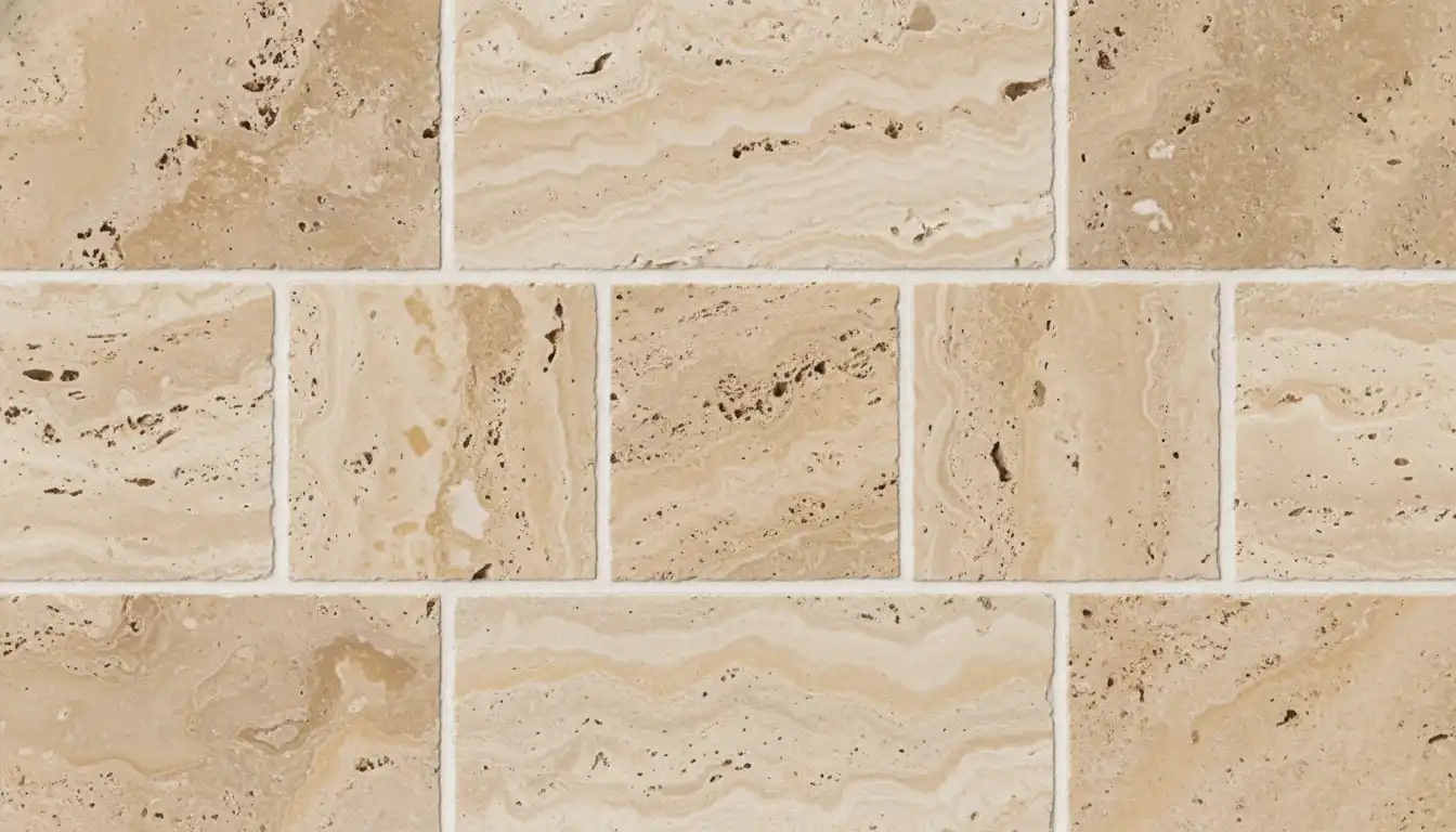
Unlike uniform ceramic or porcelain tiles, travertine is a natural product with inherent variations, pits, and textures. Each tile is unique. The grout you choose doesn’t just fill the gaps; it becomes an integral part of the overall visual tapestry, either harmonizing with the stone or fighting against it.
The right choice will make your floor or wall feel like a seamless, monolithic slab of luxurious stone. The wrong choice will draw the eye to the grout lines themselves, breaking up the flow and detracting from the travertine’s organic beauty. Getting this decision right is fundamental to protecting your investment.
The Core Decision: To Blend or To Contrast?
Fundamentally, there are two main strategies when selecting a grout color: blending or contrasting. Each approach creates a dramatically different final look, and the right choice depends on your design goals for the space.
A blended approach aims to make the grout lines disappear, creating a continuous and unified surface. A contrasting approach, on the other hand, uses grout to frame each tile, turning the layout and pattern into a prominent design feature.
The Blended Approach: Creating a Seamless Stone Surface
For a blended look, you should select a grout color that closely matches the main or dominant color of your travertine tiles. This is the most popular and often safest choice for travertine. It creates a sophisticated, cohesive finish that makes spaces feel larger and more serene.
This method is excellent for highlighting the natural beauty and movement within the stone itself, rather than the pattern of the tile installation. It’s forgiving of slight imperfections in grout line width and is ideal for creating a timeless, classic look.
The Contrasting Approach: Making Your Tiles Pop
A contrasting grout is intentionally chosen to be either significantly lighter or darker than the tile. This technique accentuates the shape of each tile and the geometric pattern of the layout (like a herringbone or brick pattern). While it can be a bold and stylish choice, it comes with risks.
Contrasting grout lines demand perfection in tile layout and spacing, as any inconsistency will be immediately obvious. This approach can sometimes make a space feel smaller and can look dated if the contrast is too harsh. A dark grout with light travertine, for instance, can create a “checkerboard” effect that feels busy and distracting.
| Grout Strategy | Best For | Pros | Cons |
|---|---|---|---|
| Blending (Matching) | Creating a spacious, monolithic look; highlighting the stone’s natural beauty. | Makes rooms feel larger; hides minor imperfections; timeless and elegant. | Can lack visual punch if the tile has very little variation. |
| Contrasting | Emphasizing a specific tile pattern (e.g., herringbone, hexagon); creating a graphic, bold statement. | Highlights the geometry of the tiles; adds strong visual interest. | Can make spaces feel smaller; unforgiving of installation errors; can look dated if not done well. |
| Neutral Middle-Ground | A safe choice that offers subtle definition without overwhelming the tile. | Provides gentle definition; maintains a cohesive feel; balances contrast and blending. | May not be bold enough for those wanting a strong design statement. |
Beyond Light vs. Dark: The Undertone Secret No One Talks About
Here is the most critical piece of advice for selecting travertine grout color: you must match the undertones. Travertine is never just one flat color. It is a complex stone with subtle, underlying hues that give it depth and character. The failure to recognize and match these undertones is the number one reason for a disappointing grout choice.
Your travertine might be “beige,” but does it have hints of pink, yellow, or grey? Pairing a travertine with pink undertones with a grout that has yellow undertones will always look subtly “wrong,” even if they are both technically “beige.” This color clash is what creates a cheap or artificial look.
How to Identify Your Travertine’s True Undertone
To find the true undertone of your tile, you need to observe it carefully. Gather several tiles from your batch, as the color can vary from piece to piece. Take them into the room where they will be installed and look at them in different lighting conditions—natural daylight, morning light, and artificial evening light.
Place the tiles against a pure white object, like a piece of paper or a primed board. This will help your eyes perceive the subtle base colors more clearly. Look for the consistent, subtle shade in the background of the stone, not just the darkest or lightest veins. Is it a creamy yellow, a soft rose, a silvery gray, or a neutral tan?
Choosing the Perfect Grout: A Step-by-Step Practical Guide
Once you understand the importance of undertones and have decided between blending and contrasting, it’s time to make your final selection. Follow these practical steps to ensure a perfect result.
Step 1: Gather Physical Samples. Never, ever choose a grout color from a computer screen or a printed chart. Go to a tile store and get physical grout sample sticks. Bring them home and place them directly in the gaps between your tiles.
Step 2: Test on Scrap Tiles. The single most effective way to be certain is to do a test run. Take a few spare travertine tiles, mount them to a piece of plywood or cardboard, and apply your top two or three grout color choices. Let the grout dry for at least 24 hours, as the color can change significantly as it cures.
Step 3: Consider the Finish. The finish of your travertine—whether it’s honed (matte), polished (shiny), or tumbled (rustic)—affects how light reflects off the surface, which in turn influences how the grout color appears. Tumbled travertine, with its rougher edges, typically has wider grout lines, making the grout color an even more prominent feature.
Step 4: Think About Maintenance. Practicality matters. A very light grout in a high-traffic area like a kitchen or entryway will show dirt more readily. A mid-tone grout that matches a secondary color in the travertine is often the most forgiving choice for busy households.
A Note on Grout Type: Sanded vs. Unsanded
The type of grout is just as important as the color. For travertine, which typically has grout lines of 1/8 inch or wider, sanded grout is the standard choice. The sand provides strength and prevents cracking in wider joints. Unsanded grout is only appropriate for very narrow grout lines (less than 1/8 inch), which are less common with natural stone installations.
The principles of choosing the right grout width are universal for most tile projects. While travertine allows for some flexibility, understanding the perfect grout line size for your specific tile and location is key to a professional finish.
Common Travertine Grout Color Mistakes to Avoid at All Costs
To ensure success, be aware of these common pitfalls that can ruin an otherwise beautiful travertine installation.
Mistake #1: Ignoring Undertones. This is the most critical error. A perfect shade match with the wrong undertone will always feel dissonant and cheapen the look of the natural stone.
Mistake #2: Choosing Stark White. Pure white grout almost never works with travertine. It is too harsh and clinical, creating a stark contrast that looks artificial against the soft, earthy tones of the stone. Always opt for off-whites, creams, ivories, or light beiges instead.
Mistake #3: Going Too Dark Unnecessarily. A very dark grout can look fantastic in specific, modern designs, but it can easily overwhelm travertine. It can also fill the natural pits and voids in unfilled travertine, making the surface look speckled and dirty. A dark grout can also sometimes cause issues where the color leaches, a problem homeowners sometimes face as grout bleeding when wet, creating discoloration.
Mistake #4: Forgetting About Lighting. A color that looks perfect under the fluorescent lights of a showroom can look completely different in the warm, natural light of your living room. Always make your final decision in the space where the tile will be installed.
What About a Groutless Look?
Some homeowners are drawn to the idea of a groutless installation for a completely seamless appearance. However, for interior applications like floors and showers, this is not recommended. Grout provides essential spacing for tile expansion and contraction and prevents water and debris from getting between the tiles.
The closest you can get to this aesthetic is to use a very thin grout line with a grout color that is a perfect match for the tile’s dominant tone. This approach is different from a true dry stack tile finish, which is a specific technique used for certain wall veneers and is not suitable for most travertine applications.
Final Verdict: Your Checklist for Travertine Grout Success
Choosing the right travertine grout color doesn’t have to be a guessing game. By following a methodical process, you can select a color that elevates your stone and creates a truly luxurious finish. Keep this final checklist in mind for a flawless result.
- Identify the Undertones: Determine if your travertine leans pink, yellow, grey, or neutral. This is your primary guide.
- Decide: Blend or Contrast? For a timeless look, choose a blended approach. For a bold, graphic statement, consider a subtle contrast.
- Get Physical Samples: Never choose from a screen. Bring grout sample sticks home to test in your space.
- Create a Test Board: Grout a few spare tiles and let them dry completely to see the true, final color.
- Consider Lighting and Maintenance: Make your final choice based on your room’s specific lighting and how much foot traffic the area will receive.
- When in Doubt, Go Neutral: The safest, most classic choice is a neutral beige or cream that matches the mid-tone of your travertine. It is a choice that will never go out of style.
By focusing on harmony and undertones rather than just light versus dark, you will ensure that your grout enhances, rather than detracts from, the inherent beauty of your travertine tile.