Shiitake vs Accessible Beige: The Paint Mistake You Can’t Afford to Make
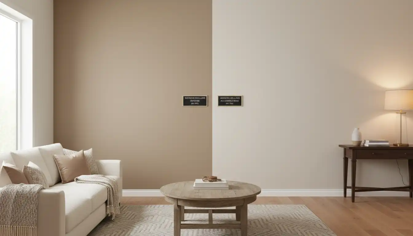
Choosing the perfect neutral paint color feels like it should be simple. You want something warm, inviting, and versatile. Yet, you find yourself frozen in the paint aisle, staring at two chips that look almost identical: Sherwin Williams Shiitake (SW 9173) and Accessible Beige (SW 7036). This indecision is a common roadblock for homeowners, leading to costly repaints and frustrating design clashes.
The core of the problem lies in the subtle but critical differences in their undertones and how they react to light. One wrong choice can leave a room feeling flat, dated, or clashing with your existing decor. This guide will dissect these two popular colors, revealing the hidden nuances that will empower you to make a confident and correct decision for your home.
You'll Learn About
Unmasking the Undertones: The Secret Divide
The primary distinction between Shiitake and Accessible Beige lies in their undertones, the subtle hints of color that emerge under different lighting conditions. Understanding these is the key to avoiding a design disaster.
Shiitake is a warm, earthy neutral that leans into its beige and taupe roots. However, it carries a complex blend of undertones, often described as having hints of green, red, and even a subtle pink in certain lights. This complexity gives it a rich, grounded feel, almost like a mushroom cap, making it a sophisticated choice for creating a cozy atmosphere.
Accessible Beige, on the other hand, is a true “greige,” a balanced mix of beige and gray. Its dominant undertone is gray, which cuts the potential for it to look too yellow or dated, a common pitfall of older beiges. While it has warmth, the gray undertone gives it a more modern and airy feel compared to the earthier Shiitake.
A Deeper Dive into Sherwin Williams Shiitake (SW 9173)
Shiitake is a color that exudes warmth and comfort. It’s a mid-toned neutral that feels substantial without being dark. Think of it as a color that can ground a space, providing a solid and elegant backdrop for your furnishings.
With a Light Reflectance Value (LRV) of 51, Shiitake sits right in the middle of the scale, absorbing and reflecting an almost equal amount of light. This makes it a fantastic choice for rooms where you want to create a cozy, enveloping feel, such as bedrooms, dens, or formal living rooms. The complex undertones in Shiitake pair beautifully with natural materials like wood, stone, and linen.
Where Shiitake Truly Shines
Shiitake performs best in spaces that benefit from its inherent warmth. It is an excellent choice for creating an inviting entryway or a relaxing bedroom retreat. In a dining room, it can set a sophisticated and intimate mood. It’s also a strong contender for kitchen cabinets, especially when paired with a creamy white or a contrasting dark countertop.
Because of its earthy nature, it harmonizes well with homes that feature traditional or transitional decor. If your home has warm wood floors or cabinetry, Shiitake will likely complement them beautifully. Pairing it with a crisp white trim will make its warm, rich character stand out even more.
The Versatility of Accessible Beige (SW 7036)
Accessible Beige is one of Sherwin Williams’ most popular and versatile neutral colors for a reason. Its balance of beige and gray makes it a chameleon that can adapt to a wide range of styles and lighting conditions. For those who are nervous about beige looking too yellow, this is often the perfect solution.
Its LRV of 58 means it is slightly lighter and reflects more light than Shiitake. This makes it a great option for brightening up spaces without resorting to a stark white. The gray undertone keeps it feeling fresh and modern, preventing the “builder-grade beige” look of the past. If you’re looking for a color that can transition seamlessly through an entire house, Accessible Beige is a fantastic whole-home color.
Ideal Spaces for Accessible Beige
The adaptable nature of Accessible Beige makes it suitable for almost any room. It excels in open-concept living areas where you need a color that can flow from the living room to the kitchen and dining space. In rooms with less natural light, its higher LRV can help the space feel brighter and more open.
This color is a safe bet for hallways, bathrooms, and even basements. It pairs well with a variety of finishes, from dark hardwood to light tile. Because of its neutrality, it provides a flexible backdrop that allows your furniture, artwork, and accessories to take center stage. For those seeking quality paint, it’s worth noting the performance differences between brands like Farrell Calhoun vs Sherwin Williams when choosing a finish.
Shiitake vs Accessible Beige: A Side-by-Side Comparison
To truly understand the differences, a direct comparison is essential. Seeing the numbers can help clarify how these colors will behave in your home.
| Feature | Sherwin Williams Shiitake (SW 9173) | Sherwin Williams Accessible Beige (SW 7036) |
|---|---|---|
| Light Reflectance Value (LRV) | 51 | 58 |
| Primary Undertones | Warm Beige, Taupe, Green/Red | Warm Gray, Subtle Green |
| Color Family | Beige / Taupe | Greige / Beige |
| HEX Code | #C8BCAB | #D1C7B8 |
| RGB Values | R: 200, G: 188, B: 171 | R: 209, G: 199, B: 184 |
The Impact of Light and Fixed Elements
Paint color is never just about the paint; it’s about how that paint interacts with its environment. The amount and type of light a room receives will dramatically alter how both Shiitake and Accessible Beige appear.
In a north-facing room, the light is cooler and more indirect. This cool light can amplify the gray in Accessible Beige, making it look more like a true greige. For Shiitake, the cool light can sometimes bring out its subtle green undertones, which is a critical factor to test for. Both colors can work beautifully in north-facing rooms to add warmth.
In a south-facing room with abundant, warm light, both colors will appear warmer and lighter. Accessible Beige may wash out and look more like a soft off-white, while Shiitake’s warmth will be enhanced, making it feel very cozy and inviting. The key is to sample the color on the wall and observe it at different times of the day.
The Coordination Catastrophe: Beyond the Wall Color
One of the most significant yet overlooked aspects of choosing a neutral is how it coordinates with the fixed elements in your home. This includes flooring, countertops, kitchen backsplashes, and even large pieces of furniture. This is where a subtle undertone clash can create a major design headache.
Shiitake’s earthy, complex undertones make it a natural partner for materials like travertine, slate, and warm-toned granites. It also works beautifully alongside medium to dark wood tones, like oak or walnut. If your home features brick elements, such as a fireplace or an exterior wall, Shiitake’s warmth can be a stunning complement. This is an important consideration, just as choosing the right paint for an outdoor feature like a brick retaining wall is crucial.
Accessible Beige’s greige profile gives it incredible flexibility. It can bridge the gap between warm wood tones and cooler elements like Carrara marble or gray-veined quartz countertops. If your flooring has a mix of warm and cool tones, Accessible Beige is often the safer choice to tie everything together without clashing.
The Final Verdict: Making the Right Choice for Your Home
The choice between Sherwin Williams Shiitake and Accessible Beige is not about which color is better, but which color is right for your specific space, lighting, and existing decor. By carefully considering the nuances, you can make a choice that enhances your home’s beauty and avoids a costly mistake.
Choose Sherwin Williams Shiitake If:
- You want to create a cozy, grounded, and enveloping atmosphere.
- Your home has warm-toned fixed elements like wood, travertine, or brick.
- The room receives ample natural light that can handle a color with a mid-range LRV.
- You appreciate a complex neutral with sophisticated, earthy undertones.
Choose Sherwin Williams Accessible Beige If:
- You need a versatile, go-with-anything neutral for an open-concept space or a whole-home color palette.
- Your decor includes a mix of warm and cool tones that need to be unified.
- The room could benefit from a lighter color to maximize brightness.
- You want a modern neutral that avoids looking too yellow or too sterile.
Ultimately, the most critical step is to sample, sample, sample. Paint large swatches on different walls in the room and observe them throughout the day and night. Only then can you be truly confident that you’ve found the perfect neutral that will transform your house into a home.