Sedate Gray vs Agreeable Gray: Don’t Dare to Paint Until You Read This
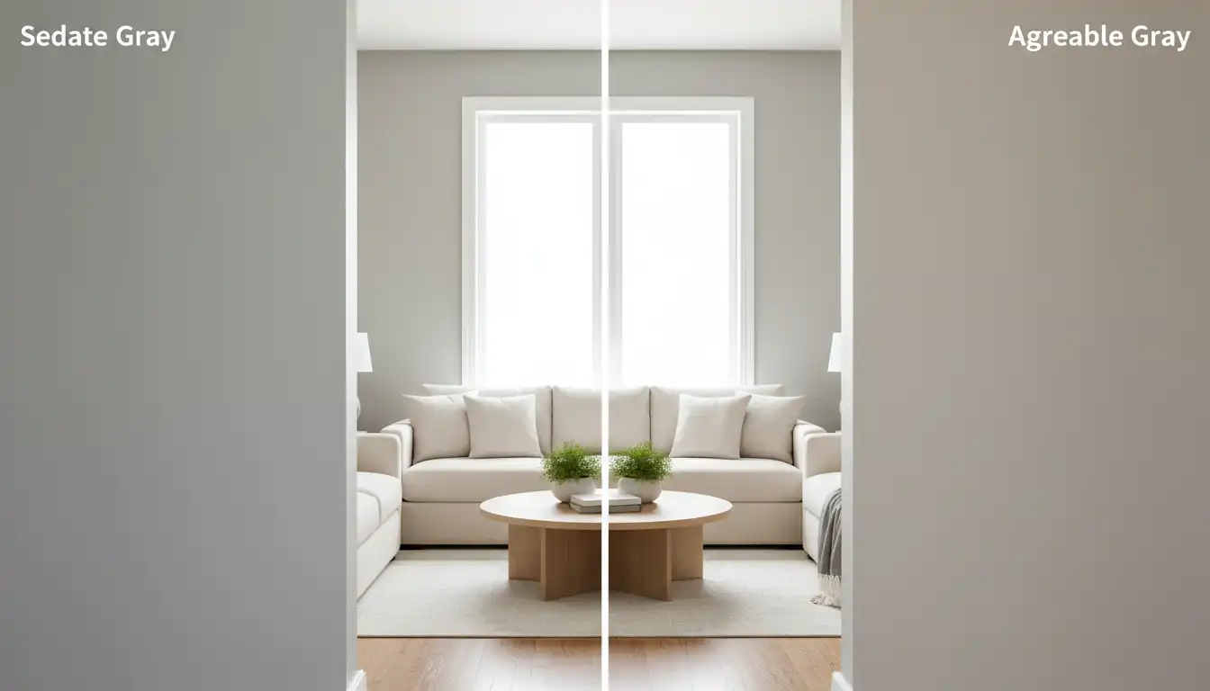
Choosing between these two Sherwin-Williams favorites depends on whether you want a modern greige or a tranquil, organic neutral. Agreeable Gray (SW 7029) is a versatile “greige” with a warm beige undertone, making it a safe, clean choice for any room.
Sedate Gray (SW 6169) has a similar brightness but features soft green and khaki undertones. This gives it a more “earthy” and restful vibe compared to the pure neutrality of Agreeable. Choose Agreeable for a seamless, bright backdrop, or Sedate for a cozy, nature-inspired feel that pairs beautifully with wood tones.
Quick Comparison
| Feature | Agreeable Gray | Sedate Gray |
| Undertone | Beige / Greige | Green / Khaki |
| LRV (Brightness) | 60 | 61 |
| Best Vibe | Modern & Versatile | Restful & Earthy |
You'll Learn About
The Ultimate Paint Dilemma: Choosing the Perfect Gray for Your Home
Picking the right gray paint feels like it should be simple. Yet, you stand in the paint aisle, surrounded by hundreds of swatches that all look the same but somehow completely different. Two names constantly surface in this sea of gray: Sherwin-Williams Sedate Gray and Sherwin-Williams Agreeable Gray. You’ve heard they are top contenders, but this decision is paralyzing.
The core problem isn’t just about picking a color; it’s about avoiding a costly mistake. You’re worried the color will look completely different on your wall than it does on the tiny paper swatch. Will it clash with your floors? Will it make your room feel cold and sterile, or will it create the warm, inviting sanctuary you envision? This guide will solve that dilemma for you.
Undertones: The Hidden Code That Changes Everything
The secret to understanding any paint color, especially grays, lies in its undertones. These are the subtle hints of other colors that come alive in different lighting conditions. This is where Sedate Gray and Agreeable Gray diverge significantly, making them suitable for very different spaces and aesthetics.
Agreeable Gray (SW 7029): The Chameleon Greige
There’s a reason Agreeable Gray is one of the most popular paint colors of all time. It is a “greige,” a perfect balance between gray and beige. This gives it a warmth that many other grays lack. Its primary undertone is beige/taupe, but it has a softness that prevents it from looking muddy or dated.
Because of this warmth, Agreeable Gray is incredibly versatile. It can adapt to its surroundings, looking slightly warmer or cooler depending on the light and the decor you pair it with. This adaptability makes it a safe, yet beautiful, choice for large, open-concept spaces.
Sedate Gray (SW 6169): The Cool, Calming Green-Gray
Sedate Gray is a more complex and nuanced color. As its name implies, it creates a more serene and, well, sedate atmosphere. Its dominant undertone is green, but it can also flash hints of blue or even a subtle beige in certain lighting, which can surprise homeowners.
This green undertone gives it an earthy, organic feel. It is a fantastic choice for creating a tranquil retreat, such as a bedroom, bathroom, or home office. However, its coolness requires more careful consideration of your home’s existing finishes and lighting.
LRV: The Science of Light and Color
Light Reflectance Value, or LRV, is a scale from 0 (absolute black) to 100 (pure white). It measures how much light a paint color reflects. Understanding LRV is crucial for predicting how bright or dark a color will feel in your room.
Agreeable Gray has an LRV of 60, while Sedate Gray has an LRV of 61. On paper, this is a negligible difference. They both sit in a sweet spot, reflecting a good amount of light without washing out or feeling stark. However, the *type* of light they reflect is dictated by their undertones, which is why they feel so different in a space.
Head-to-Head: A Direct Comparison
Choosing between two fantastic neutrals requires a clear breakdown of their characteristics. Seeing their key attributes side-by-side can quickly illuminate which color is the right fit for your specific project and design goals.
This table offers a snapshot of their core differences, helping you align their features with the needs of your space, from the overall mood you want to create to the specific decor elements you plan to incorporate.
| Feature | Agreeable Gray (SW 7029) | Sedate Gray (SW 6169) |
|---|---|---|
| Color Family | Greige (Gray + Beige) | Green-Gray |
| Primary Undertone | Beige / Taupe | Green / Blue |
| LRV (Light Reflectance Value) | 60 | 61 |
| Feels Like… | Warm, Inviting, Versatile | Calm, Serene, Earthy |
| Best For… | Living rooms, open-concept spaces, hallways | Bedrooms, bathrooms, offices, laundry rooms |
| Pairs Well With… | Warm whites, wood tones, both warm and cool decor | Creamy whites, dark woods, brass and gold metals |
The Most Critical Factor: Your Home’s Lighting
You can analyze undertones and LRV all day, but nothing impacts paint color more than your home’s unique lighting. The direction your windows face will drastically alter how both Agreeable Gray and Sedate Gray appear on your walls. Always test paint samples in your own home before committing.
North-Facing Rooms
North-facing light is cool and indirect. This blue-toned light will wash out warmth and enhance cool undertones. In this light, Agreeable Gray will look like a more true, neutral gray, losing much of its beige softness. Sedate Gray’s green and blue undertones will be strongly amplified, making it feel much cooler and more pronounced.
South-Facing Rooms
South-facing rooms are a decorator’s dream, filled with warm, bright light throughout the day. This golden light enhances warm tones. Here, Agreeable Gray will appear at its warmest, leaning more into its greige and beige character. Sedate Gray will soften beautifully, with its green undertones looking more earthy and less stark.
East and West-Facing Rooms
These rooms are transformative. East-facing rooms get bright, warm light in the morning and cooler light in the afternoon. The opposite is true for west-facing rooms. You must observe the paint samples at all times of the day to see how the color shifts and ensure you love it in both its warm and cool states.
Building a Cohesive Palette Around Your Choice
Your wall color is the foundation, but the room only comes together when you coordinate it with trim, furniture, and decor. Each of these grays provides a different canvas to build upon.
Decorating with Agreeable Gray
The universal appeal of Agreeable Gray makes it incredibly easy to decorate with. It shines in modern farmhouse, transitional, and contemporary designs. For trim, a clean white like Sherwin-Williams Pure White creates a crisp, classic look. It pairs beautifully with both light and dark wood floors.
When it comes to hardware, Agreeable Gray is a flexible backdrop. Brushed nickel or chrome hardware can pull out its cooler gray side, while aged brass or matte black provides a warm contrast. When selecting door hardware, comparing options like the sleek lines of the Schlage Solstice vs Latitude can make a surprising impact on the room’s modern feel.
Decorating with Sedate Gray
Sedate Gray calls for a more deliberate design approach. It excels at creating a spa-like, organic modern, or moody traditional aesthetic. Pair it with a creamy, off-white trim like Sherwin-Williams Alabaster to avoid a look that is too stark and cold. This combination enhances the color’s inherent softness.
This color is stunning with natural materials. Think about walnut wood tones, jute rugs, linen curtains, and lots of live plants. The goal is to lean into its earthy quality. When designing the connection between your indoor and outdoor spaces, a wall of Sedate Gray can beautifully complement lush exterior plantings, such as when deciding between privacy trees like Nigra Arborvitae vs Green Giant, creating a seamless flow from home to garden.
A Deeper Consideration: Wellness and Your Home Environment
Choosing a paint color goes beyond aesthetics; it affects the psychological feel and health of your home. The color you choose can influence your mood, and the paint itself can impact your indoor air quality. This holistic view is essential for creating a true sanctuary.
The very name “Sedate Gray” points to its ability to calm the mind. In an increasingly overstimulated world, creating a bedroom or workspace that promotes tranquility can have tangible benefits for your well-being. This is where color psychology becomes a powerful design tool.
Furthermore, as you meticulously plan your wall color, it’s wise to consider your entire home’s environment. Opting for low-VOC or zero-VOC paints is a critical step in maintaining healthy indoor air. This conscious choice pairs well with considering other non-toxic materials, because after all, you might be asking yourself is Pergo laminate flooring toxic as you create a healthier living space from the ground up.
Final Verdict: Which Gray Is Right for You?
There is no single “better” color between Sedate Gray and Agreeable Gray. The right choice is entirely dependent on your home’s unique features and your personal goals for the space.
Choose Agreeable Gray if: You need a versatile, warm, and inviting neutral that works almost anywhere. It’s a fantastic choice for open-concept homes, transitional styles, and anyone looking for a beautiful, failsafe color that will stand the test of time.
Choose Sedate Gray if: You want to create a calm, serene, and earthy retreat. It’s perfect for bedrooms, bathrooms, and offices where a peaceful atmosphere is the priority. You must be prepared to embrace its strong green undertones, which will vary significantly with your lighting.
The ultimate advice is simple: sample, sample, sample. Paint large swatches on poster boards and move them around the room at different times of day. See how they look next to your sofa, your kitchen cabinets, and your flooring. Only then can you move forward with confidence, knowing you’ve made the perfect choice for your home.