Revere Pewter vs Worldly Gray: The Ultimate Greige Showdown
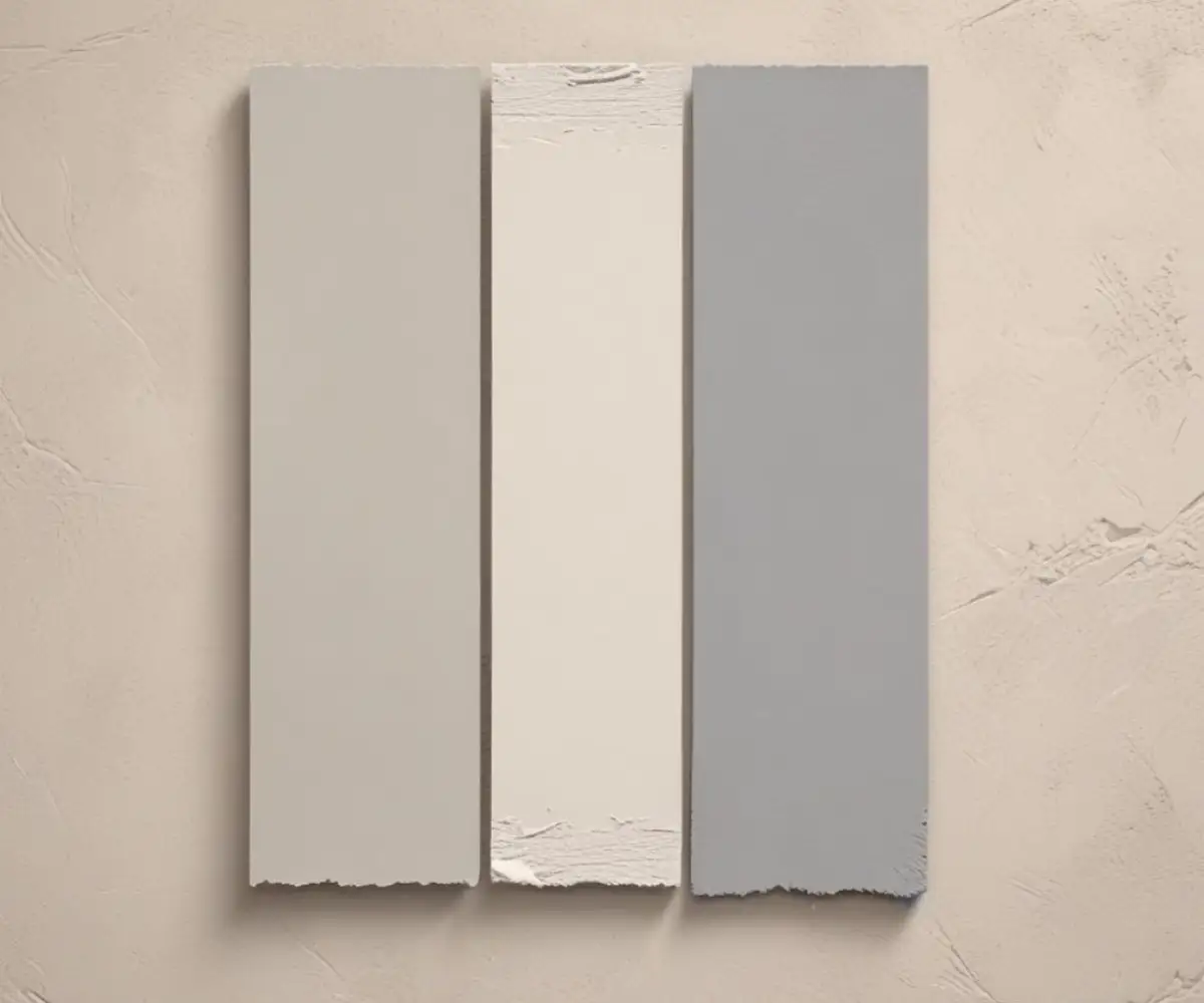
Choosing the perfect neutral paint color is a notoriously difficult decision. You stand in front of a wall of seemingly identical swatches, each promising to be the ideal backdrop for your home. Two of the most celebrated contenders in the world of greige are Benjamin Moore’s Revere Pewter and Sherwin-Williams’ Worldly Gray.
At first glance, they appear almost interchangeable. Both are sophisticated, warm, gray-beige hybrids that promise versatility. However, this similarity is deceptive, and choosing the wrong one can dramatically alter the mood and feel of your space, leaving you with a costly and time-consuming repaint.
You'll Learn About
The Greige Dilemma: Why Are These Colors So Popular (and Tricky)?
Greige—a fusion of gray and beige—has dominated interior design for its ability to provide the crispness of gray with the warmth of beige. It’s a color that feels both modern and timeless, creating a sophisticated canvas for almost any decor style. The challenge, however, lies in their undertones.
These hidden colors can emerge under different lighting conditions, clashing with your flooring, furniture, or countertops. What looked like a perfect warm gray on a tiny paint chip can suddenly appear strangely green or unexpectedly purple on your walls, creating a sense of discord in your carefully planned design.
Deep Dive: Benjamin Moore Revere Pewter (HC-172)
Revere Pewter is arguably one of the most iconic and popular greige paint colors of all time. It’s often lauded as the “perfect” whole-house neutral for its ability to adapt to various settings. It’s a light-medium warm gray that feels balanced and earthy.
The defining characteristic of Revere Pewter is its subtle green undertone. In most lighting, this undertone gives the color a natural, grounded feeling. However, in certain conditions, particularly in north-facing rooms with cool light or when placed next to finishes with pink or red tones, this green can become more pronounced than desired.
Understanding LRV
Revere Pewter has a Light Reflectance Value (LRV) of approximately 55. The LRV scale runs from 0 (pure black) to 100 (pure white), indicating how much light a color reflects. At 55, Revere Pewter sits in the mid-range, meaning it has enough depth to not wash out in brightly lit rooms but is light enough to not feel heavy in smaller spaces.
Unpacking Sherwin-Williams Worldly Gray (SW 7043)
Worldly Gray is Sherwin-Williams’ answer to the demand for a perfect, versatile greige. It’s also a warm, mid-toned gray-beige that creates a cozy and inviting atmosphere. Many designers consider it a very close alternative to Revere Pewter, but with key distinctions.
Worldly Gray tends to lean slightly warmer and can present different undertones. While it can also show a hint of green, it’s more often noted for having a soft violet or taupe undertone. This subtle purple hint can make it feel a touch cozier and can be more forgiving next to certain wood tones and stone finishes.
Comparing LRV
The LRV of Worldly Gray is 57, making it just a fraction lighter than Revere Pewter. This slight difference in brightness means it will reflect a tiny bit more light, which could be a deciding factor in a room with limited natural light. While the numerical difference is small, it can be perceptible on a large wall.
The Ultimate Showdown: Revere Pewter vs Worldly Gray Head-to-Head
To truly understand the nuances between these two colors, a direct comparison is essential. This table breaks down their key attributes, helping you see where they align and where they diverge.
| Feature | Benjamin Moore Revere Pewter (HC-172) | Sherwin-Williams Worldly Gray (SW 7043) |
|---|---|---|
| LRV | ~55 | 57 |
| Overall Temperature | Warm | Warm (often appears slightly warmer) |
| Primary Undertone | Earthy Beige/Gray | Taupe/Beige |
| Potential “Tricky” Undertone | Green | Subtle Violet or Green |
| Feels In a Room | Balanced, earthy, classic | Cozy, soft, inviting |
| Best For… | Open-concept spaces, well-lit rooms, transitional decor | Bedrooms, north-facing rooms, spaces needing extra warmth |
Undertones: The Hidden Factor That Changes Everything
The most critical factor in your decision will be the undertones. Revere Pewter’s green can be a beautiful, earthy element, but if your home has pink-beige carpets or tiles from the 90s, it might create an undesirable clash. Conversely, Worldly Gray’s subtle violet undertone can be a dealbreaker if you have a lot of yellow-toned wood, as yellow and purple are opposites on the color wheel and can intensify each other.
It’s also important to recognize that paint formulas can have slight variations between batches. This is why you must always test a sample from the current batch you intend to buy. A sample pot mixed a year ago may not be a perfect match for the gallon you purchase today, and those minute differences can impact how undertones appear on your wall.
The Impact of Light: North vs. South Facing Rooms
The direction of your windows will fundamentally change how these colors look in your home. Understanding this interaction is key to avoiding a paint color mistake.
In north-facing rooms, which receive cooler, indirect blue-toned light, Revere Pewter’s green undertone can become more apparent, and the color may look grayer and flatter. Worldly Gray, with its slightly higher warmth and taupe/violet undertone, often performs better in these conditions, retaining its cozy feel and balancing the cool light.
In south-facing rooms, which are bathed in warm, yellow-toned light all day, both colors will appear much warmer and more beige. Revere Pewter will look its best here, appearing as a soft, luminous greige. Worldly Gray will also look beautiful but may lean more strongly into its beige side, appearing almost like a light taupe.
How to Choose the Right Greige for YOUR Home
You can’t choose a paint color based on photos online. The only way to know for sure is to test it in your own space, with your unique lighting and furnishings. Follow these professional steps for a foolproof decision.
Step 1: Get Large Samples. Do not rely on small paint chips. Purchase sample pots and paint large sections on poster boards or use peel-and-stick samples. This allows you to move the color around the room without marking up your walls.
Step 2: Test in Multiple Locations. Place your large samples on different walls within the same room. A color will look dramatically different on a wall that gets direct sunlight versus one that is always in shadow. For more insight into professional techniques, understanding whether to edge or roll first can improve your sampling and final paint job.
Step 3: Observe at All Times of Day. Look at the samples in the morning, at midday, and at night with your artificial lights on. The color’s undertones can shift dramatically as the light changes.
Step 4: Consider Your Fixed Elements. This is the most important step. Place your samples directly next to your kitchen cabinets, backsplash, flooring, fireplace surround, and large pieces of furniture. This is where undertone clashes become most obvious.
Coordinating Colors and Trim: What Pairs Best?
Both Revere Pewter and Worldly Gray are versatile neutrals that pair well with a wide range of colors. The key is to choose a trim color that complements their warmth.
For trim, avoid stark, cool whites. Instead, opt for a soft, clean white or a creamy off-white. For Revere Pewter, popular choices include Benjamin Moore White Dove or Chantilly Lace. For Worldly Gray, Sherwin-Williams Pure White or Alabaster create a beautiful, harmonious look. The quality of your paint also matters, which you can learn more about in comparisons like Showcase vs Emerald for Sherwin-Williams paints.
As for accent colors, Revere Pewter pairs beautifully with deep blues (like Hale Navy), sage greens, and darker charcoals. Worldly Gray looks stunning with rich browns, olive greens, and muted, dusty blues.
The Final Verdict: Which Greige Reigns Supreme?
There is no universal winner in the battle between Revere Pewter and Worldly Gray. The superior color is entirely dependent on your home’s specific conditions.
Choose Benjamin Moore Revere Pewter if: You have a space with balanced, warm light (like a south-facing room) and want a classic, earthy greige. It excels in open-concept areas where its adaptability can shine, and its green undertone won’t clash with your existing finishes.
Choose Sherwin-Williams Worldly Gray if: You need to add warmth to a space, particularly a room with cool, northern light. Its subtle taupe/violet undertones create a cozy, inviting feel, making it an excellent choice for bedrooms and living areas where comfort is a priority.
Ultimately, the power to choose correctly lies in thorough testing. By observing these colors in your own home, next to your own things, you can move beyond the screen and make a confident choice that will serve as the perfect backdrop for your life for years to come.