Platinum vs Delorean Gray Grout: The #1 Mistake to Avoid
You’ve spent weeks, maybe even months, picking the perfect tile. You’ve pictured it in your space, imagining the finished look. But now you’re stopped cold by a seemingly small detail that holds immense power: the grout color.
For many homeowners, the choice between two popular shades like Platinum gray and Delorean gray becomes a point of analysis paralysis. They look similar on the swatch, but the wrong choice can undermine your entire design, making your beautiful new tile look lackluster, dated, or just plain wrong.
This decision is far more than picking a light or medium gray. It’s about defining lines, creating a mood, and ensuring your investment looks stunning for years to come. Making the wrong call isn’t just a cosmetic issue; it’s a costly and frustrating mistake to fix.
You'll Learn About
Why Your Grout Color Is More Critical Than You Think
Grout is not just the filler between your tiles; it’s a fundamental design element that dictates the final aesthetic. It can either create a seamless, monolithic surface or a bold, graphic pattern. The color you choose fundamentally alters the perception of your tile. A high-contrast grout makes each tile shape pop, while a low-contrast grout blends in for a more subtle, cohesive look.
The core of the problem lies in the subtle but powerful impact of undertones. Just like with paint, grout colors have hidden cool, warm, or neutral hues that can clash with your tile, countertops, or cabinet colors if not chosen carefully. This is the hidden trap that many fall into, resulting in a finished project that feels slightly “off” without them knowing why.
Furthermore, the lighting in your room plays a dramatic role. The cool, blueish light of a north-facing window will interact with grout color very differently than the warm, yellow tones of incandescent bulbs in the evening. A color that looks like the perfect neutral gray in the store can suddenly appear blue, brown, or even purplish once installed in your home.
Deep Dive: Polyblend’s Platinum Grout
Platinum (often #115) is a very light, soft gray. Think of it as a pale silver or a whisper of gray. It’s a popular choice for homeowners who want a hint of definition without the starkness of a darker grout line.
Its primary characteristic is its subtlety. Platinum is excellent for creating a gentle separation between tiles, particularly white or light-colored ones. This allows the tile itself to remain the star of the show while still highlighting the pattern in a soft, understated way. It helps make a space feel bright, airy, and clean.
However, its light color is also its main challenge. Platinum is more susceptible to showing stains, especially in high-traffic areas like kitchen backsplashes or bathroom floors. While a good sealer is non-negotiable, you should anticipate more diligent cleaning to keep it looking pristine. This is a crucial consideration, similar to the challenges faced with keeping pure white grout clean on certain tiles, like in the case of marble tile with white grout where staining is a major concern.
When to Choose Platinum Grout:
- You want a soft, low-contrast look with white or light tiles.
- You are aiming for a bright, airy, and spacious feel.
- The tile is in a lower-traffic area or you are committed to regular cleaning.
- You want to gently highlight a tile pattern without it becoming a dominant feature.
Unpacking Delorean Gray Grout
Delorean Gray (often #165) is a confident, true medium gray. It sits comfortably in the middle of the gray spectrum, making it an incredibly versatile and popular choice. It provides a more noticeable contrast than Platinum without being as bold or dramatic as a dark charcoal.
This color is a workhorse in the design world. Delorean Gray is exceptionally effective at defining the shape and pattern of tiles. With classic white subway tiles, it creates that iconic, timeless grid look that is both modern and traditional. Its neutral undertones typically prevent it from clashing with other colors in the room, although lighting can sometimes pull out subtle variations.
One of its biggest advantages is practicality. As a medium gray, it is far more forgiving of daily dirt, splashes, and minor stains than a lighter shade like Platinum. This makes it a robust choice for busy kitchens, entryways, and family bathrooms where maintenance is a key concern.
When to Choose Delorean Gray Grout:
- You want to clearly define the tile pattern and make it a design feature.
- You are looking for a versatile, timeless gray that works with many tile colors.
- The tile is in a high-traffic or high-mess area, and you need a lower-maintenance option.
- You want to match the gray veining in marble or quartz tiles for a cohesive look.
The Side-by-Side Showdown: Platinum vs. Delorean Gray
Seeing the key attributes of each color next to each other clarifies the choice. While both are excellent neutral grays, they serve different design goals and practical needs. One creates a soft blend, while the other crafts sharp definition.
Choosing incorrectly between a blended look and a defined one is the most common misstep. Homeowners often pick the “safer” light option, not realizing their intricate tile pattern needed the contrast of a medium gray to truly shine. Conversely, others choose a medium gray hoping for subtlety, only to find the resulting grid pattern is too busy for their small space.
Below is a direct comparison to help guide your decision.
| Attribute | Platinum Gray | Delorean Gray |
|---|---|---|
| Color Family | Light Silver-Gray | True Medium Gray |
| Undertones | Generally cool to neutral | Neutral, can occasionally appear slightly warm |
| Visual Effect | Blends with light tiles for a soft, seamless look | Contrasts to define and highlight tile shapes |
| Best For | Creating an airy, spacious feel; subtle patterns | Showcasing geometric patterns; high-traffic areas |
| Dirt Visibility | Higher; shows stains and discoloration more easily | Lower; more forgiving of daily dirt and grime |
| Pairs Well With | Bright white, cool-toned marbles, light pastels | White, black, colored tiles, warm or cool marbles |
The Secret Factor No One Talks About: Color Consistency
Beyond undertones and lighting, there’s another critical factor that can sabotage your results: grout color inconsistency. Cement-based grouts are notorious for drying lighter than they appear on the packaging or when wet. This issue is a frequent complaint among DIYers and even some professionals.
Several variables cause this: using too much water during mixing or cleanup, variations in humidity, and the porosity of the tile itself. An overly wet sponge can literally pull the pigment out of the grout lines as you clean, leading to a blotchy, uneven finish. This is why a sample board is not just a suggestion—it’s your project’s insurance policy. Many users who pick Delorean Gray are shocked when it dries to a much lighter shade, sometimes looking closer to Platinum.
This variability highlights the importance of precise mixing and careful application. If you’re concerned about color accuracy, exploring premium grouts or additives might be a wise investment. Products designed for better performance can offer more reliable results, which begs the question for many homeowners: is Grout Maximizer worth it to ensure a stable, vibrant color?
Your Step-by-Step Guide to a Perfect Choice
Avoid the common pitfalls by following a structured decision-making process. This methodical approach removes guesswork and ensures the color you choose is the color you get.
Step 1: Analyze Your Tile and Space
Look closely at your tile. Does it have color variation or veining? For marble or marble-look tiles, a great strategy is to match the grout to the color of the primary vein. Delorean Gray often works beautifully for this. For a simple, solid-colored tile, your decision is about the overall effect. The choice between two whites, for instance, can drastically alter the final look, a principle that applies to grays as well. Considering how different shades interact is key, whether it’s snow white vs bright white grout or Platinum vs Delorean Gray.
Also, assess the room’s size and lighting. In a small bathroom, the strong grid pattern created by Delorean Gray might feel too busy. The softer lines of Platinum could help the space feel larger and more serene.
Step 2: Define Your Desired Effect
Be honest about the look you want to achieve. Are you aiming for a bold, graphic statement or a subtle, textured backdrop?
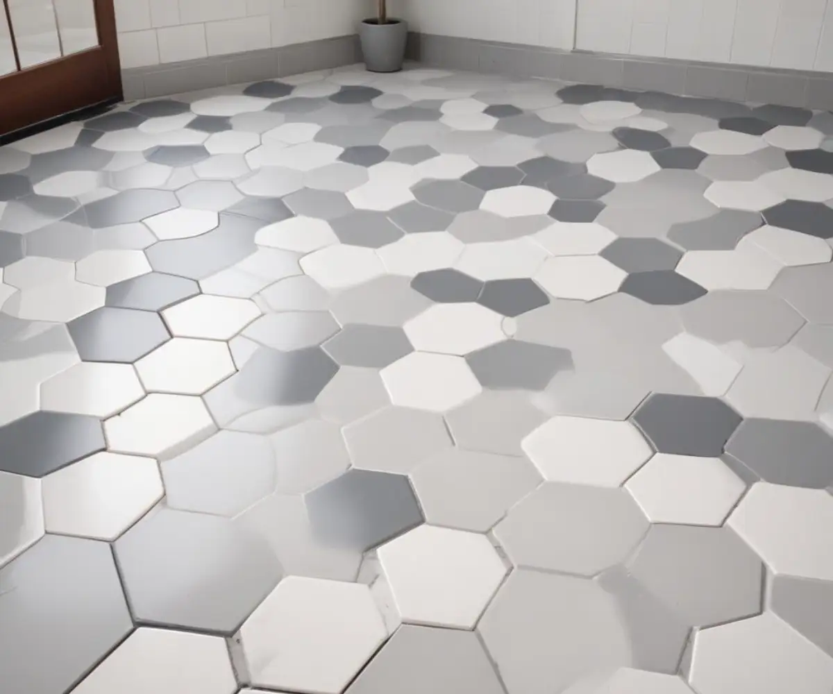
For a bold, defined look: Choose Delorean Gray. It will make each tile stand out, emphasizing the pattern you’ve chosen, whether it’s a herringbone, hexagon, or classic subway layout.
For a soft, blended look: Choose Platinum. It will minimize the appearance of grout lines, creating a more continuous and uniform surface that feels calm and expansive.
Step 3: The Unskippable Sample Test
Never, ever choose a grout color from a printed chart or a computer screen. The only way to know for sure is to test it in your space with your tile and your light. Purchase small quantities of both Platinum and Delorean Gray grout.
Create a sample board by mounting a few spare tiles onto a piece of cardboard or plywood. Grout one section with Platinum and the other with Delorean Gray, following the mixing and application instructions precisely. Let it cure completely for at least 72 hours to see the final, true dry color. Place this sample board in the room where the tile will be installed and observe it at different times of day—in the bright morning sun, in the afternoon shade, and under artificial light at night. This simple step will prevent a massive, costly mistake.
Common Mistakes That Lead to Grout Regret
Understanding the common errors can help you sidestep them and achieve a professional-looking result you’ll love for years.
Mistake #1: Ignoring the Room’s Overall Palette
The grout must work with more than just the tile. It needs to complement your cabinet color, countertop material, wall paint, and even your hardware finish. A cool-toned Platinum grout might clash in a room dominated by warm, creamy beige tones. Always hold your grout samples up to these other finishes to ensure a harmonious color story.
Mistake #2: Forgetting Long-Term Maintenance
It’s easy to fall in love with the delicate look of Platinum grout, but you must be realistic about its upkeep. In a busy kitchen where tomato sauce might splash or a bathroom floor that sees constant foot traffic, Delorean Gray is the more practical, stress-free choice. Choosing a grout that fits your lifestyle is just as important as choosing one that fits your aesthetic.
Mistake #3: Improper Mixing and Cleaning
As mentioned, using too much water is the fastest way to ruin your grout color. Follow the manufacturer’s instructions to the letter. Use a digital scale to measure your powder and water for a perfect ratio. When cleaning, use a barely damp sponge and rinse it frequently in clean water to avoid washing out the color pigment and causing efflorescence—a chalky white residue that can plague darker grouts.
The Final Verdict: Which Gray Grout is Right for You?
There is no universal “better” choice between Platinum and Delorean Gray. The right answer is entirely dependent on your specific project, your design goals, and your tolerance for maintenance.
Choose Platinum if your priority is a soft, subtle, and airy aesthetic where the tile pattern gently blends into the background. It is the perfect choice for creating a serene and spacious feel, provided you are prepared for the more demanding cleaning routine.
Choose Delorean Gray if you want a versatile, timeless look that clearly defines your tile pattern and stands up to the rigors of daily life. It is the practical and powerful choice for creating visual interest and ensuring your tile remains a focal point with less worry about stains and discoloration.
By understanding the nuances of these two fantastic colors, testing them in your own space, and considering the long-term realities of your home, you can move past the paralysis and make a confident decision that beautifully completes your tile project.