Paint Colors for Sterling Oak Floors? Unlock Your Home’s Wow Factor
Sterling oak flooring is a stunning choice for modern homes, offering a chic and versatile foundation. However, its beautiful gray tones can quickly become a design challenge. Many homeowners find themselves stuck, fearing that the wrong paint color will transform their dream space into a cold, sterile environment reminiscent of a hospital waiting room.
This common problem stems from the floor’s unique and often subtle undertones. Choosing a paint color without understanding these nuances can lead to a room that feels disjointed and unwelcoming. The solution lies in a strategic approach to color, one that respects the flooring’s character while infusing the space with warmth and personality.
You'll Learn About
Why Choosing a Paint Color for Sterling Oak is So Challenging
The core of the issue with sterling oak flooring lies in its complex color profile. It’s not just a flat gray; it’s a sophisticated blend of tones that can shift and change depending on various factors within a room. This complexity is what makes it beautiful, but also what makes paint selection a daunting task for many.
Failing to account for these characteristics is the primary reason homeowners end up with a room that feels “off” or emotionally cold. It’s a frustrating outcome after investing time and money into beautiful new floors.
The Deceptive Undertones of Sterling Oak
At first glance, sterling oak appears to be a straightforward light gray. However, a closer look reveals a subtle mix of cool gray with hints of beige or even silver. These undertones are the hidden players in your design scheme. Some sterling oak varieties lean cooler, with more prominent blue or silver notes, while others have a warmer, more taupe-like feel. These subtle differences are critical.
Furthermore, the perceived color of the flooring can change dramatically throughout the day. Bright, direct sunlight might wash out the color, emphasizing its lighter gray aspects, whereas the soft, warm light of the evening can bring its beige undertones to the forefront. This chameleon-like quality means a paint color that looks perfect in the morning might clash by sunset.
The “Gray Box” Dilemma: Avoiding a Sterile Look
A frequent concern is creating a “gray box” effect, where gray floors, gray walls, and gray furniture converge into a monotonous, uninspired space. This overuse of a single color family, especially a cool one, can make a room feel flat, boring, and devoid of personality. The goal is to use the sterling oak as a neutral foundation, not as a mandate for an entirely gray room.
Without intentional contrast and warmth, the room lacks visual interest and emotional comfort. The key is to introduce colors and textures that complement the gray without competing with it, creating a balanced and inviting atmosphere that feels both sophisticated and livable.
The Foundation: How to Identify Your Floor’s True Colors
Before you even think about picking up a paint swatch, you must become a detective. Your mission is to uncover the true nature of your sterling oak flooring within the unique context of your home. This foundational step is non-negotiable and will save you from costly and time-consuming repainting efforts down the road.
Two primary factors will reveal everything you need to know: the floor’s inherent undertones and the specific lighting conditions of your room. Mastering the observation of these two elements is the secret to a perfect paint pairing.
The White Paper Test
One of the simplest yet most effective methods for identifying undertones is the white paper test. Place a sheet of plain, bright white printer paper on your sterling oak floor. The stark contrast of the pure white will make the floor’s underlying colors pop.
Does the gray next to the paper suddenly look more beige? Does it take on a subtle blue or even a faint greenish hue? Observe the flooring in different areas of the room and at different times of the day to get a comprehensive understanding of its color DNA. This simple test provides a clear, objective baseline.
Analyze Your Lighting
Natural and artificial light are the most influential factors on how colors are perceived in a space. A north-facing room receives cool, indirect light throughout the day, which will amplify the cool tones in your sterling oak. To counteract this, you’ll want to lean towards wall colors with more warmth.
Conversely, south-facing rooms are blessed with warm, bright light, which can make colors appear more yellow. This abundance of warm light gives you more flexibility to use cooler paint tones without the risk of the room feeling chilly. East-facing rooms get warm light in the morning and cooler light in the afternoon, while west-facing rooms are the opposite. Also, consider your artificial lighting; warm-toned LED bulbs (around 2700K) can add coziness, while cool-toned bulbs (4000K+) create a more crisp, energizing light.
Fail-Proof Paint Color Palettes for Sterling Oak Floors
Once you’ve identified your floor’s undertones and analyzed your room’s lighting, you can confidently explore paint palettes. The key is to select a color family that achieves your desired mood, whether it’s serene and neutral, calm and cool, or bold and dramatic. These curated palettes are designed to create a harmonious and intentional look.
Think of these suggestions as starting points. Always remember to test large swatches of your chosen colors on your walls to see how they interact with your floors and lighting before committing.
The Serene Neutrals: Beyond Basic White
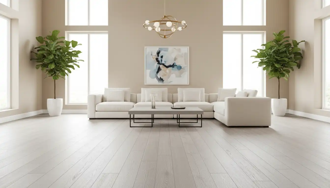
Neutrals are a classic choice for a reason, but not all neutrals are created equal. The right neutral will make your sterling oak floors look sophisticated and intentional. Warm off-whites are often the safest and most welcoming choice. Colors like Sherwin-Williams Alabaster or Benjamin Moore Swiss Coffee have creamy undertones that beautifully balance the coolness of the gray floor, preventing a stark or clinical feel.
If you prefer a crisper, more modern aesthetic, a cool off-white like Benjamin Moore Chantilly Lace can work, especially in a room with abundant warm, natural light. For the perfect middle ground, consider a greige—a blend of gray and beige. Colors like Sherwin-Williams Agreeable Gray or Benjamin Moore Revere Pewter are design chameleons, expertly bridging the gap between the cool-toned floors and any warmer elements in your decor.
The Calming Cool Tones: Creating a Cohesive Retreat
Leaning into the cool nature of sterling oak can create a wonderfully serene and cohesive space. This approach uses an analogous color scheme, where colors next to each other on the color wheel are paired together. Soft, muted blues and greens are exceptional partners for gray floors.
Consider a dusty sage green like Sherwin-Williams Sea Salt for a touch of nature-inspired tranquility. For a more coastal or airy vibe, a light blue-gray such as Benjamin Moore Boothbay Gray can create a peaceful retreat. These colors harmonize with the floor’s gray tones, resulting in a sophisticated and unified design that feels calm and restorative. To add a vibrant, organic touch, consider bringing in plants like a Watercress Purple Gem, which adds a beautiful splash of color.
The Bold & Dramatic: Making a Statement
For those who crave a more dynamic and personality-filled space, sterling oak provides the perfect neutral canvas for bold color. Using a dark, moody paint color creates a stunning contrast that makes the light floors pop. This high-contrast look is incredibly chic and sophisticated.
A deep charcoal like Sherwin-Williams Iron Ore or a rich navy such as Benjamin Moore Hale Navy on an accent wall—or even all four walls in a well-lit room—can be breathtaking. Jewel tones also work beautifully in moderation. An emerald green or deep teal accent can infuse the room with energy and luxury, turning a simple room into a designer showcase.
A Deeper Dive: Pro Color Matching Strategies
Moving beyond basic color selection, professional designers employ specific strategies to ensure a room feels balanced, cohesive, and thoughtfully curated. These techniques elevate a space from simply “painted” to “designed.” By incorporating these rules, you can create a room that is not only beautiful but also harmonious and functional.
These strategies focus on creating balance and ensuring that every element in the room, from the walls to the decor, works together. Understanding these principles is key to unlocking a truly professional-looking result.
The 60-30-10 Rule for a Balanced Room
The 60-30-10 rule is a timeless interior design principle that ensures a balanced color palette. It dictates that 60% of your room should be a dominant color, 30% a secondary color, and 10% an accent color. In a room with sterling oak floors, your walls will typically represent the 60%.
The 30% is your secondary color, often found in furniture, curtains, or an area rug. The final 10% is your accent, delivered through small decor items like throw pillows, artwork, or vases. This formula prevents any single color from overpowering the space and creates a sense of visual order and harmony.
| Color Family | Mood/Vibe | Specific Paint Suggestions | Best For… |
|---|---|---|---|
| Warm Off-Whites | Cozy, Inviting, Bright | Sherwin-Williams Alabaster, Benjamin Moore Swiss Coffee | North-facing rooms or spaces needing warmth. |
| Greiges | Balanced, Modern, Versatile | Sherwin-Williams Agreeable Gray, Benjamin Moore Revere Pewter | Open-concept spaces and transitional decor styles. |
| Cool Blues & Greens | Calm, Serene, Coastal | Sherwin-Williams Sea Salt, Benjamin Moore Boothbay Gray | Bedrooms, bathrooms, and creating a peaceful retreat. |
| Dark & Moody Hues | Dramatic, Sophisticated, Cozy | Sherwin-Williams Iron Ore, Benjamin Moore Hale Navy | Accent walls, dining rooms, or rooms with ample natural light. |
The Unspoken Rule of Color Temperature Balance
Perhaps the most critical and often overlooked strategy is balancing color temperature. Sterling oak floors are inherently cool-toned. Even if you choose a cool paint color for the walls, you must consciously introduce warm elements to the room to avoid a sterile feel. This creates a sophisticated tension and balance that is key to high-end design.
Incorporate warmth through wood furniture in honey or walnut tones, metallic accents in brass or gold, and layered textiles like a jute rug or a chunky wool throw. This principle of undertone and temperature harmony is crucial for various flooring types, a point often emphasized in Coretec Grande Makkah Oak reviews. This deliberate mix of warm and cool is what gives a room depth, character, and an inviting ambiance.
Common Mistakes to Avoid When Pairing Paint with Sterling Oak
Even with the best intentions, a few common missteps can derail your design. Being aware of these potential pitfalls can help you navigate the painting process more effectively and ensure a final result you love. These are the details that often separate a DIY look from a professionally designed space.
Avoiding these errors is just as important as choosing the right color. A small oversight can create a visual disconnect that undermines the entire room’s aesthetic.
Ignoring Your Trim Color
The color of your trim, baseboards, and doors plays a significant role in the overall look. A stark, builder-grade white trim can look jarring against a warm off-white wall. Conversely, a creamy trim might look dingy next to a crisp, cool gray wall.
Ensure your wall color and trim color have compatible undertones. A good rule of thumb is to either match the trim to a white you’ve chosen for the ceiling or opt for a soft, versatile white like Benjamin Moore White Dove, which works well with both warm and cool palettes. Considering finishes is also important, as a deep dive into a Bertazzoni vs. Wolf comparison shows how appliance finishes can influence kitchen color schemes.
Choosing a Paint with the Wrong Undertone
This is the most common mistake of all. You might choose a beige paint, thinking it will add warmth, only to find it has a strong yellow or pink undertone that clashes horribly with the subtle taupe in your sterling oak floors. This happens when a paint color is chosen in isolation at the hardware store under fluorescent lights.
The only way to avoid this is by testing. Never commit to a color without first painting a large swatch (at least 2×2 feet) on your wall. Observe it throughout the day as the light changes to ensure it complements your flooring in all conditions, not just under the artificial lighting of a store.
Forgetting to Test, Test, Test!
Relying on a tiny paint chip is a recipe for disaster. Colors look dramatically different on a larger scale and in the context of your home’s unique lighting. Paint chips can be misleading and are often not a true representation of the final color.
Invest in sample pots or use peel-and-stick sample services like Samplize. Apply samples to multiple walls within the same room, as the color can look different on a wall that gets direct sunlight versus one that is always in shadow. This step, while seemingly small, is the single most important action you can take to guarantee you’ll be happy with your final choice.
Conclusion: Your Perfect Room Awaits
Choosing the right paint color to go with your sterling oak flooring is not about finding a single “correct” answer, but about making an informed and intentional decision. By taking the time to understand the unique character of your floors and the specific lighting of your space, you empower yourself to create a home that is both beautiful and deeply personal. The journey from a potential “gray box” to a warm, inviting sanctuary is entirely within your control.
Remember the core principles: identify the undertones, respect your room’s natural light, choose a palette that evokes the desired feeling, and always balance cool tones with warm elements. With these strategies in hand, you can move forward with confidence, ready to unlock the full design potential of your sterling oak floors and create a space you will love for years to come.