Natural Cream vs Edgecomb Gray: Stop Guessing on Neutrals
Choosing the right neutral paint color feels like a simple task, but it’s a decision that can subtly make or break your entire home’s atmosphere. You stand in front of a wall of paint chips, each one looking deceptively similar, yet knowing one choice will create a warm, inviting space while another will leave your room feeling cold, muddy, or just plain wrong. This is the exact dilemma faced when choosing between two of Benjamin Moore’s most popular complex neutrals: Natural Cream and Edgecomb Gray.
The core of the problem isn’t just about picking a beige or a gray; it’s about understanding the complex personality of each color. One leans into a soft, creamy warmth, while the other offers a sophisticated, transitional greige. Making the wrong choice can lead to a cascade of design frustrations, from clashing with your existing furniture to creating an unintended mood that costs time, money, and effort to fix.
You'll Learn About
Why This Neutral Paint Choice Is So Deceptive
The challenge with colors like Natural Cream and Edgecomb Gray is that their appearance on a tiny swatch is a poor predictor of how they will behave on your walls. Several hidden factors are at play, turning what should be a straightforward decision into a complex puzzle. Understanding these factors is the first step to making a confident choice.
The Hidden Power of Undertones
Undertones are the subtle hints of color hiding within a neutral paint. These undertones are the primary reason a paint color can look perfect in the store but completely different in your home. They are activated by light and surrounding colors, revealing themselves in often unexpected ways. Forgetting to account for them is a common misstep, much like the subtle differences discussed when comparing shades that seem almost identical but perform very differently.
Natural Cream contains soft green undertones that can sometimes surface, while Edgecomb Gray is a more complex greige with its own subtle green-gray character. Ignoring these undertones can result in a room that feels slightly “off,” clashing with the blues, reds, or yellows in your flooring, furniture, and textiles.
How Lighting Changes Everything
Lighting is the single most influential factor in how a paint color is perceived. Natural light changes throughout the day, and the direction your room faces plays a critical role. A north-facing room receives cool, indirect light, which can amplify the gray in both colors, while a south-facing room’s warm, direct light will bring out their creamy, beige qualities.
Artificial lighting adds another layer of complexity. Warm-toned LED bulbs might enhance the coziness of Natural Cream, whereas cool-toned bulbs could make Edgecomb Gray appear much starker and more gray than intended. The interaction between light and color is dynamic and must be observed in your specific space.
A Deep Dive into Benjamin Moore Natural Cream (OC-14)
Natural Cream is a sophisticated off-white that offers warmth without leaning too yellow. It’s often described as a complex cream or a very light greige, making it an incredibly versatile choice for creating a serene and inviting atmosphere. Its character is soft, but it has enough depth to avoid looking washed out.
The True Nature of Natural Cream: Warmth with a Twist
With a Light Reflectance Value (LRV) of 64.78, Natural Cream sits in a sweet spot. It reflects a good amount of light, helping to brighten spaces, but has enough pigment to feel cozy and substantial. Its primary characteristic is a soft, creamy beige base.
However, its secret lies in its subtle green undertones. In most lighting, these undertones are barely perceptible, simply adding to its neutrality. But in certain conditions, particularly when placed next to strong pink or red tones, this hint of green can become more apparent, preventing the color from ever looking too peachy.
Where Natural Cream Excels
This color is a fantastic choice for a wide range of spaces. Natural Cream is especially effective in rooms that need warmth and light, such as living rooms, bedrooms, and hallways. It’s an excellent option for north-facing rooms where its inherent warmth can counteract the cool-toned light.
It pairs beautifully with both dark and light wood tones, making it a flexible partner for existing furniture and flooring. Whether you have rich cherry floors or light oak cabinets, Natural Cream can create a cohesive and elegant backdrop. It’s also a reliable choice for a whole-house color palette due to its ability to adapt to different lighting conditions gracefully.
Unpacking Benjamin Moore Edgecomb Gray (HC-173)
Edgecomb Gray, also known as Baby Fawn, is one of Benjamin Moore’s most popular greige paint colors. It strikes a beautiful balance between gray and beige, creating a transitional color that is neither too cold nor too warm. This adaptability has made it a go-to for designers and homeowners seeking a timeless neutral.
The Chameleon-Like Quality of a Perfect Greige
Edgecomb Gray has an LRV of 63.09, making it slightly darker than Natural Cream. This small difference gives it a bit more presence and depth on the wall. Its reputation as a “chameleon” color comes from its undertones, which can shift depending on the environment.
It is a warm gray with soft green-gray undertones. In a room with ample warm, southern light, it will appear more beige and soft. In a north-facing room or under cooler artificial lights, its gray side will become more prominent. This shifting nature is part of its appeal, but it also makes testing it in your space absolutely essential.
Ideal Applications for Edgecomb Gray
Edgecomb Gray shines in spaces where you want a sophisticated, modern neutral that still feels inviting. It’s a fantastic choice for open-concept floor plans, as it transitions beautifully from room to room. Its balance of warm and cool makes it compatible with a wide array of other colors and materials.
However, its tendency to lean gray in low-light situations means it can sometimes look flat or “muddy” in a dark hallway or a room without sufficient natural light. It performs best when it has enough light to bring its warm, beige qualities to life. It is also a popular choice for kitchen cabinets, offering a warm alternative to stark white.
The Head-to-Head Comparison: Natural Cream vs Edgecomb Gray
While both colors are soft, warm neutrals from Benjamin Moore, they create distinctly different feelings in a room. Natural Cream consistently presents as a warm, creamy off-white. Edgecomb Gray is more of a true greige, with a noticeable gray component that gives it a more contemporary, transitional feel.
Comparing the Core Attributes
To truly understand their differences, a side-by-side comparison is necessary. The key metrics reveal how each color will likely behave and feel once on your walls.
| Feature | Benjamin Moore Natural Cream (OC-14) | Benjamin Moore Edgecomb Gray (HC-173) |
|---|---|---|
| LRV (Light Reflectance Value) | 64.78 (Slightly brighter) | 63.09 (Slightly darker) |
| Primary Color Family | Off-White / Complex Cream | Greige / Warm Gray |
| Dominant Undertones | Soft Green | Green-Gray |
| Overall Feeling | Warm, Cozy, Creamy, Serene | Sophisticated, Balanced, Transitional |
| Best For | Adding warmth to any space, especially north-facing rooms. | Creating a modern, versatile neutral in well-lit areas. |
The Most Overlooked Factor: Your Home’s Fixed Elements
Beyond lighting, the single most important consideration that is often overlooked is how a paint color interacts with the permanent fixtures in your home. These are the elements that are difficult and expensive to change, such as your flooring, countertops, kitchen backsplash, and even the brick or stone on your fireplace.
For example, if you have honey oak trim or cabinets, the orange-yellow tones in the wood need a paint color that can neutralize them. A color with the wrong undertone will clash and intensify the orange. Similarly, the cool, gray veins in a Carrara marble countertop might look jarring next to an overly warm cream but harmonize perfectly with the balanced nature of a greige like Edgecomb Gray.
The Surefire Way to Choose Your Perfect Neutral
Reading about colors is one thing, but making the final decision requires a practical, hands-on approach. To avoid costly mistakes, follow a methodical testing process that goes far beyond taping a tiny chip to the wall.
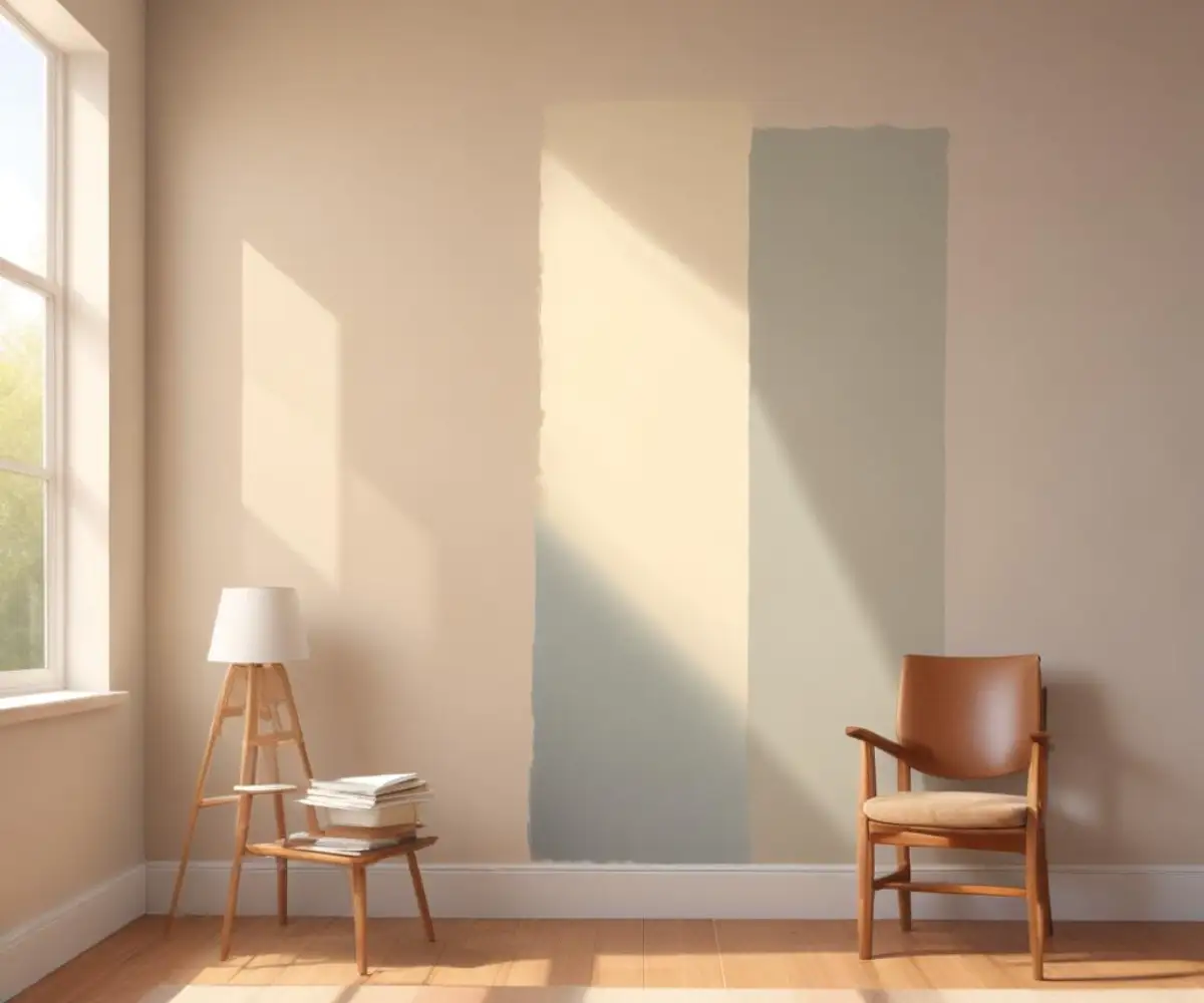
Step 1: Get Large Samples
Do not make a decision based on a small paint chip. Instead, purchase sample pots of both Natural Cream and Edgecomb Gray. Paint a large poster board (at least 2 feet by 2 feet) with two coats of each color, leaving a white border around the edge to help your eye see the color more accurately.
Step 2: The 24-Hour Test in Multiple Locations
Move your large sample boards around the room you plan to paint. Place them on different walls to see how they look in direct light, in shadow, and at different times of the day—morning, noon, and night. This will reveal how the color shifts as the lighting changes.
Step 3: Test Against Your Fixed Finishes
This is the most critical step. Hold your sample boards directly next to your trim, flooring, kitchen cabinets, countertops, and fireplace. This is where the undertones will reveal themselves. Does Natural Cream’s warmth complement your floors, or does it bring out an unwanted yellow tone? Does Edgecomb Gray’s balance work with your backsplash, or does it suddenly look too gray?
Beyond the Color: Why Paint Quality Matters
Once you’ve selected your perfect neutral, the quality and finish of the paint itself will have a significant impact on the final result. The brand and sheen you choose can alter the color’s appearance and durability.
The Impact of Brand and Finish
Different paint brands use different formulas, which can lead to slight variations in the final color. While Benjamin Moore is a trusted name, it is worth understanding how different brands compare, as seen in discussions around competing paint manufacturers. A higher-quality paint will offer better coverage and a more durable finish.
The paint’s sheen also plays a role. A matte finish will absorb light and hide imperfections, giving the color a soft, velvety look. An eggshell or satin finish will have a slight sheen, reflecting more light and making the color appear slightly brighter. This can be particularly noticeable with nuanced colors like Edgecomb Gray.
The Final Decision: Which Neutral Is Right for You?
Ultimately, the choice between Natural Cream and Edgecomb Gray comes down to your home’s specific characteristics and the atmosphere you wish to create. There is no universally “better” color; there is only the right color for your unique space.
Choose Natural Cream if you are seeking consistent, gentle warmth. It is the safer bet if you want to create a cozy, inviting, and luminous space that feels timeless and serene. It is more forgiving in various lighting situations and pairs beautifully with traditional and rustic decor styles.
Choose Edgecomb Gray if you want a sophisticated and transitional neutral. It is perfect for modern, contemporary, or modern farmhouse styles where you need a color that can bridge warm and cool tones. Its complexity adds a layer of designer-like depth, provided you have adequate light to let its character shine. For those who enjoy exploring unique colors further, finding a special custom paint match could be the next step in your design journey.