Mindful Gray Cabinets: The #1 Mistake with Repose Gray Walls
The allure of a sophisticated, all-gray kitchen is undeniable. It promises a timeless, chic, and versatile backdrop for daily life. Among the thousands of shades, the combination of Sherwin Williams Mindful Gray for cabinets and Repose Gray for walls has become a go-to for designers and homeowners alike. Yet, this seemingly perfect pairing holds a hidden challenge that can leave your dream kitchen feeling disappointingly “off,” cold, or disjointed. The problem isn’t the colors themselves, but a fundamental misunderstanding of how they interact.
Many homeowners invest significant time and resources into this specific gray-on-gray palette, only to find the final result falls flat. The cabinets and walls, which appeared harmonious on paint chips, suddenly seem to clash in the full light of the kitchen. This frustrating outcome is the number one reason a seemingly straightforward design choice becomes a source of regret, proving that even with popular neutrals, success lies deep within the details.
You'll Learn About
Why This Gray-on-Gray Combo is So Deceptively Tricky
The core issue with pairing Mindful Gray and Repose Gray lies in their subtle but powerful undertones. While they exist on the same Sherwin Williams color strip, suggesting they are simply lighter and darker versions of each other, their undertones can behave very differently depending on the environment. This nuanced conflict is the primary reason for the design dissonance many experience.
The Secret War of Undertones: Green vs. Violet
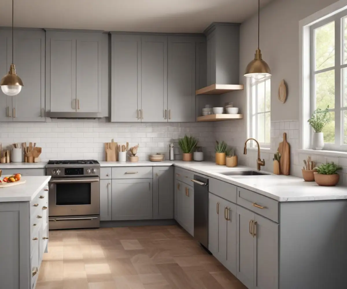
At its heart, the challenge is a subtle clash of undertones. Mindful Gray (SW 7016) is a mid-tone warm gray that often reveals soft green undertones. In certain lighting conditions, especially when placed near warm wood tones or in south-facing rooms, this green can become more pronounced. It’s a complex greige that straddles the line between gray and beige, giving it a grounded, earthy feel.
On the other hand, Repose Gray (SW 7015), while also a warm gray, frequently displays subtle violet or taupe undertones. Although it’s just one step lighter than Mindful Gray, this hint of purple can create a cool, crisp look. The problem arises when the green in the cabinets and the violet in the walls are brought together; they can subtly fight for dominance, preventing the seamless, monochromatic look you were hoping for.
How Your Kitchen’s Lighting Changes Everything
Lighting is the second critical factor that can make or break this color combination. The type and amount of light in your kitchen will dramatically influence which undertones are revealed. A kitchen flooded with warm, southern-facing sunlight might wash out the nuance, while a north-facing room with cooler, indirect light can amplify the underlying violet and green hues, making any discord more obvious.
Artificial lighting is just as crucial. LED bulbs with a cool, high Kelvin temperature (4000K-5000K) can make both grays appear stark and cold, highlighting the blueish-purple hints in Repose Gray. Conversely, warm-toned bulbs (2700K-3000K) can bring out the warmer, greener side of Mindful Gray, sometimes making Repose Gray walls look muddy in comparison. Without careful lighting control, your kitchen’s color palette can feel inconsistent throughout the day.
The Foolproof Formula for Perfect Harmony
Achieving a stunning kitchen with Mindful Gray cabinets and Repose Gray walls is entirely possible, but it requires a strategic approach. Success hinges on controlling the lighting and introducing “bridge” elements that connect the two grays, neutralizing their competing undertones and creating a cohesive, professionally designed space. This method turns a potential color clash into a sophisticated, layered design.
Step 1: Master Your Lighting Plan
Before finalizing any paint, establish your lighting. Aim for LED bulbs with a neutral temperature, typically between 3000K and 4000K, to render colors most accurately. Installing layered lighting—ambient (ceiling fixtures), task (under-cabinet lights), and accent (pendants)—gives you control over how the space feels. For task areas, a well-placed lighting system can be essential; consider how you might install specific fixtures like flush-mount outlets for a seamless look. A great guide on installing flush-mount wall outlets can prevent common mistakes that detract from your design.
Most importantly, test your paint swatches in your kitchen. Paint large sample boards and move them around the room at different times of the day and night, observing how they look under both natural and your chosen artificial light. This single step can save you from a costly repainting job.
Step 2: The Critical Role of a “Bridge” Element
The secret to unifying Mindful Gray and Repose Gray is to introduce a third element that acts as a visual bridge between them. This element should contain tones that complement both the green and violet undertones, effectively tricking the eye into seeing them as a harmonious pair. The most effective bridge elements are your countertops and backsplash, as they physically connect the cabinets and walls.
A crisp, clean white is often the most effective and timeless choice. It acts as a buffer, providing a clean separation that allows both grays to be appreciated on their own merit without clashing. It doesn’t compete; it clarifies. Warmer whites with very subtle creamy undertones can also work, but they must be chosen with extreme care to avoid looking yellow against the grays.
Step 3: Choosing Your Bridge: Countertops and Backsplash
Your choice of countertop and backsplash is the most important decision you will make in executing this design. For countertops, consider a quartz or granite with a soft white base and subtle, warm veining. Veins that incorporate hints of gold, beige, or a warmer taupe can tie into the warmth of both grays and provide that necessary visual connection. Avoid countertops with strong blue or cool gray veining, as this will only exacerbate the undertone clash.
For the backsplash, simplicity is key. A classic white subway tile is a nearly foolproof option. To add texture and warmth without introducing competing colors, consider a handcrafted-look tile, like a Zellige tile, in a shade of white. The slight variations in color and texture will add depth and prevent the space from feeling sterile. If you want a bit more pattern, a marble backsplash with both warm and cool veining can also serve as an excellent bridge.
Coordinating Finishes: Beyond the Paint
With the core color palette established, the next layer of design involves selecting finishes that enhance the sophisticated look and, crucially, add warmth to prevent the gray-on-gray scheme from feeling cold or one-dimensional. Hardware, flooring, and trim are the supporting cast that can make your kitchen feel truly complete and inviting.
Hardware: The Jewelry of Your Cabinets
Hardware choice has an outsized impact on the final feel of your kitchen. To counteract the coolness inherent in any gray palette, opt for hardware in warm metal finishes. Brushed gold, champagne bronze, and aged brass are excellent choices that introduce a necessary touch of warmth and luxury. The warm glow of these metals beautifully complements the subtle green undertones in Mindful Gray cabinets.
If your style leans more modern or industrial, matte black hardware can also be a stunning choice. It provides a sharp, graphic contrast against the light gray cabinets without adding more cool tones like chrome or polished nickel would. The key is to create contrast and visual interest. In a kitchen featuring cabinetry from a line like the KraftMaid Momentum collection, the hardware can define the overall style.
Flooring That Grounds the Space
Your flooring is the foundation of the room’s design and a major opportunity to add organic warmth. Natural hardwood floors with warm, medium-brown tones are an ideal choice. The richness of the wood will balance the grays and prevent the space from feeling sterile. Luxury vinyl plank (LVP) in a realistic wood look is another durable and effective option.
If you have existing tile floors, try to work with them. Tiles in shades of beige, cream, or warm gray can work well. If your tile is a cool gray, you may need to lean more heavily on other elements like a warm-toned runner, wood bar stools, or a butcher block island top to introduce the necessary warmth.
| Finishing Element | Recommended Choice | Effect on Grays | Best For |
|---|---|---|---|
| Hardware | Brushed Gold / Champagne Bronze | Adds warmth and luxury; complements green undertones. | Transitional, Modern, Glam |
| Hardware | Matte Black | Creates sharp, modern contrast without adding coolness. | Modern, Industrial, Farmhouse |
| Flooring | Warm Hardwood / LVP | Grounds the space and balances the cool tones of the paint. | Almost Any Style |
| Countertop | White Quartz with Warm Veins | Acts as a “bridge” to unify cabinet and wall colors. | Transitional, Contemporary |
| Backsplash | White Ceramic Tile | Provides a clean, classic buffer between the two grays. | Timeless, Versatile |
Design Elements That Elevate the Look
The final touches are what transform a well-coordinated kitchen into a truly exceptional space. Thoughtful choices in trim color and the deliberate inclusion of texture can make the room feel layered, personal, and inviting. These details ensure your gray kitchen is anything but boring.
The Great Debate: White vs. Cream Trim
When selecting a trim color to go with Repose Gray walls, the choice is critical. While it may be tempting to use a creamy, warm white to add warmth, this is often a mistake. A crisp, clean white like Sherwin Williams Extra White or Pure White is the superior choice. A clean white creates a sharp, defined line that makes the Repose Gray feel intentional and sophisticated. A creamy off-white, by contrast, can look dingy or yellowed next to the subtle coolness of the gray walls.
Bringing in Texture and Warmth
A gray kitchen requires texture to feel alive. Incorporate natural materials to break up the smooth, painted surfaces. Display a collection of wooden cutting boards against the backsplash. Place a small potted plant or a vase of fresh greenery on the counter. Use a woven textile runner on the floor or textured linen bar stools at the island.
The kitchen island itself is a prime opportunity to introduce a new material. A butcher block top on an island can add immense warmth and character. This is especially effective if you are wondering are two-tier kitchen islands out of style; a single-level island with a contrasting warm top is a timeless design choice that beautifully complements the gray scheme.
Common Mistakes to Avoid at All Costs
Even with a solid plan, a few common missteps can derail your design. Being aware of these potential pitfalls will help you navigate the final stages of your project successfully, ensuring a cohesive and beautiful outcome that stands the test of time.
Choosing the Wrong Paint Sheen
The finish of your paint is just as important as the color. For kitchen cabinets, a durable satin or semi-gloss finish is essential for easy cleaning. This slight sheen will also reflect light, helping the Mindful Gray feel rich rather than flat. For the Repose Gray walls, an eggshell or satin finish is ideal. It offers a soft, wipeable surface that hides minor imperfections better than a matte finish, which can make grays look dull and lifeless, especially in lower light.
Ignoring Your Home’s Fixed Elements
Always consider the fixed elements in and around your kitchen that are not changing. This includes flooring in an adjacent room of an open floor plan, window frame colors, or a nearby stone fireplace. Your new kitchen must exist in harmony with the rest of your home. If your home is filled with warm, beige tones, you will need to work harder to bridge the gap between those colors and your new gray kitchen, perhaps by choosing a backsplash tile that incorporates both beige and gray.
Forgetting to Add Contrast
The biggest danger of any gray-on-gray scheme is creating a space that feels flat and monotonous. It is vital to create contrast. This is achieved not just with color (like a white countertop) but with texture and tone. Ensure there is a mix of light and dark elements. If your cabinets and walls are light gray, use dark hardware, a darker wood floor, or dark-toned bar stools to create depth and prevent the design from feeling one-dimensional.