Linen White vs Swiss Coffee: The #1 Mistake With Off-White Paint
Choosing the perfect off-white paint feels like it should be easy. You walk into the paint store, grab a few swatches that look white-ish, and head home. But then you hold them up to your wall, and the serene, warm white you envisioned suddenly looks blindingly yellow, depressingly dingy, or starkly cold. This is the paralysis of choice, and it’s a problem homeowners face every day.
Two of the most popular culprits in this confusion are Benjamin Moore’s Linen White and the ever-popular Swiss Coffee. They are both beautiful, warm, off-white colors, but their subtle differences can dramatically alter the mood and feel of a room. Picking the wrong one isn’t just a matter of taste; it can make your entire space feel “off,” forcing you into an expensive and time-consuming repaint.
This guide will demystify these two iconic colors. We will break down their core components, explore how they react to their environment, and provide a clear framework to help you choose with absolute confidence. Say goodbye to guesswork and hello to the perfect, warm, and inviting walls you’ve been dreaming of.
You'll Learn About
The Core Dilemma: Why Off-Whites Are So Deceptive
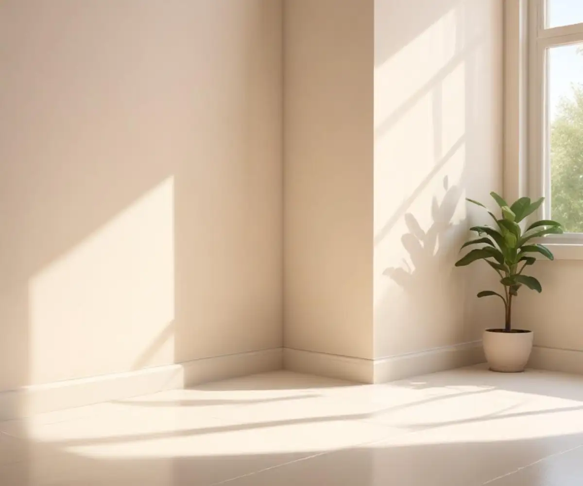
The fundamental reason off-white paints are so challenging is that they aren’t truly white. They are complex shades packed with hidden colors called undertones. These undertones are the ghosts in the machine, subtly shifting the color’s appearance based on its surroundings. A paint chip that looks like a soft cream under the fluorescent lights of a hardware store can transform into a strong yellow in a sunny room.
Another critical factor is Light Reflectance Value (LRV). LRV is a scale from 0 (absolute black) to 100 (pure white), indicating how much light a color reflects. A higher LRV means the color will bounce more light around, making a space feel brighter and more open. A lower LRV absorbs more light, creating a cozier, more saturated feel. The LRV difference between two off-whites can be the deciding factor in how bright your room ultimately feels.
Deep Dive: Benjamin Moore Linen White (912)
Benjamin Moore’s Linen White is a timeless, classic off-white that exudes a distinct and unmistakable warmth. Think of it as the color of antique linen sheets or a rich, creamy vanilla. It’s a color with depth and character, making it a go-to for creating cozy, inviting, and traditional spaces.
The defining characteristic of Linen White is its prominent yellow and beige undertones. These are not subtle hints of color; they are a core part of its identity. In a well-lit, south-facing room, this color will glow with a soft, sunny disposition. However, in a room with less natural light or with warm-toned artificial lighting, these yellow undertones will become much more pronounced. With an LRV of 80.94, it reflects a significant amount of light but has enough saturation to not feel washed out.
Best Uses for Linen White:
- Traditional and Historic Homes: Its inherent warmth and classic feel make it a perfect match for older homes with detailed woodwork and traditional furnishings.
- North-Facing Rooms: The cool, blue-toned light of north-facing rooms can make many whites feel sterile. Linen White’s strong warm undertones counteract this, balancing the light to create a cozy and welcoming atmosphere.
- Bedrooms and Living Rooms: It excels in spaces designed for comfort and relaxation, where its creamy glow can create a serene and restful environment.
Unpacking Swiss Coffee: The Versatile Contender
Swiss Coffee is one of the most popular off-white paint colors, but it comes with a major point of confusion: multiple brands sell a color named Swiss Coffee, and they are not the same. Benjamin Moore’s Swiss Coffee (OC-45) and Behr’s Swiss Coffee (12) are two of the most common, and while similar, they have key differences. For this comparison, we will focus primarily on the Benjamin Moore version, which is widely considered a benchmark for the color.
Benjamin Moore’s Swiss Coffee is a sophisticated, soft, warm white. It is often described as more muted and versatile than Linen White. Its warmth comes from subtle yellow, green, and sometimes even beige undertones. These undertones are softer and more complex than those in Linen White, which allows Swiss Coffee to adapt more easily to different lighting conditions and design styles. With an LRV of 81.91, it’s slightly brighter than Linen White, reflecting a little more light into the space.
Best Uses for Swiss Coffee:
- Transitional and Modern Farmhouse Styles: Its soft warmth is clean enough for modern aesthetics but cozy enough for rustic elements, making it incredibly versatile.
- Whole-House Color: Because it’s less likely to lean too yellow, many designers use Swiss Coffee as a neutral backdrop throughout an entire home.
- Kitchens and Cabinets: It provides the look of a classic white kitchen but with an added layer of warmth that prevents it from feeling clinical.
The Head-to-Head Comparison: Linen White vs Swiss Coffee
When you place these two colors side-by-side, their differences become immediately apparent. Linen White is more saturated and reads as a distinct cream or beige-white. Swiss Coffee, while still warm, appears more neutral and muted in comparison. Its subtle green undertone helps to balance the yellow, preventing it from becoming overly creamy.
To truly understand which color is right for your project, a direct feature comparison is essential. The table below breaks down the key attributes of Benjamin Moore’s Linen White against both Benjamin Moore’s and Behr’s versions of Swiss Coffee, as they are the most common contenders.
| Feature | Benjamin Moore Linen White (912) | Benjamin Moore Swiss Coffee (OC-45) | Behr Swiss Coffee (12) |
|---|---|---|---|
| LRV | 80.94 (Slightly darker) | 81.91 (Slightly brighter) | 84 (Noticeably brighter) |
| Primary Undertone | Strong Yellow/Beige | Soft Yellow with Green/Beige | Creamy Yellow/Beige |
| The Vibe | Traditional, Cozy, Creamy | Versatile, Soft, Modern | Warm, Inviting, Creamy |
| Best For | Warming up cool, north-facing rooms. | A whole-house neutral, transitional designs. | Spaces needing a soft, bright warmth. |
| Pairs Well With | Dark woods, terracotta, warm earth tones. | Natural wood tones, sage greens, warm grays. | Light woods, muted blues, earthy textures. |
The #1 Factor You’re Ignoring: Lighting
No paint color exists in a vacuum. The single most important factor that will determine how Linen White or Swiss Coffee looks in your home is your lighting—both natural and artificial. Ignoring this is the biggest mistake you can make.
North-Facing Rooms: These rooms receive cool, indirect light that can make colors appear dull or gray. Linen White is often the hero here, as its strong yellow undertones actively fight against the cool light to bring warmth and life to the space. Swiss Coffee can work, but its green undertone may become more noticeable in this light, which isn’t always desirable.
South-Facing Rooms: Flooded with bright, warm light all day, these rooms can handle a wider range of colors. However, this is where Linen White can become overwhelmingly yellow. Swiss Coffee often shines in these spaces, as the abundant warm light enhances its soft, creamy nature without making it feel too saturated.
Artificial Lighting: The type of lightbulb you use is critical. Warm-toned LED bulbs (around 2700K) will amplify the yellow undertones in both colors, making Linen White very creamy and Swiss Coffee very cozy. Cooler-toned bulbs (3500K-5000K) will neutralize the warmth, which can make Linen White look more balanced but might wash out Swiss Coffee or make it feel flat.
The Pro Secret: Beyond the Tiny Swatch
Never, ever choose a paint color based on a small paper swatch from the store. It is simply not large enough to give you an accurate representation of the final look. The secret to getting it right lies in proper sampling.
Instead of painting a small square directly on your existing wall, invest in large, movable sample boards. Paint two coats onto poster board or a product like Samplize peel-and-stick samples. This allows you to move the color around the room and see how it looks on different walls at different times of the day. Check it in the morning, at noon, and at night with the lights on. This process reveals the color’s true character and its undertones.
Furthermore, the paint’s finish, or sheen, will impact its appearance. A matte or eggshell finish will make the color look softer and hide imperfections, while a satin or semi-gloss finish will reflect more light and can make the undertones appear more prominent. Considering the quality and finish of your paint, whether you’re debating options like in a Showcase vs Emerald comparison, is just as important as the color itself.
Pairing with Trim: The Make-or-Break Decision
A common mistake is pairing a warm, creamy wall color like Linen White or Swiss Coffee with a stark, cool-toned white trim. This contrast can make your beautiful off-white walls look dingy, dirty, or unintentionally yellow. The key is to harmonize the undertones.
For Linen White walls, avoid trim colors with cool blue or gray undertones. A foolproof method is to use Linen White itself on the trim but in a higher sheen, like semi-gloss. This creates a seamless, sophisticated look. Alternatively, a soft, warm white like Benjamin Moore’s White Dove can work beautifully.
For Swiss Coffee walls, you have a bit more flexibility. It pairs well with clean whites like Benjamin Moore’s Chantilly Lace for a crisp contrast or with softer whites like White Dove for a more subtle transition. The goal is to ensure your trim doesn’t make your walls look “off.”
Final Verdict: Which Off-White Reigns Supreme?
There is no single “winner” in the battle between Linen White and Swiss Coffee. The best color is the one that is best for your specific space, lighting, and design goals. This choice requires a thoughtful analysis of your home’s unique characteristics.
Choose Benjamin Moore Linen White if:
- You have a north-facing room that needs significant warmth.
- You are aiming for a distinctly traditional, cozy, or historic aesthetic.
- You want a color with a strong, creamy presence that doesn’t shy away from its yellow undertones.
Choose Benjamin Moore Swiss Coffee if:
- You are looking for a versatile, whole-house color that adapts to various styles.
- You want a soft, warm white without the risk of it looking too yellow.
- Your home has a modern farmhouse, transitional, or minimalist design.
Ultimately, the decision rests on careful observation and testing. By understanding their undertones, considering your room’s natural light, and sampling correctly, you can move past the fear of making the wrong choice. You can finally select the perfect off-white that transforms your house into a warm and welcoming home.