Light French Gray 50% Lighter: The Secret to Perfect Neutral Walls?
The quest for the perfect gray paint can feel endless. You search for a shade that is truly neutral, one that doesn’t unexpectedly flash blue in the morning light or lean mysteriously purple in the evening. Sherwin-Williams Light French Gray (SW 7654) is a celebrated contender, known for its balanced, sophisticated tone. However, for some spaces, even this popular neutral can feel a bit too dark or heavy.
This has led many homeowners and designers to a clever solution: asking the paint store to mix Light French Gray at 50% lighter. This custom tweak promises to lift the color, creating a softer, airier version. But does this popular hack really work, and what are the hidden risks of creating a custom color?
You'll Learn About
What Does “50% Lighter” Actually Mean?
When you ask a paint store to make a color “50% lighter,” they aren’t simply adding white paint to a can of the original color. Instead, they adjust the formula itself. A specific paint color is created by adding precise amounts of various colorants (like black, magenta, or umber) to a neutral base.
To create a 50% lighter version, the paint technician reduces the amount of each colorant in the formula by half. This results in a new, unique color that is related to the original but is technically a completely different shade. It’s a custom mix, not just a diluted one.
The Undertone Question: Does Lighter Mean Purer?
A primary challenge with gray paint is managing its undertones. The original Light French Gray is prized for being a very neutral gray, but it has subtle violet and blue undertones that can become more noticeable in certain lighting, particularly in north-facing rooms which receive cooler, indirect light. These undertones give the color its character but can be surprising if you’re not expecting them.
Reducing the pigment load by 50% significantly alters how these undertones behave. The color becomes softer and the undertones are often less pronounced, resulting in a more neutral, gentle gray. However, because there is less pigment, the color can also be more influenced by its surroundings and the quality of light in the room. In some cases, lightening a color can wash it out, making it feel cooler than the original.
LFG vs. LFG 50% Lighter: A Direct Comparison
Understanding the key differences between the original formula and its lightened version is crucial for making the right choice for your space. The most significant technical difference is the Light Reflectance Value (LRV), which measures how much light a color reflects.
The original Light French Gray has an LRV of 53, placing it in the mid-range of light absorption and reflection. A 50% lighter version will have a higher LRV, meaning it will bounce more light around the room, making the space feel brighter and more open.
Key Differences at a Glance
To make the decision easier, here is a side-by-side comparison of the two paint options.
| Feature | Original Light French Gray (SW 7654) | Light French Gray 50% Lighter |
|---|---|---|
| LRV (Light Reflectance Value) | 53 (Mid-range) | Higher than 53 (Brighter) |
| Perceived Undertones | Subtle violet and blue undertones, can feel cool. | Undertones are softer, often appearing more neutral but can wash out to cool. |
| Best For | Rooms with ample natural light, creating a defined yet neutral backdrop. | North-facing rooms, smaller spaces, or areas needing a brighter, airier feel. |
| Potential Issues | Can feel too dark or heavy in low-light situations. | Can be difficult to get touch-up paint that matches perfectly. |
How to Get This Custom Color Right and Avoid Disaster
Opting for a custom paint color requires careful planning to ensure you get the result you envision. A mistake at this stage can be costly and time-consuming. Follow these steps for a successful outcome.
Go to a reputable paint store, preferably a Sherwin-Williams location, as they will have the exact formula for SW 7654. Be very specific with your request: “Sherwin-Williams 7654 Light French Gray, mixed at 50% of the formula.” Do not just ask them to “add white.”
Always get a sample first. This is the most critical step. Paint a large swatch (at least 2×2 feet) on your wall or on a poster board that you can move around the room. Observe it at all times of day—morning, noon, and night—to see how it changes with the light. Ensuring your lighting is working correctly is key; you don’t want an always-on light switch interfering with how the color truly looks in different conditions.
Buy enough paint for the entire project at once. Because this is a custom mix, there can be very slight variations between batches. Buying all the paint you need in one go ensures perfect consistency across all your walls.
Where to Use Light French Gray 50% Lighter
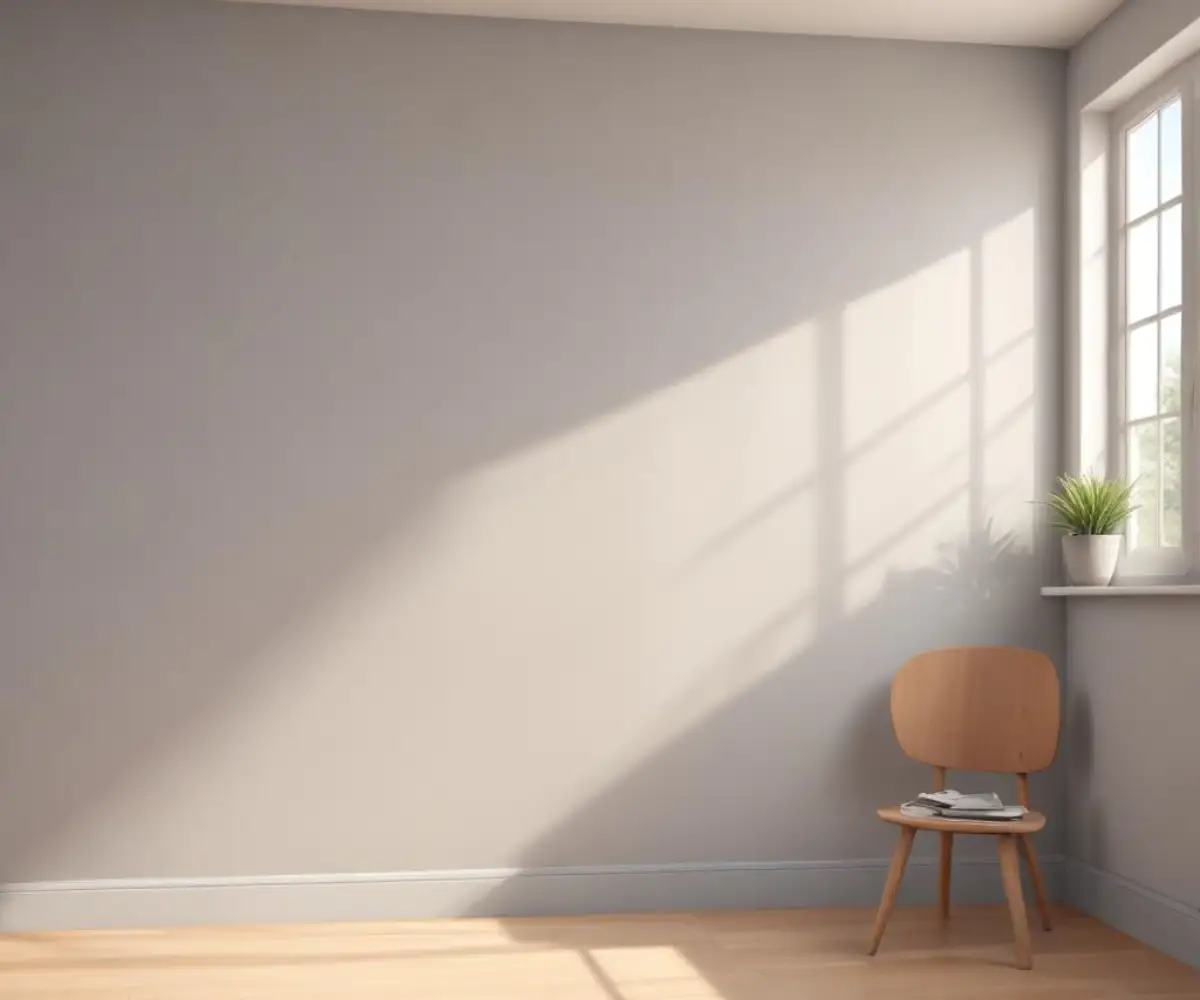
The softer, brighter nature of this custom shade makes it incredibly versatile. It’s an excellent choice for creating a serene and sophisticated atmosphere in almost any room of the house. It works particularly well in spaces that can feel closed-in or lack abundant natural light.
Consider using it in hallways, smaller bedrooms, or basements to make the areas feel more expansive. In a living room or primary bedroom, it creates a tranquil backdrop that allows furniture and artwork to stand out. It also serves as a beautiful cabinet or trim color when paired with slightly darker or crisper walls.
Perfect Pairings: Building a Cohesive Color Palette
Pairing your unique gray with the right trim and accent colors will elevate your design and create a polished, intentional look. The neutrality of Light French Gray 50% Lighter makes it a flexible partner for a wide range of hues.
For trim, a crisp white like Sherwin-Williams Extra White (SW 7006) will create a clean, modern contrast. For a softer, warmer look, consider an off-white like Sherwin-Williams Pure White (SW 7005). These finishing touches, like your wall plates and switches, complete the look. High-quality hardware, such as sleek European light switches, can add a touch of modern elegance against the soft gray wall.
For accent colors, this gray pairs beautifully with muted blues, soft greens, blush pinks, and deep charcoals. It also provides a stunning backdrop for warm wood tones and natural textures, creating a space that feels both sophisticated and inviting. A clean wall color is also the perfect canvas for displaying classic decor, such as timeless white dishes in a kitchen or dining area.
Alternatives to Consider Before Committing
If the idea of a custom-mixed color feels too risky, several existing Sherwin-Williams colors offer a similar aesthetic without the need for custom formulation. These colors are readily available and easy to touch up down the line.
- Sherwin-Williams Repose Gray (SW 7015): A slightly warmer gray with subtle violet and beige undertones. It has an LRV of 58, making it a bit lighter than the original LFG.
- Sherwin-Williams Agreeable Gray (SW 7029): A very popular greige (gray-beige) that is warmer than LFG. With an LRV of 60, it’s a solid choice for a light, inviting neutral.
- Sherwin-Williams Passive (SW 7064): A cooler gray with distinct blue undertones and an LRV of 60. It offers a crisp, airy feel perfect for modern spaces.
A Deeper Dive: The Science of Light and Paint
One of the biggest frustrations when choosing paint is the phenomenon of metamerism. This is when a color appears to be a perfect match under one light source (like the fluorescent lights of a store) but looks completely different under another (like the natural daylight in your home). This happens because the pigments in the paint reflect different wavelengths of light differently.
Custom-mixed colors can be especially susceptible to metamerism. By reducing the pigment, the properties of the white base paint—which is typically made with titanium dioxide—have a greater influence on how light is reflected. This is why testing the paint sample in your own home, with your specific lighting, is non-negotiable. It’s the only way to see how the color will truly behave on your walls.
The Hidden Risk of Custom Colors
Beyond getting the color right the first time, the biggest drawback of a custom mix is the challenge of future touch-ups. While a good paint store can replicate the formula, tiny variations in the base paint or calibration of the tinting machine can lead to a new batch that is just slightly off. This difference might be unnoticeable on a small patch but could be obvious if you need to repaint an entire section of a wall.
To mitigate this, always keep the original paint can with the formula sticker on it. Better yet, purchase a quart or two more than you think you will need for the initial project. This ensures you have a perfectly matched supply for any scuffs or repairs needed down the road.
The Final Verdict
Light French Gray 50% lighter can be the perfect solution for those who love the neutrality of the original but need a brighter, softer presence. It excels in rooms that need a visual lift, offering a serene and highly versatile backdrop for any design style. However, its custom nature demands extra diligence.
By understanding the process, testing thoroughly, and planning for the future, you can confidently use this “hack” to create a truly unique and beautiful color for your home. It’s a custom touch that can transform a room from simply painted to perfectly designed.