Kohler Sea Salt vs White: The #1 Mistake to Avoid for a Timeless Bathroom
Choosing the right fixtures is one of the most stressful parts of a renovation. You’re told that “white is timeless,” but one look at a product catalog reveals a dozen shades of it. This decision paralysis leads to a critical mistake: selecting a white that clashes with your other design elements, turning a dream sanctuary into a discordant space.
The choice between two seemingly similar colors, like Kohler’s classic White and the nuanced Sea Salt, can dramatically alter the mood, warmth, and perceived cleanliness of your room. This isn’t just about picking a color; it’s about defining the entire atmosphere of your home’s most personal spaces.
You'll Learn About
The Illusion of White: Why This Choice Is Harder Than You Think
Not all whites are created equal. The fundamental difference lies in their undertones—the subtle hints of color that emerge under different lighting conditions. A pure, sterile white can feel crisp and modern in one bathroom but cold and clinical in another. An off-white might bring warmth and character, or it could look dingy next to pure white tiles.
This decision impacts everything from your vanity and countertop selection to the paint on your walls. Getting it wrong means starting a domino effect of design compromises. Understanding the distinct personalities of Kohler White and Kohler Sea Salt is the first step to avoiding this costly error.
Kohler White: The Crisp, Clean Classic Explained
Kohler’s standard White is a true, bright white. It contains no discernible undertones, making it a benchmark for purity and cleanliness in the industry. For decades, it has been the go-to for a reason.
Its primary advantage is its universal compatibility. Kohler White pairs effortlessly with any color scheme, from bold, dramatic palettes to soft, muted tones. It creates a sharp, high-contrast look that makes spaces feel larger, brighter, and impeccably clean. This versatility makes it a safe but powerful choice for both modern and traditional designs.
However, its starkness can be a double-edged sword. In rooms with cool, northern-facing light, it can sometimes feel sterile or overly bright. Furthermore, its pure nature means that every speck of dust or grime is more visible, demanding more diligent maintenance to keep it looking pristine.
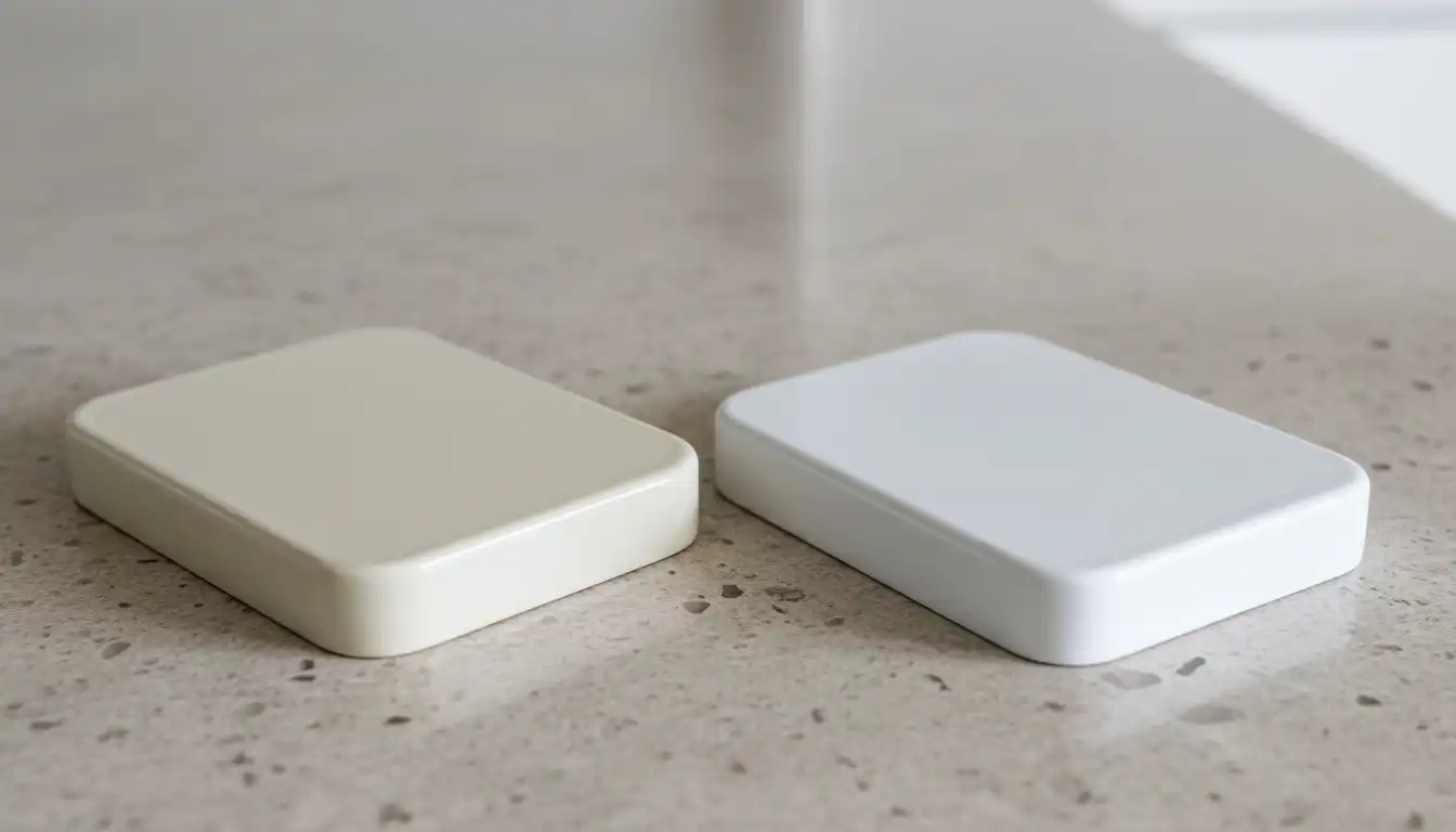
Kohler Sea Salt: The Subtle, Sophisticated Alternative
Kohler Sea Salt is not just an off-white; it’s a complex, sophisticated neutral. Described as a soft white with subtle gray undertones, it has a textured, almost layered appearance that gives it incredible depth. This isn’t a flat color, but one that seems to shift gently with the light.
The main benefit of Sea Salt is the warmth and character it introduces. It provides the brightness of white without any of the coldness. This makes it ideal for creating a serene, spa-like atmosphere. The gentle gray undertones are also more forgiving, helping to conceal minor water spots or dust between cleanings.
The challenge with Sea Salt lies in its coordination. Those same beautiful undertones can clash if paired with the wrong elements. For example, placing a Sea Salt sink next to a pure white subway tile can make the sink appear dingy or discolored by comparison. Success with Sea Salt requires a more thoughtful approach to the surrounding color palette.
Head-to-Head: The Ultimate Kohler Sea Salt vs White Comparison
Making an informed decision requires a direct comparison of the key attributes that will impact your daily life and long-term satisfaction. This table breaks down the essential differences to guide your choice.
| Feature | Kohler White | Kohler Sea Salt |
|---|---|---|
| Undertone | None (Pure, bright white) | Soft gray with subtle texturing |
| Best For | Creating a crisp, clean, high-contrast look. Maximizing the sense of space and light. | Creating a warm, serene, and sophisticated atmosphere with depth. |
| Style Match | Modern, minimalist, traditional, and high-contrast designs. Pairs with any color. | Coastal, modern farmhouse, transitional, and spa-inspired designs. Pairs with warm neutrals and natural materials. |
| Maintenance | Shows dirt, dust, and grime more readily. Requires frequent cleaning to look its best. | More forgiving; subtle undertones help conceal water spots and dust. |
| Light Reflection | Maximizes light reflection, making rooms feel brighter and larger. Can create glare in direct sunlight. | Reflects light softly, providing a gentle glow without harshness. |
| Resale Value | Universally appealing and a safe choice for resale. | Can be perceived as a high-end, custom choice, but may be less appealing to buyers seeking a pure white. |
The #1 Factor You’re Ignoring: Lighting’s Drastic Impact
The single biggest mistake homeowners make is choosing a color based on a showroom sample or an online photo. The appearance of both White and Sea Salt will change dramatically based on the lighting in your actual home. This factor is more critical than any other when making your final choice.
Natural light from a north-facing window casts a cool, blueish hue, which can make Kohler White feel almost clinical while bringing out the subtle gray undertones in Sea Salt beautifully. Conversely, the warm, golden light from a south-facing window can make pure White feel inviting and bright, while potentially giving some off-whites a yellowish cast.
Artificial Light Changes Everything
The type of lightbulb you use is just as important. Warm white LEDs (around 2700K) will enhance the cozy feeling of Sea Salt. Cool white or daylight LEDs (4000K-5000K) will amplify the crisp, clean nature of Kohler White but could wash out the subtlety of Sea Salt. Always test physical samples in your room at different times of the day and with your chosen light fixtures turned on.
Coordinating Your Design: Vanities, Tiles, and Paint
A fixture’s color does not exist in a vacuum. It must harmonize with every other surface in the room to create a cohesive design. Here is a guide to building a palette around each finish.
Pairing with Kohler White
Because it is a true neutral, White offers limitless possibilities. For a striking, modern aesthetic, pair it with dark vanities in navy blue, charcoal gray, or even black. This high contrast is timeless and sophisticated. For hardware, chrome, polished nickel, and matte black all stand out beautifully against a pure white backdrop. When discussing faucet brands, the longstanding debate of Kraus vs Kohler often comes up, with both offering excellent options in these finishes.
Pairing with Kohler Sea Salt
Sea Salt thrives when paired with other warm and natural tones. Think of vanities made from light oak, walnut, or painted in “greige” or mushroom colors. For countertops, materials like quartz with warm veining or natural stone complement Sea Salt’s depth. When it comes to hardware, finishes like brushed gold, champagne bronze, and oil-rubbed bronze enhance its inherent warmth and create a truly luxurious feel.
Beyond Color: Does Material Change the Game?
A crucial detail often overlooked is how the fixture’s material affects the color’s appearance. The same “White” or “Sea Salt” can look subtly different on enameled cast iron versus acrylic. This nuance can be the deciding factor in creating a perfectly harmonized space.
Kohler’s enameled cast iron, for instance, has a rich, glossy finish that gives colors an incredible depth and luminosity. The thick enamel over the dark cast iron base can make White appear even brighter and Sea Salt’s texture more pronounced. When choosing a bathtub, understanding these material differences is key, as explored in comparisons like the Kohler Underscore vs Archer, which are available in both materials.
Acrylic, on the other hand, offers a more uniform and consistent color presentation. The color is solid throughout the material, which can result in a slightly softer, less reflective appearance compared to the high gloss of enamel. Neither is better, but they are different, and this must be considered if you are mixing materials within the same bathroom.
Making the Final Call: Your Actionable Decision Guide
To avoid decision fatigue and choose with confidence, ask yourself these three critical questions:
- What is the mood I want to create? If the answer is “bright, spacious, and clean,” lean towards Kohler White. If it’s “warm, serene, and relaxing,” Kohler Sea Salt is likely your better choice.
- What are my coordinating elements? If you have or want pure white tiles, a pure white vanity, or cool-toned paint, stick with Kohler White to avoid a color clash. If you are using natural woods, warm-toned stones, and creamy or beige tiles, Kohler Sea Salt will blend more harmoniously.
- What is the lighting situation? In a room with limited or cool-toned natural light, Kohler White can help brighten the space, while Kohler Sea Salt will add much-needed warmth. In a very bright, sun-drenched room, the softness of Sea Salt can prevent the space from feeling washed out. Considering a complete shower solution like LuxStone can also impact your choice, and understanding the Kohler LuxStone price and its available color palettes is a valuable step.
The Verdict: Which Kohler Finish Is Right For You?
There is no universally “correct” answer in the Kohler Sea Salt vs White debate. The mistake is not in choosing one over the other, but in choosing without considering the context of your entire design.
Choose Kohler White for its timeless versatility, its ability to maximize light and space, and its effortless pairing with any color palette. It is the perfect choice for a clean, crisp, and high-energy aesthetic. Choose Kohler Sea Salt for its sophisticated warmth, its unique depth and character, and its ability to create a soft, serene, and inviting sanctuary. It excels in spaces that embrace natural textures and a more nuanced color story.
By analyzing your lighting, coordinating your materials, and defining the mood you wish to create, you can move beyond the paralysis of choice. You can select the perfect white for your home—not just as a default, but as a deliberate, foundational element of a beautiful and timeless design.