Dove Wing vs Seapearl: Avoid This Mistake for the Perfect Off-White
Choosing the perfect off-white paint feels like it should be simple. In reality, it’s one of the most challenging design decisions, often leading to frustrating and costly mistakes. You select a chip that looks like a soft, gentle neutral at the store, only to find it transforms into a completely different color on your walls—sometimes appearing cold and sterile, other times disappointingly yellow.
Two of the most popular and notoriously tricky off-whites from Benjamin Moore are Dove Wing (OC-18) and Seapearl (OC-19). They look nearly identical on a swatch but behave in dramatically different ways once applied. This subtle variation is where the biggest mistakes are made, leaving homeowners with a color that clashes with their lighting and decor.
This guide will demystify these two beautiful colors. We will explore their hidden undertones, how they react to light, and which one is truly right for your space. Understanding the nuanced differences is the key to achieving the serene, sophisticated look you envisioned.
You'll Learn About
Unmasking the Undertones: The Core of the Confusion
The primary reason off-whites are so deceptive is their undertones—the subtle hints of color that emerge under different lighting conditions. Both Dove Wing and Seapearl are warm off-whites, but their undertones come from different parts of the color spectrum, which dictates how they feel in a room.
For a paint that’s known for its quality and durability, exploring different brand options like those in a comparison of Sherwin-Williams paints can also provide valuable context. High-quality paint ensures that these complex undertones are rendered accurately on your walls.
Benjamin Moore Dove Wing (OC-18): The Soft Greige
Dove Wing is a soft, warm off-white with prominent gray and beige (greige) undertones. Think of it as a whisper of greige. This touch of gray is crucial; it grounds the color and prevents it from leaning too warm or appearing yellow, a common pitfall with off-whites. In certain lighting, a hint of creamy yellow gives it a cozy, inviting feel.
However, this same gray undertone can be its biggest challenge. In a room with cool, northern-facing light, the gray can become more pronounced, making Dove Wing appear more like a light gray than an off-white. Some homeowners have even reported it looking faintly blue or violet in low-light conditions, a frustrating outcome when expecting a warm neutral.
Benjamin Moore Seapearl (OC-19): The Creamy Neutral with a Secret
Seapearl is also a warm off-white, but its undertones are a complex blend of gray and green. The subtle green is what truly sets it apart from Dove Wing. This undertone gives Seapearl a unique, earthy softness that feels both fresh and warm. It’s often described as a creamy off-white that avoids feeling yellow.
The challenge with Seapearl lies in that very green undertone. If your room has a lot of natural greenery outside the windows, or if you pair it with certain decor, that green can become more noticeable. In some lighting, it can look more like a light greige, similar to Dove Wing, but the potential for a green cast is always present.
The Numbers Don’t Lie: LRV Head-to-Head
Light Reflectance Value (LRV) is a measurement of how much light a paint color reflects. The scale runs from 0 (absolute black) to 100 (pure white). A higher LRV means the color is lighter and will reflect more light back into the room.
Dove Wing has an LRV of 77.52, while Seapearl’s LRV is 77.95. As you can see, their brightness levels are nearly identical. This explains why they are so difficult to tell apart on a small swatch. The fractional difference in LRV is imperceptible to the naked eye. This confirms that the real distinction between these two colors lies entirely in their undertones, not their brightness.
Side-by-Side: The Ultimate Comparison
To truly understand which color is right for your project, a direct comparison is essential. This table breaks down the key attributes of Dove Wing and Seapearl, helping you visualize how they will function in a space.
| Feature | Benjamin Moore Dove Wing (OC-18) | Benjamin Moore Seapearl (OC-19) |
|---|---|---|
| Primary Undertone | Gray (Greige) | Green-Gray (Greige) |
| LRV | 77.52 | 77.95 |
| Feels Like | A soft, airy, muted off-white. Can feel like a true light greige in some light. | A creamy, earthy off-white with a hint of warmth. |
| Best For | Spaces where you want a neutral backdrop that won’t lean yellow. Works well in modern farmhouse and transitional styles. | Rooms that need a touch of warmth without being overly creamy. Great for creating a serene, spa-like atmosphere. |
| Potential Pitfall | Can look cold, gray, or even blue/purple in north-facing or low-light rooms. | The green undertone can become more prominent, especially when reflecting greenery from outside. |
| Pairs Well With | Cooler blues, crisp whites (like Chantilly Lace), and dark charcoals (like Kendall Charcoal). | Earthy greens (like October Mist), warm wood tones, and soft beige colors. |
The Solution: How to Choose the Right Off-White for Your Home
Choosing between Dove Wing and Seapearl isn’t about picking the “better” color—it’s about picking the right color for your specific environment. The number one rule is to never, ever choose a paint color based on a chip from the store or an image online. You must test large samples in your own space.
Step 1: Analyze Your Light
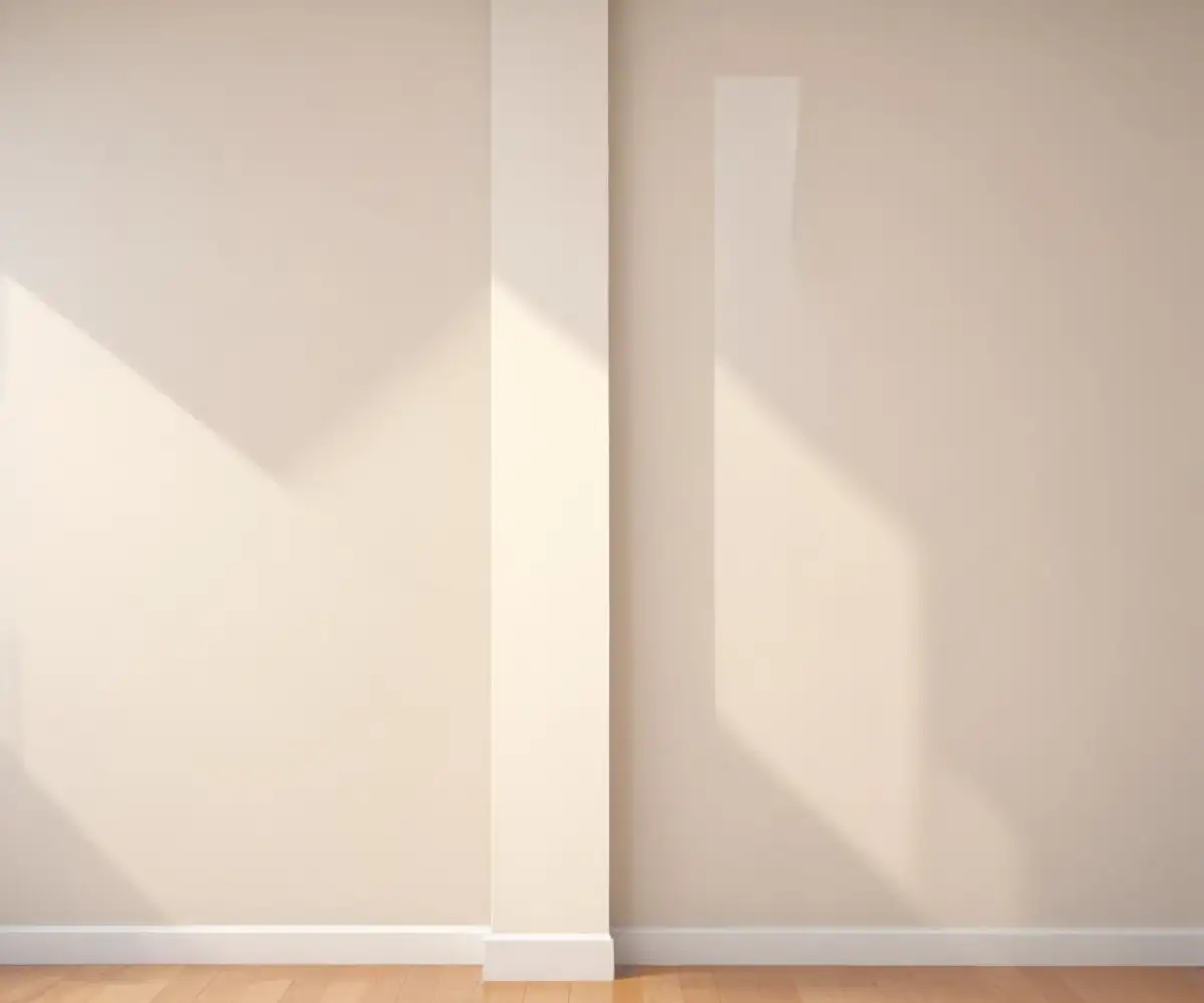
The type of natural light a room receives is the single most important factor in how an off-white will look. Observe your room throughout the day to understand its lighting profile.
- North-Facing Light: This light is cool and indirect, bringing out blue and gray undertones. In this light, Dove Wing is likely to look much grayer and potentially cold. Seapearl, with its touch of green warmth, may be a better choice to balance the coolness, though it too will appear more muted.
- South-Facing Light: This light is bright and warm all day long. Both colors will look their best here. Dove Wing will appear as a soft, warm off-white, and Seapearl will look beautifully creamy and inviting. The intense light will minimize the risk of unwanted undertones appearing.
- East-Facing Light: This light is bright and warm in the morning, then cooler in the afternoon. You must test the colors and observe them in both morning and evening to ensure you like how they shift. Dove Wing might feel perfect in the morning but too gray in the afternoon.
- West-Facing Light: This light is softer in the morning and becomes very warm and intense in the late afternoon. This warm evening light can make colors look more yellow or orange than they are. Dove Wing’s gray undertone can help balance this, while Seapearl might feel a bit too warm.
Step 2: Evaluate Your Artificial Lighting
Your light bulbs have a huge impact. LED bulbs come in different color temperatures, measured in Kelvins (K).
- Warm White (2700K-3000K): These bulbs cast a yellowish glow, which will enhance the warmth in both Dove Wing and Seapearl.
- Cool White (3500K-4100K): These bulbs have a more neutral or even bluish light, which will bring out the gray undertones in Dove Wing and could make Seapearl’s green undertone more apparent.
- Daylight (5000K-6500K): This intense, blue-white light will make both colors look cooler and starker. It will strongly emphasize the gray in Dove Wing.
For a paint that offers reliable performance across different product tiers, looking into a comparison between Behr paint lines can offer insights into what quality to expect at various price points.
Step 3: Consider Your Fixed Elements
Your paint color must harmonize with the “fixed” elements in your home—the things that are difficult and expensive to change. Bring your large paint samples and hold them up next to:
- Flooring: How does the paint look next to your wood floors’ undertones (yellow, orange, red)? Does it complement your tile or carpet?
- Countertops and Backsplash: In a kitchen, these are critical. A granite countertop with cool gray veining might favor Dove Wing, while a warmer, creamier quartz might look better with Seapearl.
- Furniture and Cabinetry: Your wall color should create a pleasing backdrop for your existing pieces. Hold samples behind your sofa, next to your wood furniture, and beside your kitchen cabinets.
Step 4: The Ultimate Test – Sampling Correctly
Do not paint a small swatch directly on your existing wall color. This will distort your perception of the new color. Instead, follow this professional method:
- Get large, movable samples. Paint two coats onto large poster boards or use peel-and-stick samples.
- Place them on different walls. Move the samples around the room to see how they look on walls that get direct light and walls that are in shadow.
- Observe over 48 hours. Look at the colors in the morning, at midday, in the late afternoon, and at night with your lights on. This is the only way to see how the undertones will shift.
- Compare them to each other. Place the sample of Dove Wing right next to the sample of Seapearl. This direct comparison will make their subtle undertones immediately obvious.
Making the Final Decision
After thorough testing, the choice often becomes clear.
Choose Benjamin Moore Dove Wing if:
- You have south-facing or ample warm light.
- Your decor leans transitional, modern farmhouse, or contemporary.
- You want to avoid any hint of green and prefer a more neutral, muted greige off-white.
- Your fixed elements include cooler tones like gray stone, dark wood, or crisp white trim.
Choose Benjamin Moore Seapearl if:
- You need to balance cool, north-facing light with a touch of warmth.
- Your style is more organic, coastal, or traditional.
- You want a creamy off-white that won’t look yellow.
- Your fixed elements include warm wood tones, earthy finishes, and creamy countertops.
Ultimately, both Dove Wing and Seapearl are stunningly complex neutrals that can create a timeless and elegant foundation for your home. The key is not to rush the process. By understanding their undertones and, most importantly, testing them properly in your unique environment, you can avoid the common pitfalls and choose with confidence. You can finally achieve that perfect, elusive off-white you’ve been searching for.