Delorean Gray Mapei Equivalent: Your Ultimate Guide to the Perfect Grout Match
You have meticulously selected the perfect tile. After weeks of searching, you found the one that perfectly captures your vision for a stunning new kitchen backsplash, bathroom floor, or feature wall. But now you face a decision that can make or break the entire project: choosing the grout color. This final detail seems small, but its impact is immense.
The problem arises when you have your heart set on a specific, popular color like Custom Building Products’ Delorean Gray, but your contractor prefers Mapei products, or your local store only stocks the Mapei brand. This common scenario leaves homeowners scrambling, trying to find an equivalent shade that won’t disrupt their design. Choosing the wrong gray can throw off the entire color palette, turning a dream project into a lasting regret.
You'll Learn About
Why Grout Color Is More Than Just Filler
Grout is not simply the stuff that fills the gaps between tiles; it is a critical design element that defines the final look of your surface. The right color can unify a space, create a seamless and expansive feel, or make the tile pattern pop with dramatic contrast. The wrong color, however, can look jarring, dirty, or completely wash out the beauty of your expensive tiles.
The secret to mastering grout selection lies in understanding undertones. Gray is rarely just gray; it often has subtle hints of blue (cool), beige (warm), or brown. Identifying these undertones is crucial for creating a cohesive and professional-looking finish. Mismatched undertones are often the culprit when a finished tile job just feels “off.”
Decoding Delorean Gray: The Perfect Mid-Tone Neutral
Before finding an equivalent, it is essential to understand what makes Delorean Gray so popular. It is widely considered one of the most versatile and reliable medium-gray grouts available. Its key strength is its remarkable neutrality. It typically reads as a true mid-tone gray without strong warm or cool undertones, although in certain lighting, it can show a hint of warmth.
This neutrality allows it to pair beautifully with a vast range of tile colors and styles, from classic white subway tiles to dramatic, dark porcelain. It provides enough contrast to define the tile shape without being overwhelmingly bold. This chameleon-like quality is why so many designers and homeowners specify it by name.
The Best Mapei Equivalent for Delorean Gray
After extensive research and comparison, the consensus points to one primary Mapei color as the closest match to Delorean Gray. However, a couple of other options are worth considering depending on your specific tile and lighting conditions. These shades are your best bet for achieving that coveted Delorean Gray look using Mapei products.
Mapei Warm Gray: The Top Contender
Despite its name, Mapei’s Warm Gray is overwhelmingly cited as the closest equivalent to Delorean Gray. Many users find that the “warmth” is extremely subtle and that it functions as a perfect mid-tone, neutral gray. It offers a similar depth and color saturation, creating a soft contrast that defines tiles without being too harsh.
This is the go-to choice for those seeking a direct replacement. It pairs exceptionally well with both warm-toned tiles, like beige or cream, and classic white tiles where a true neutral is desired. Many designers consider Mapei’s Warm Gray and Custom’s Delorean Gray to be virtually interchangeable for most applications.
Mapei Silver: A Slightly Cooler Alternative
If your tile has distinct cool undertones, such as Carrara marble with its blue-gray veining, Mapei’s Silver might be a better choice. While not a direct match to the neutrality of Delorean Gray, Silver is a beautiful light-to-medium gray that leans slightly cooler. It harmonizes perfectly with cool color palettes.
Choose Silver if you want to enhance the cool tones in your tile rather than introduce the very slight warmth that can sometimes be perceived in Delorean Gray or Warm Gray. It provides a crisp, clean look that feels modern and bright.
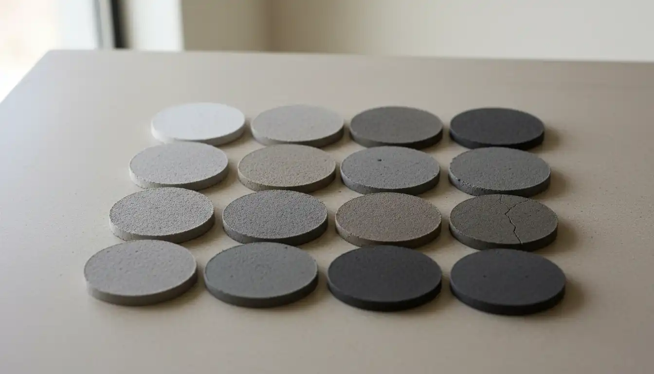
Side-by-Side Grout Comparison
Choosing a grout color from a screen can be misleading. However, a direct comparison of their intended characteristics can guide your decision. This table breaks down the top contenders to help you visualize which option is best suited for your project.
| Grout Color | Brand | Primary Undertone | Best For |
|---|---|---|---|
| Delorean Gray | Custom | Neutral (Slightly Warm) | A versatile, go-to medium gray for most tile types. |
| Warm Gray | Mapei | Neutral / Subtle Warmth | The closest overall match to Delorean Gray. |
| Silver | Mapei | Cool / Blue-Gray | Cool-toned tiles like marble, blue, or pure white tiles. |
| Pewter | Mapei | Neutral / Dark | Creating stronger contrast with light tiles for a bold look. |
The Critical Factors That Alter Final Grout Color
Here is a crucial piece of information that many articles overlook: the color on the sample stick is not always the color you will get on your wall or floor. Several on-site factors can dramatically change the final appearance of your grout, and being aware of them can save you from a costly mistake.
The amount of water used during mixing is paramount. Too much water can dilute the pigments, causing the grout to cure significantly lighter than intended and become weaker. Conversely, not enough water can make it difficult to work with and may result in a darker, uneven color. Always follow the manufacturer’s instructions to the letter.
The porosity of your tile also plays a role. Highly porous materials like unsealed natural stone or certain handmade ceramic tiles can absorb water from the grout mix too quickly. This rapid dehydration can affect the chemical curing process, leading to blotchy color and compromised strength. Sealing tile edges before grouting can help mitigate this issue. For challenging projects involving natural materials, consider using a product like a river rock color enhancer after installation to ensure both protection and visual depth.
How to Guarantee Your Grout Color Choice
Never, ever finalize your grout color based on an online image or the printed color on the bag. The only way to be 100% confident in your choice is to test it in the actual environment where it will be installed. Follow these foolproof steps to avoid any surprises.
First, obtain physical grout samples. Most tile stores have plastic sample sticks of different grout colors. Take these home and hold them up against your tile in the room where it will be installed. Observe how the color looks in the morning, afternoon, and evening, as well as with artificial lighting turned on.
For the most accurate preview, create a sample board. Get a few leftover pieces of your tile and affix them to a small piece of plywood or cardboard. Mix a small amount of the grout you are considering and apply it between these sample tiles. This allows you to see exactly how the grout will look next to the texture and color of your specific tile.
Finally, be patient. Wet grout is always significantly darker than its final, cured color. You must wait at least 48-72 hours for the sample to dry completely to see the true shade. This single step prevents the common panic of thinking the color is far too dark immediately after installation.
Common Mistakes to Avoid When Matching Grout
Navigating a home renovation can be stressful, and it’s easy to make small mistakes that have a big impact. Sometimes you might feel like you i hate contractors when communication breaks down over details like grout color. To prevent this, be clear and proactive in your choices. Avoid these common pitfalls.
The biggest error is trusting a digital image. Screens are not color-calibrated, and a photo of someone else’s kitchen cannot capture the unique lighting and conditions of your own home. Another mistake is ignoring undertones. Placing a warm-gray grout next to a cool-toned tile can create a subtle, unsettling clash.
Finally, don’t rush the process. Pressuring a contractor to grout before you have had a chance to test a sample is a recipe for disappointment. A good professional will understand the importance of this step and work with you to ensure you are happy with the final result. Remember, removing and replacing grout is a difficult, labor-intensive job to be avoided at all costs.
Frequently Asked Questions
What is the most popular Mapei gray grout color?
Warm Gray is exceptionally popular due to its versatility and its status as a close equivalent to other popular neutral grays on the market. Silver and Pewter are also common choices for those seeking cooler or darker options, respectively.
Will my grout dry lighter or darker?
Cement-based grout will always dry significantly lighter than it appears when it is wet. It is crucial to allow the grout to cure for at least 48 to 72 hours to see its true, final color before making any judgments.
Can I mix different grout colors together?
While technically possible, mixing different grout colors is not recommended. It is extremely difficult to achieve a consistent color across multiple batches, which can lead to a splotchy, unprofessional finish. It is much safer to find a single color that meets your needs.
Conclusion: Achieve a Flawless Finish with Confidence
The quest for the perfect Mapei equivalent to Delorean Gray ends with a clear frontrunner: Warm Gray. This versatile, neutral shade captures the essence of Delorean Gray, making it a reliable choice for a wide array of design projects. For cooler-toned tiles, Mapei’s Silver offers a crisp and complementary alternative.
Ultimately, the power to achieve a flawless finish lies in testing. By creating a sample board and observing it in your home’s unique lighting, you eliminate guesswork and move forward with certainty. This diligence ensures that your grout will perfectly enhance your tile, tying your entire project together for a beautiful, professional result that you will admire for years to come. This attention to detail is just as important as decisions about larger investments, like the overall porcelanosa kitchen cabinets cost, in achieving a high-end look.