Decorator’s White vs Super White: The Brutal Truth on Which “White” Is a Trap
Choosing a white paint feels like it should be the easiest decision in a renovation. It’s just white, after all. But this seemingly simple choice is a high-stakes trap that ensnares countless homeowners, leaving them with walls that look sterile, dingy, or worse—subtly the wrong color.
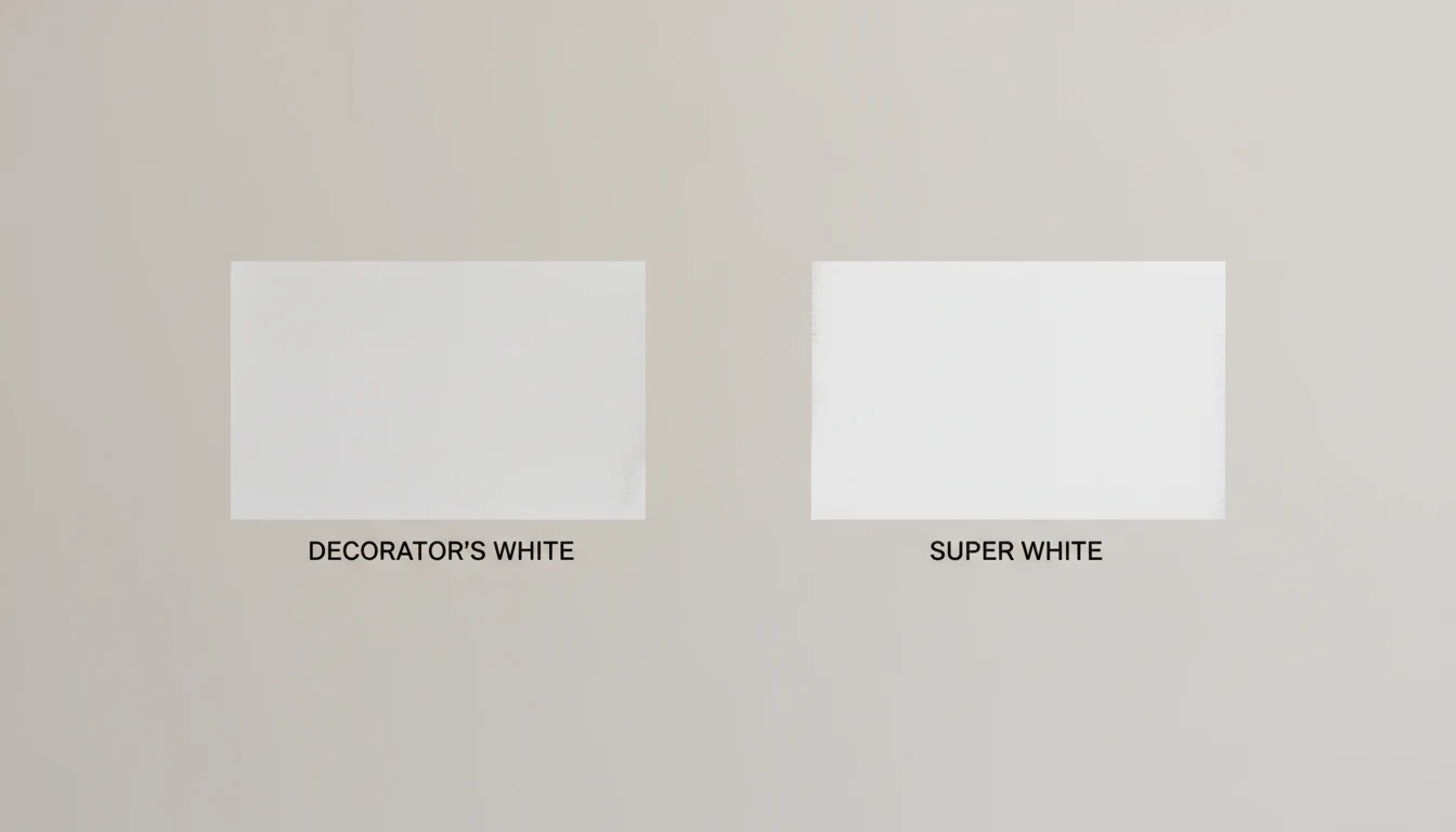
The problem isn’t a lack of options; it’s the paralyzing abundance of them. Standing at the forefront of this confusion are two of Benjamin Moore’s most iconic yet misunderstood shades: Decorator’s White and Super White. One promises a soft, designer-approved sophistication, while the other offers a clean, gallery-worthy crispness. Choose correctly, and your space is transformed into a bright, cohesive sanctuary. Choose poorly, and you’re left wondering why your “white” walls look blue, gray, or simply “off.”
You'll Learn About
The Core Difference: Undertones are Everything
To end the debate, you must understand one critical concept: undertones. These are the subtle hints of color hiding within a paint shade that completely change how it behaves in your home. The fundamental difference between Decorator’s White and Super White lies right here.
Decorator’s White (OC-149) is a soft white with noticeable cool gray and sometimes subtle violet undertones. This touch of gray “mutes” the white, preventing it from feeling stark or clinical. In contrast, Super White (OC-152 / PM-1) is one of Benjamin Moore’s purest, cleanest whites, defined by its lack of strong undertones. It is a crisp, bright, and unapologetically neutral white that aims to reflect light without adding any color bias. This single distinction is the primary driver of every decision that follows.
Deep Dive: Benjamin Moore Decorator’s White (OC-149)
Decorator’s White has long been a favorite among designers for its sophisticated and versatile nature. It offers a clean look without the harshness of a pure white, making it a popular choice for a variety of applications.
The Telltale Undertones of Decorator’s White
The defining characteristic of Decorator’s White is its soft gray undertone. In certain lighting, particularly cooler, north-facing light, this can also flash a hint of purple or blue. This prevents the color from feeling sterile, lending it a refined and calming quality. However, this same undertone is its greatest weakness; if paired with warm, creamy colors or placed in a poorly lit room, it can look dingy or dirty next to a brighter white.
Understanding its LRV (Light Reflectance Value)
Decorator’s White has an LRV of 84.6. LRV measures how much light a color reflects, with 100 being pure white. At 84.6, it reflects a significant amount of light, but it’s noticeably less bright than other popular whites like Chantilly Lace (92.2) or even Super White itself. This slightly lower LRV contributes to its softer, more muted appearance on the wall.
Where Decorator’s White Shines
This color is exceptionally well-suited for walls in modern, minimalist, or contemporary spaces where you want a white that feels intentional and soft. It is a fantastic choice for trim, doors, and cabinetry, especially when paired with cooler wall colors like grays, blues, and greens. Its ability to pair beautifully with materials like Carrara marble makes it a go-to for kitchens and bathrooms.
The Hidden Dangers of Decorator’s White
The biggest mistake is using it in a room with inadequate or cool-toned natural light. In a north-facing room, its gray undertones can become overwhelmingly prominent, making the room feel cold and shadowy. Furthermore, never pair Decorator’s White trim with a warmer white wall color like White Dove or Swiss Coffee; the contrast will make the trim look discordantly blue-gray.
Deep Dive: Benjamin Moore Super White (OC-152)
Super White is the color purists reach for. It’s clean, crisp, and delivers a gallery-like aesthetic that makes it a powerful tool in a designer’s arsenal.
The Unforgiving Purity of Super White
Super White is revered for its neutrality. It has minimal to no discernible undertones, making it one of the truest whites available. This purity means it provides a stark, high-contrast look that can make other colors pop. It’s the ultimate clean slate, reflecting light and color without influencing them.
The High-Impact LRV of Super White
With an LRV of 89.09, Super White is significantly brighter and more reflective than Decorator’s White. This high LRV means it will bounce a tremendous amount of light around a room, making spaces feel larger and more open. It is this intense reflectivity that makes it a superb choice for creating sharp, clean lines.
Where Super White Dominates
Super White is the undisputed champion for trim, doors, ceilings, and cabinetry. When you want a crisp, clean border that contrasts sharply with your wall color—no matter what that color is—Super White delivers. On walls, it creates a stark, minimalist, gallery-like effect that works best in spaces with abundant natural light and modern architecture.
When Super White Fails
On walls in rooms with low or cool-toned light, Super White can quickly feel cold, sterile, and clinical. Its starkness can highlight every imperfection on a wall’s surface, making it unforgiving of flaws. If you are seeking a soft, cozy, or inviting atmosphere for a living room or bedroom, using Super White on the walls can be a major misstep, leading to a space that feels more like a hospital than a home.
Head-to-Head: The Ultimate Comparison Table
Sometimes, seeing the data side-by-side is the only way to make a clear choice. Here is a direct comparison of the key attributes that define these two whites.
| Feature | Decorator’s White (OC-149) | Super White (OC-152) |
|---|---|---|
| Primary Undertone | Cool Gray, subtle violet/blue | None (Neutral) |
| LRV (Brightness) | 84.6 (Bright, but softer) | 89.09 (Very bright, crisp) |
| Overall Feel | Soft, sophisticated, muted, calming | Crisp, clean, bright, stark, modern |
| Best For Walls | Modern spaces with good lighting | Minimalist, gallery-style rooms with abundant light |
| Best For Trim/Doors | Excellent with cool wall colors | Excellent with virtually any wall color |
| Pairs Best With | Cool grays, blues, greens, marble | Bold colors, modern decor, sharp lines |
| Avoid In | North-facing or low-light rooms; with warm whites | Low-light rooms or if seeking a cozy feel |
The #1 Factor You’re Ignoring: Lighting
No paint color exists in a vacuum. Its final appearance is dictated entirely by the light that hits it. This includes not only the direction your windows face but also a factor most people completely overlook: the color temperature of your light bulbs.
Natural Light: The Four Exposures
The direction your windows face drastically alters how paint colors appear.
- North-Facing Rooms: This light is cool and indirect, which will amplify the gray and blue undertones in Decorator’s White, potentially making it look dreary. Super White may appear stark and cold here.
- South-Facing Rooms: This light is bright and warm all day. Both whites will look their truest and best in this environment. Super White will be brilliantly bright, while Decorator’s White will appear as a perfect soft neutral.
- East-Facing Rooms: Bright and warm in the morning, cooler in the afternoon. A color might look perfect at 9 AM but feel cold by 4 PM.
- West-Facing Rooms: Softer in the morning, with intense, warm light in the late afternoon. This warm evening light can soften the starkness of Super White.
Artificial Lighting: The Secret Room-Wrecker
Here is where many well-laid plans fall apart. The type of light bulb you use can either enhance or ruin your paint choice. This is measured in Kelvins (K), and understanding it is non-negotiable.
- Warm White (2700K – 3000K): These bulbs cast a cozy, yellow-hued light. They can make Super White look softer but can sometimes bring an unwanted muddiness to the gray undertones in Decorator’s White.
- Neutral/Cool White (3500K – 4500K): This light is more neutral and balanced. It’s often the best choice for kitchens and bathrooms and will represent both whites fairly accurately.
- Daylight (5000K+): This light has a bluish tint and is very intense. It will make Decorator’s White look much cooler and can push Super White into feeling almost clinically sterile.
How to Choose Without Regret: The Pro Testing Method
Never, ever choose a white paint color from a tiny chip under the fluorescent lights of a hardware store. To make a confident decision, you must test the colors properly in your own space.
Step 1: Ditch the Tiny Paint Chips
Small paint chips are misleading. The surrounding colors in the store and on the paint card distort your perception. They are only useful for initial narrowing down, not final decisions.
Step 2: Use Large Samplize Boards or DIY
The best method is to use large, movable samples. Companies like Samplize offer peel-and-stick samples made with real paint. Alternatively, get sample pots and paint two coats onto large white poster boards, leaving a white border around the edge.
Step 3: The Multi-Wall, Multi-Time Test
Place your large samples on different walls within the same room. A color can look different on the wall opposite the window compared to the wall next to it. Observe the samples at different times of day: in the bright morning light, at midday, and at night with your artificial lights on. This is the only way to see how the undertones will truly behave.
Step 4: Compare Against Your Fixed Elements
This is a critical step. Hold your samples directly next to your flooring, kitchen cabinets, countertops, backsplash, and large furniture pieces. The right white will create harmony with these elements; the wrong one will clash, making your existing finishes look yellow, pink, or dingy in comparison.
Final Verdict: Which White Is Right For You?
The choice between Decorator’s White and Super White isn’t about which color is “better,” but which is functionally correct for your unique space, lighting, and decor.
Choose Decorator’s White if:
- You want a soft, sophisticated white for your walls that doesn’t feel stark.
- Your space has ample, balanced natural light.
- You are pairing it with cool colors like grays, blues, or with finishes like marble.
Choose Super White if:
- You need a crisp, pure, brilliant white for trim, doors, or cabinets to create sharp contrast.
- You want a modern, gallery-like feel on your walls and have abundant natural light to support it.
- You need a neutral white that will not clash with any other color in your design scheme.
Ultimately, the power to choose the right white lies in understanding the subtle forces of undertone and light. For a flawless finish, proper prep is key, and this sometimes means starting from scratch. When dealing with old layers, knowing whether to use Citristrip Paste vs Gel can save you hours of frustration. And once you’ve selected your perfect white, remember that the quality of the paint itself matters just as much; a debate like Showcase vs Emerald highlights how different paint lines can affect the final look and durability. A wall painted in a brilliant white can be the perfect backdrop for other elements; for those in rentals, knowing how to hang a whiteboard in an apartment can complete a clean, functional space. By testing diligently and respecting the powerful influence of light, you can avoid the white paint trap and select a shade that elevates your home with confidence.