Cherry Wood Furniture With Gray Walls: The #1 Secret to a Modern Look
The classic elegance of cherry wood furniture can feel at odds with the modern appeal of gray walls. Many homeowners find this combination looks dated or that the colors clash, creating a space that feels heavy and uninspired rather than chic and sophisticated. This design challenge often stems from a misunderstanding of color theory, specifically the undertones present in both the wood and the paint.
Cherry wood’s rich, red undertones can fight against the cool, often blue or green, undertones in many popular gray paints. The result is a room where the furniture and walls seem to compete for attention, leaving the space feeling visually jarring and disconnected. But this classic combination doesn’t have to be a design dead end.
The key to success lies in understanding and mastering the balance of these undertones. With the right approach, you can create a harmonious, elegant, and surprisingly modern interior. This guide will unlock the secrets to making cherry wood and gray walls work together beautifully.
You'll Learn About
The Undertone Problem: Why Cherry and Gray Can Clash
The primary reason cherry wood furniture struggles with gray walls is the battle of undertones. Cherry wood isn’t just a simple brown; it’s characterized by deep, warm red and orange undertones. These undertones give it a traditional, luxurious feel, reminiscent of heritage pieces like you might find in Old Meeting House furniture collections.
Gray paint, on the other hand, is rarely a pure, neutral gray. It almost always leans toward a specific color temperature. Cool grays have blue, purple, or green undertones, while warm grays (often called “greige”) have yellow, beige, or brown undertones.
When you pair cherry wood’s strong red hues with a cool gray that has prominent blue undertones, the colors can appear to vibrate against each other. This creates a high-contrast look that can feel jarring and dated, rather than cohesive and intentional. It makes the rich wood look old-fashioned and the trendy gray feel cold and sterile.
Beyond Paint: The Role of Lighting
Natural and artificial light play a massive role in how colors are perceived. North-facing rooms receive cooler, bluer light, which can amplify the cool undertones in gray paint and make cherry wood appear even darker and more imposing. South-facing rooms get warmer, more yellow light, which can help bridge the gap between warm wood and cool walls.
The type of lightbulbs you use also has a significant impact. LED bulbs come in a range of color temperatures, from “cool white” (which mimics daylight) to “warm white” (which has a cozier, yellowish glow). Using the wrong bulb can sabotage your color scheme entirely, making your carefully chosen gray paint look completely different than it did on the swatch.
The Solution: Creating Harmony Between Wood and Wall
Unlocking a stunning design with cherry wood and gray walls is about strategic selection and balance. The goal is to choose a gray that either complements or intentionally contrasts with the cherry wood’s red undertones in a way that feels deliberate and sophisticated. Success is not just possible; it’s a formula.
This approach transforms the combination from a potential design pitfall into a powerful statement of style. It’s about making the classic wood feel fresh and the modern paint feel timeless. The following steps provide a clear path to achieving this elegant harmony.
Step 1: Identify Your Cherry Wood’s Dominant Undertone
Before you even look at a paint swatch, examine your furniture closely. Does it have a deep, burgundy-red hue, or does it lean more towards a brighter, orange-red? Place a pure white sheet of paper next to the wood to help your eyes isolate the true undertones.
Understanding the specific shade of your cherry wood is the critical first step. This knowledge will guide your paint selection process and prevent you from choosing a gray that will actively fight against your furniture. This is the foundation upon which your entire color palette will be built.
Step 2: Choose the Right Gray Paint
Once you know your wood’s undertone, you can select the perfect gray. Your best bet is to opt for a warm gray or a greige. These grays contain beige or yellow undertones that will naturally complement the warmth of the cherry wood, creating a cohesive and inviting atmosphere.
If you prefer a more traditional, higher-contrast look, you can choose a cool gray. However, it’s crucial to select one with soft, subtle undertones. A gray with a slight hint of green can be surprisingly effective, as green is opposite red on the color wheel, creating a pleasing and balanced contrast that feels intentional.
Always test paint samples on your wall in different lighting conditions throughout the day. Paint a large swatch next to the furniture to see how the colors interact. This step is non-negotiable for avoiding costly mistakes.
| Gray Paint Type | Best For | Feeling & Mood | Expert Tip |
|---|---|---|---|
| Warm Gray (Greige) | Most cherry wood tones | Cozy, harmonious, inviting | Look for grays with visible beige or taupe undertones to create a seamless transition. |
| Cool Gray (Blue/Green Undertone) | Creating intentional contrast | Sophisticated, formal, modern | Choose a muted cool gray, not a stark one. A soft gray-green often works best. |
| Neutral Gray (Minimal Undertone) | Modern, minimalist spaces | Clean, architectural, crisp | Requires careful use of textiles and lighting to avoid feeling sterile. Best with sleek furniture lines. |
Step 3: Bridge the Colors with a Cohesive Palette
With your main colors selected, the next step is to build a palette that ties everything together. This is where you can introduce accent colors through decor, textiles, and art. These supporting colors will act as a bridge between the warm wood and the cool walls.
Think in terms of a “color triad.” You have your warm wood (red/orange base) and your gray wall. The third color should complement both. Earthy greens, deep blues, and even rich creams work exceptionally well.
For example, navy blue throw pillows on a sofa can pick up on the coolness of the gray walls while providing a rich contrast to the cherry furniture. A cream-colored area rug can provide a neutral base that brightens the room and connects the other elements. This careful layering of color is what makes a room feel professionally designed.
Step 4: Leverage Texture and Material Finishes
A common mistake is focusing solely on color. Texture is equally important for creating a rich, layered look that prevents the space from feeling flat. The smooth, often polished finish of cherry wood furniture needs to be balanced with varied textures throughout the room.
Incorporate materials like linen curtains, a chunky knit throw blanket, or a jute area rug. These elements add visual interest and softness. When selecting metals for lamps, hardware, and decor, brushed nickel, silver, or matte black work beautifully with cooler gray walls and provide a modern update to the traditional feel of cherry wood.
If your flooring is also wood, you might be wondering about coordination. It’s perfectly acceptable to have wood stairs a different color than the floor, and the same principle applies here; the key is ensuring the undertones don’t clash.
Executing the Design: Room by Room Strategies
Applying these principles will look slightly different depending on the room’s function and existing elements. A living room has different needs than a bedroom, and the amount of natural light can dictate your choices. Let’s break down how to tailor this combination for different spaces in your home.
The goal is to create a consistent feel while allowing each room’s unique purpose to shine through. This involves adjusting the intensity of your accent colors, the scale of your furniture, and the type of lighting you use. This thoughtful application is the final layer of a successful design.
The Living Room: Creating a Welcoming Hub
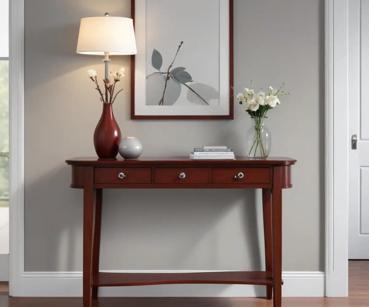
In the living room, comfort is key. Start by anchoring the space with a large area rug in a neutral tone like cream or a soft, warm beige. This creates a visual break between the cherry wood furniture and the floor, making the room feel larger and more open.
Choose upholstery for sofas and chairs in solid, neutral fabrics. Think light gray, oatmeal, or a deep charcoal. Introduce your accent colors through pillows, throws, and artwork. A gallery wall that incorporates frames in black, silver, and a matching cherry wood tone can be a powerful way to tie the entire room together.
The Dining Room: A Sophisticated Space for Entertaining
A dining room is often a more formal space, and this color combination can create an incredibly elegant atmosphere. A large cherry dining table and chairs against a medium-to-dark warm gray wall can feel dramatic and luxurious. The key here is lighting.
A statement chandelier with a metallic finish (like brushed silver or aged brass) will draw the eye upward and provide warm, ambient light. Use an upholstered runner on the table in a color that complements your accents, and consider upholstered end chairs to soften the look of the wood. Remember to protect your floors, as the constant movement of chairs can cause damage, a problem homeowners also face when a Dyson is scratching hardwood floors.
The Bedroom: A Serene and Restful Retreat
For the bedroom, the goal is to create a calm and relaxing environment. Opt for a lighter shade of warm gray or greige for the walls. This will make the space feel airy and serene, preventing the often-heavy feel of a full cherry wood bedroom set from overwhelming the room.
Layer the bed with soft textiles in various shades of cream, white, and your chosen accent color. Soft blues and muted greens are excellent choices for a bedroom palette. Use table lamps with fabric shades to cast a soft, diffused glow that enhances the cozy atmosphere.
Final Considerations: The Details That Make the Difference
You’ve chosen your paint, arranged your furniture, and selected your textiles. Now it’s time for the final touches that elevate the design from good to great. These small details are often overlooked but are crucial for creating a polished and cohesive space.
Think about the flow of your home, the hardware on your furniture, and the greenery you introduce. Each element is an opportunity to reinforce your design concept. This is where you truly personalize the space and make it feel uniquely yours.
Hardware and Fixtures
The hardware on your cherry wood furniture—drawer pulls, knobs, and hinges—presents a key opportunity. If the existing hardware is dated (often a shiny, yellow brass), swapping it out is a low-cost, high-impact update. Switching to brushed nickel, polished chrome, or matte black hardware will instantly modernize the furniture and tie it in with the cool tones of the gray walls.
Bringing in Nature
Finally, don’t underestimate the power of greenery. Houseplants add life, color, and texture to any room. The vibrant green leaves provide a beautiful, natural contrast to the red tones in the cherry wood and the neutral gray of the walls. A tall fiddle-leaf fig in a corner or a collection of small succulents on a bookshelf can make the entire space feel more alive and complete.