Cambria Torquay vs Swanbridge: The #1 Mistake You Can’t Afford To Make
Choosing the perfect white quartz countertop feels like the final, monumental decision in a kitchen remodel. You’ve agonized over cabinet colors, flooring, and fixtures. Now, you’re faced with two stunning options from a top-tier brand like Cambria: Torquay and Swanbridge.
Online, they can look deceptively similar. Both offer a sophisticated, marble-like aesthetic that promises to elevate your space. Yet, choosing the wrong one can be a disastrously expensive mistake that clashes with your entire design vision.
The core problem isn’t about which one is “better,” but which one is right for your specific kitchen. The subtle differences in their base tones and veining patterns are the critical details that can make or break your design’s harmony. This guide will illuminate those differences and give you a foolproof method for making the perfect choice.
You'll Learn About
Torquay vs. Swanbridge: A Head-to-Head Visual Analysis
Understanding the distinct personality of each design is the first step. While both mimic the luxury of natural stone, they speak very different design languages. One whispers classic elegance, while the other projects modern confidence.
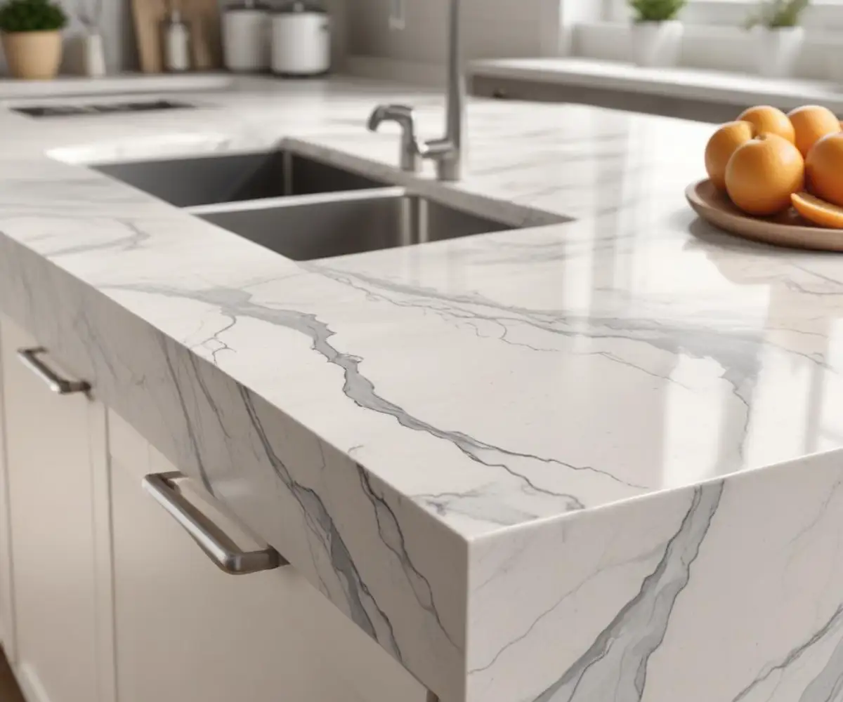
The Classic Elegance of Cambria Torquay
Think of Cambria Torquay as the timeless choice that has graced beautiful kitchens for years. Its foundation is a soft, creamy white, providing a gentle warmth that feels inviting and classic. It avoids the stark, sterile feeling that some brighter whites can create.
The veining is subtle and sophisticated, with delicate swirls of light gray and hints of taupe. This pattern closely resembles the gentle beauty of Carrara marble, making it a perfect fit for traditional, transitional, and modern farmhouse kitchens where a touch of warmth is desired.
The Modern Sophistication of Cambria Swanbridge
Cambria Swanbridge is the more contemporary counterpart. It features a cooler, light off-white base that provides a crisp and clean backdrop. This cool tone is perfect for modern designs that emphasize brightness and airiness.
What sets Swanbridge apart is its more defined and dynamic veining. It has a medium-toned gray pattern with charcoal accents and white streams that create a sense of depth and movement across the slab. This makes it a fantastic choice for contemporary, minimalist, or transitional spaces that need a focal point without overwhelming the senses.
Beyond the Surface: Key Differences That Matter
At a glance, you might miss the crucial distinctions. However, when you place these two side-by-side, their unique characteristics become clear. Understanding these differences is essential to prevent a design mismatch with your cabinets and lighting.
This table breaks down the fundamental differences between these two popular designs.
| Feature | Cambria Torquay | Cambria Swanbridge |
|---|---|---|
| Base Color Tone | Warm, creamy off-white | Cool, crisp off-white |
| Veining Color & Pattern | Subtle, flowing light gray and taupe veining | More defined charcoal gray veining with white accents |
| Overall Vibe | Classic, soft, elegant, traditional | Modern, crisp, bright, contemporary |
| Best Paired With | Creamy white, greige, beige, and wood tone cabinets | Bright white, pure white, gray, and blue cabinets |
| Design Style | Transitional, Farmhouse, Traditional | Contemporary, Modern, Minimalist |
The Decisive Factor: Warm vs. Cool Tones
The single most important factor in your decision is the undertone. Torquay is warm, and Swanbridge is cool. This isn’t just a minor detail; it dictates how the countertop will interact with every other color in your kitchen, especially your cabinets.
Torquay’s creamy base beautifully complements cabinets painted in warm whites (like Benjamin Moore White Dove), greiges, and natural wood tones. Swanbridge’s cooler base is the perfect partner for crisp, pure white cabinets (like Benjamin Moore Chantilly Lace), shades of gray, and even bold blues or greens.
One aspect many homeowners overlook is the profound impact of lighting. A north-facing room with cool, blue-toned natural light can make Torquay look dingy, while it will make Swanbridge feel right at home. Conversely, a south-facing room with warm, yellow light can wash out Swanbridge’s cool details but will enhance Torquay’s creamy elegance.
The temperature of your artificial lighting (measured in Kelvins) also plays a huge role. Warm bulbs (~2700K) will amplify Torquay’s warmth, while cool bulbs (~4000K-5000K) will highlight Swanbridge’s crispness. Mixing warm countertops with cool lighting, or vice-versa, can create a confusing and disjointed look.
How to Choose: A Practical Step-by-Step Guide
Making the right choice requires more than just looking at pictures online. You need a hands-on, methodical approach to ensure the countertop you select creates a cohesive and stunning final result in your home.
Step 1: Analyze Your Existing Elements
Your countertops don’t exist in a vacuum. Start by taking inventory of the fixed elements in your kitchen. The most significant of these is your cabinet color, as it represents the largest vertical surface area in the room.
Also, consider your flooring, wall color, and even the finish of your appliances. A cohesive design requires that all these elements work in harmony. This is particularly crucial if you are considering the popular trend of using the same countertop and backsplash, as this will double the visual impact of your chosen stone.
Step 2: Get Physical Samples (Non-Negotiable!)
This is the most critical step in the entire process. Computer monitors and phone screens cannot accurately represent the color and depth of a quartz slab. You must obtain physical samples of both Torquay and Swanbridge.
Do not settle for the small 2×2 inch chips. Visit a showroom and ask for the largest samples they have available, ideally 12×12 inches. A larger sample gives you a much better sense of the veining’s scale and pattern repeat.
Take these samples home and view them in your kitchen. Place them on your existing counters and observe them throughout the day. See how they look in the morning light, in the direct afternoon sun, and under your artificial kitchen lighting at night. This is the only way to truly understand how they will look and feel in your space.
Step 3: The Paint Chip Test
For an undeniable confirmation, perform a direct comparison test. Take the actual paint chip for your cabinet color (or a sample door if you have one) and place it directly against both the Torquay and Swanbridge samples. The right choice will become immediately obvious.
If your cabinet is a warm white, you will see it harmonize beautifully with Torquay’s creamy base while potentially making Swanbridge look too stark or blue in comparison. If your cabinet is a pure, crisp white, you will see it align perfectly with Swanbridge’s cool tone while making Torquay look yellowish or dated. This simple test removes all guesswork.
Beyond Aesthetics: Performance and Cost
While the visual decision is paramount, it’s also important to consider the practical aspects. How do these two designs compare in terms of everyday use, maintenance, and budget?
Fortunately, because both Torquay and Swanbridge are made by Cambria, their performance characteristics are identical. Both are crafted from pure, natural quartz, making them incredibly durable and resistant to scratches and chips. Their non-porous surface means they are stain-resistant and never require sealing, a significant advantage over materials like concrete, which is a common complaint from homeowners. If you’ve ever thought, “I hate my concrete countertops,” the easy maintenance of quartz will be a welcome change.
In terms of price, Cambria typically organizes its designs into different price groups. Both Torquay and Swanbridge generally fall within the same price category, meaning the cost should not be a deciding factor between them. When evaluating the investment, it’s helpful to understand how different brands are positioned; some homeowners find value in comparing options, as seen in various Vicostone quartz reviews which highlight different features at different price points.
Answering Your Top Questions about Torquay and Swanbridge
Even after a detailed comparison, some common questions often arise. Addressing these concerns can help you make your final decision with complete confidence.
Is Cambria Torquay dated?
Absolutely not. Torquay is a classic, not a passing trend. Its resemblance to natural Carrara marble gives it a timeless quality that has been desirable for centuries. While newer designs have emerged, Torquay’s soft, elegant look remains a go-to choice for creating warm and inviting kitchens.
Can Swanbridge look too busy?
This depends on the surrounding elements. Swanbridge’s veining is more pronounced than Torquay’s, but it is still considered relatively subtle compared to other high-contrast quartz designs on the market. In a kitchen with simple, solid-colored cabinets and a subdued backsplash, Swanbridge adds a perfect touch of visual interest without overwhelming the space.
Which one is better for resale value?
Both are excellent choices that will appeal to future buyers. As premium quartz from a leading brand, both Torquay and Swanbridge signify a high-quality kitchen. The “better” choice for resale is the one that creates the most cohesive and beautifully designed kitchen overall. A well-executed design with either stone will add significant value.
The Final Verdict: Torquay or Swanbridge?
The decision between Cambria Torquay and Cambria Swanbridge ultimately comes down to a single, critical element: the undertone. Your choice must be dictated by the existing colors in your kitchen, primarily your cabinet paint.
Choose Cambria Torquay if your design calls for warmth and classic elegance, perfectly complementing creamy whites, greiges, and natural woods. Choose Cambria Swanbridge if your vision is for a crisp, modern space that pairs seamlessly with bright whites, grays, and cool-toned colors.
Your journey to the perfect countertop ends not with a guess, but with a confident, informed decision. By following the steps to analyze your space and, most importantly, testing large samples in your own home’s unique lighting, you can be certain that your choice will be the crowning jewel of your kitchen for years to come.