Bleeker Beige vs Manchester Tan: Don’t Pick a Paint Color Until You See This
Choosing the perfect neutral paint color is one of the most agonizing decisions in home design. You want a color that is versatile, timeless, and creates the right mood, but the sea of beige, tan, and greige options can be overwhelming. Make the wrong choice, and a room can feel dated, dingy, or cold.
Two of Benjamin Moore’s most celebrated neutrals, Bleeker Beige (HC-80) and Manchester Tan (HC-81), consistently rise to the top of this debate. While they sit right next to each other in the color deck, their subtle differences can dramatically alter the look and feel of your space. This guide breaks down every critical detail to help you finally decide.
You'll Learn About
Unveiling the Contenders: A Side-by-Side Introduction
At first glance, these two colors from Benjamin Moore’s Historical Collection seem incredibly similar. Both are sophisticated, warm neutrals that provide a beautiful backdrop for a wide range of decor styles. However, their core composition—their undertones and light reflectance value (LRV)—sets them on distinctly different paths.
Benjamin Moore Bleeker Beige (HC-80)
Bleeker Beige is a muted, earthy beige with noticeable gray undertones. This touch of gray places it firmly in the “greige” category for many designers, making it a more modern and balanced neutral. It’s a medium-toned color that feels grounded and calming without being too dark.
Benjamin Moore Manchester Tan (HC-81)
Manchester Tan is a warmer, brighter beige with soft yellow and green undertones. This gives it a sunnier, more inviting disposition. It’s often described as a classic, creamy tan that feels both elegant and cozy, making it a long-standing favorite for traditional and transitional homes.
The Critical Difference: Undertones and LRV Explained
The true character of a paint color is revealed through its undertones and how it interacts with light. This is where the battle between Bleeker Beige and Manchester Tan is truly won or lost for your specific room.
The Undertone Battle: Cool Gray vs. Warm Green/Yellow
The most significant distinction lies in their undertones. Bleeker Beige’s gray undertone cools it down, preventing it from ever looking too golden or peachy. This makes it exceptionally versatile, pairing well with both warm and cool color palettes. However, in rooms with limited natural light, especially north-facing rooms, this gray can become more pronounced, making the color feel a bit flat or muddy if not balanced properly.
Conversely, Manchester Tan’s subtle green and yellow undertones give it a distinct warmth. This warmth makes it fantastic for creating a cozy, welcoming atmosphere. In south-facing rooms or spaces with abundant warm light, these yellow undertones can become more prominent, which might be too much for some homeowners. The green undertone is what keeps it from becoming a dated, purely yellow-beige.
LRV: Why It Matters for Your Space
Light Reflectance Value (LRV) measures how much light a color reflects on a scale of 0 (absolute black) to 100 (pure white). The higher the LRV, the lighter and brighter the color will feel.
- Manchester Tan has an LRV of 63.24, placing it in the light range. It reflects a good amount of light, which can help make a space feel larger and more open.
- Bleeker Beige has an LRV of 51.66, making it a mid-tone color. It absorbs more light than Manchester Tan, giving it more depth and saturation. This can create a cozier, more intimate feeling in a room.
The Room-by-Room Showdown: Where Each Color Shines
Understanding the technical details is one thing; applying them to your actual home is another. Here’s how these colors typically perform in different areas of the house.
Living Rooms and Open-Concept Spaces
For large, open areas, Manchester Tan is a safe and inviting choice. Its higher LRV helps keep the space feeling bright and airy, and its warm undertones create a welcoming vibe for guests. It pairs beautifully with warm wood tones and traditional furniture.
Bleeker Beige offers a more contemporary and sophisticated look. Its grounded, earthy feel works well in modern or transitional spaces, especially when paired with crisp white trim and a mix of metal finishes. It provides a neutral backdrop that allows artwork and decor to stand out.
Bedrooms: Creating Your Sanctuary
The choice here depends entirely on the mood you want to create. Manchester Tan fosters a cozy and restful atmosphere, perfect for a warm and inviting bedroom retreat. It pairs well with soft textiles and layered neutrals.
Bleeker Beige creates a more serene and tranquil environment. Its gray undertones give it a calming presence that is ideal for a peaceful sanctuary. It works exceptionally well with muted greens, blues, and other earthy tones.
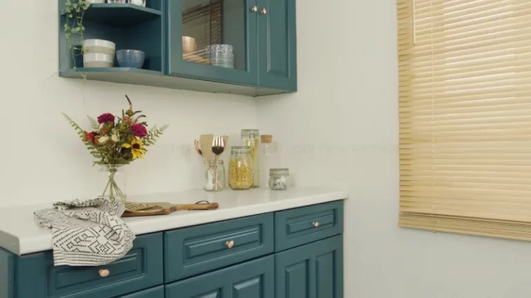
Kitchens and Cabinets
In kitchens, the existing finishes are paramount. Manchester Tan is a classic choice for pairing with creamy or warm white cabinets and countertops with gold or brown veining. It harmonizes well with warm wood floors and brass or bronze hardware.
Bleeker Beige is more flexible and often feels more updated. It looks stunning with crisp white cabinets and countertops that have cool gray or blue veining, like Carrara marble. It also provides a beautiful contrast against dark wood or painted cabinets in shades like navy or deep green.
The Ultimate Test: North-Facing vs. South-Facing Rooms
Lighting is the secret ingredient that can make or break a paint color. A color you love in a friend’s sunny, south-facing living room might look completely different in your north-facing bedroom.
For north-facing rooms, which receive cooler, indirect light, Manchester Tan is often the superior choice. Its inherent warmth helps to balance the cool-toned light, preventing the room from feeling dreary. Bleeker Beige can sometimes look drab or washed out in these spaces as the cool light amplifies its gray undertones.
For south-facing rooms, which are flooded with warm, bright light all day, Bleeker Beige is a clear winner. The intense sunlight can make Manchester Tan appear too yellow, while Bleeker Beige’s gray undertones neutralize the warmth, resulting in a perfectly balanced, soft beige.
Coordinating with Trim, Flooring, and Decor
A wall color never exists in isolation. Its success depends on how well it coordinates with the other elements in your room.
The Best White Trim Colors
Choosing the right white trim is crucial for making your wall color pop. For Manchester Tan, softer, warmer whites work best. Consider Benjamin Moore White Dove or Cloud White to complement its creamy feel without creating a stark contrast.
For Bleeker Beige, you have more options. A crisp, clean white like Benjamin Moore Chantilly Lace creates a modern, sharp contrast that highlights its greige quality. For a slightly softer look, White Dove also works beautifully here.
Flooring and Furniture Pairings
Manchester Tan pairs naturally with medium-to-dark warm wood floors, like oak and cherry. It complements traditional and farmhouse furniture styles with ease. Bleeker Beige, with its neutral base, works well with a wider variety of flooring, from light blonde woods to dark espresso stains and even cool-toned gray flooring. It is a perfect match for modern, minimalist, and transitional decor.
Key Differences at a Glance
This table summarizes the essential characteristics of each color to help you make a quick comparison.
| Feature | Benjamin Moore Bleeker Beige (HC-80) | Benjamin Moore Manchester Tan (HC-81) |
|---|---|---|
| LRV (Light Reflectance Value) | 51.66 (Mid-tone) | 63.24 (Light) |
| Primary Undertone | Gray | Yellow / Green |
| Color Temperature | Warm Greige (Cooler Beige) | Warm Tan (Warmer Beige) |
| Best For | South-facing rooms, modern/transitional spaces, pairing with cool tones. | North-facing rooms, traditional/farmhouse spaces, creating a cozy feel. |
| Pairs Best With (Trim) | Chantilly Lace (crisp), White Dove (soft) | White Dove (soft), Cloud White (warm) |
| Vibe | Sophisticated, grounded, serene, modern. | Inviting, cozy, bright, classic. |
The Overlooked Factor: How Sheen Changes Everything
One critical aspect that most comparisons miss is the impact of paint sheen. The finish you choose can subtly—or sometimes dramatically—alter how these colors appear on your walls. Understanding this can prevent costly repainting and help you master the final look.
For Bleeker Beige, a matte or flat finish enhances its earthy, almost concrete-like quality. This is perfect for achieving a sophisticated, minimalist aesthetic where you want the color to feel deep and velvety. An eggshell finish, however, will provide a soft glow that prevents the gray undertones from looking too flat, especially in rooms with less natural light. This is generally the most versatile and recommended sheen.
For Manchester Tan, a higher sheen like eggshell or satin will amplify its light-reflecting properties and its warm undertones. This can make a room feel even brighter and more luminous, but be cautious in very sunny rooms where it might create too much glare or enhance the yellow undertones. A matte finish can tone down the warmth, giving Manchester Tan a softer, more muted appearance that feels very classic and understated. When choosing between paint lines, it’s helpful to understand the differences, as seen in comparisons like Showcase vs Emerald, where sheen quality can vary.
How to Make the Final, Confident Decision
You can read articles and look at photos all day, but you cannot choose a paint color without testing it in your own home. The unique combination of your lighting, flooring, and furnishings will ultimately determine how a color looks.
Never, ever paint a small swatch directly on your wall. The existing wall color will influence your perception. Instead, follow these professional steps for foolproof testing:
- Get Large Samples: Purchase sample pots of both Bleeker Beige and Manchester Tan. Paint them on large (at least 2×2 feet) white poster boards or peel-and-stick sample sheets.
- Move Them Around: Place the painted boards on different walls within the same room. A color will look different on a wall that gets direct light versus one that is in shadow.
- Check at All Hours: Observe the colors in the morning, at midday, and at night with your artificial lights on. Note how the undertones shift throughout the day.
- Compare to Fixed Elements: Place your samples directly next to your trim, kitchen cabinets, flooring, and largest furniture pieces to see how they relate. This step is crucial for ensuring a cohesive look.
This method allows you to see the true color without interference and make a decision you’ll be happy with for years. Getting the right paint is just as important as the color; for an in-depth look at quality, resources like this Behr Pro vs Premium Plus comparison can be invaluable. If a project requires removing old layers first, knowing your options between products like in this Citristrip Paste vs Gel guide is also key.
The Verdict: Is Bleeker Beige or Manchester Tan Right for You?
Ultimately, there is no “better” color—only the color that is better for your specific space and goals. The choice between Bleeker Beige and Manchester Tan boils down to the atmosphere you wish to create and the lighting you have to work with.
Choose Benjamin Moore Bleeker Beige if:
- You want a sophisticated, modern neutral that leans more greige than beige.
- Your room receives a lot of warm, natural light (south or west-facing).
- You are pairing it with cooler finishes like gray-veined marble, black accents, and crisp white trim.
Choose Benjamin Moore Manchester Tan if:
- You want a warm, inviting, and timeless tan that creates a cozy atmosphere.
- Your room has cool, northern light or generally low natural light.
- You are coordinating with warm wood tones, creamy whites, and traditional decor.
By carefully considering the undertones, LRV, and especially the unique lighting of your home, you can confidently select the perfect neutral that will serve as a beautiful and timeless foundation for your design.