Alabaster Walls and Ceiling: Your Guide to a Flawless Finish
The dream of a seamless, light-filled space is a common goal for homeowners. Wrapping a room entirely in one color, a technique known as color drenching, promises an elegant, cohesive look that makes ceilings feel higher and rooms feel larger. But this approach is often met with hesitation and fear.
Many worry that a single color on both walls and ceiling will look flat, boring, or sterile. There’s also the common problem of the color appearing drastically different on the ceiling than on the walls, creating an unintentional, mismatched effect. This is where the magic of Sherwin-Williams Alabaster (SW 7008) comes in, but only if you avoid one critical mistake.
Successfully creating an alabaster sanctuary isn’t just about buying a few gallons of the same paint. It’s about understanding how light, sheen, and subtle undertones interact to create either a harmonious glow or a disappointing miss. This guide will walk you through the expert strategies to ensure your project is a stunning success.
You'll Learn About
Why Alabaster is the Perfect Choice for a Cohesive Look
Not all whites are created equal, and Alabaster’s unique properties make it exceptionally suited for the wall-and-ceiling treatment. Its popularity isn’t just a trend; it’s rooted in its remarkable versatility and warmth. It provides a soft, inviting atmosphere that starker whites simply cannot achieve.
Choosing a single, soft color like Alabaster eliminates the harsh visual break between walls and ceiling. This creates a seamless transition that draws the eye upward, giving the illusion of a higher, more open space. This technique works especially well in rooms with architectural quirks like angled or choppy ceilings, helping to unify the surfaces.
Understanding the Magic of Sherwin-Williams Alabaster (SW 7008)
Alabaster is a soft, warm off-white, not a pure, stark white. Its power lies in its subtle undertones—a delicate blend of beige and a hint of gray—which give it a creamy, inviting feel without ever looking yellow. This balance is what prevents it from feeling cold or clinical.
With a Light Reflectance Value (LRV) of 82, Alabaster reflects a significant amount of light, brightening any space. However, it’s soft enough that it won’t create a harsh glare, even in rooms with abundant natural light. This makes it an ideal backdrop for your decor and furnishings, allowing them to truly stand out.
The Psychological Impact of a Color-Drenched Room
Using Alabaster on both walls and ceiling creates more than just an aesthetic effect; it has a profound psychological impact. The continuous color fosters a sense of calm and serenity, making a room feel like a peaceful retreat. By blurring the boundaries of the room, it reduces visual clutter and promotes a feeling of spaciousness and tranquility.
This enveloping effect makes a space feel more intentional and thoughtfully designed. It’s a sophisticated approach that moves beyond simply coloring walls to creating a complete, immersive environment. The result is a timeless elegance that feels both modern and comfortable.
The #1 Mistake When Using Alabaster on Walls and Ceilings
The most significant error homeowners make is assuming that one can of paint in one finish will look the same on every surface. The biggest mistake is ignoring the interplay of light and sheen. A ceiling and a wall receive and reflect light in fundamentally different ways, which dramatically alters how we perceive the exact same color.
Ceilings naturally receive less direct light than walls, causing them to appear darker and casting more shadows. If you use the same paint sheen on both surfaces, the Alabaster on your ceiling can look shaded, grayer, or even dingy compared to the walls. This creates the very disjointed look you were trying to avoid.
Your Step-by-Step Guide to a Flawless Alabaster Finish
Achieving a professional, seamless look with Alabaster walls and ceiling requires a strategic approach. It’s not about complexity, but about making smart, informed choices before a brush ever touches the wall. Follow these steps to ensure a beautiful and cohesive result that enhances your home’s architecture.
From selecting the right paint finish for each surface to understanding the critical role of your lighting, each step is designed to prevent common pitfalls. This method will help you create subtle dimension and warmth, turning a simple paint job into a transformative design statement.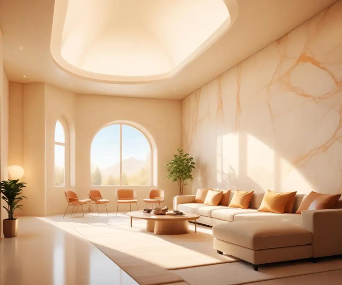
Step 1: Master the Sheen Strategy
The secret to making one color work perfectly on different planes is to vary the paint sheen. Using different sheens creates a subtle, sophisticated contrast that accounts for the different ways light interacts with the surfaces. This is the technique professionals use to add depth and dimension to a monochromatic space.
For the ceiling, always use a flat or matte finish. This type of finish absorbs light and is excellent at hiding minor surface imperfections, which are often more visible on a ceiling. For the walls, choose an eggshell or satin finish. These sheens have a slight luster that reflects a small amount of light, making the walls durable and easy to clean while giving the color a soft glow.
| Paint Sheen | Best For | Pros | Cons |
|---|---|---|---|
| Flat / Matte | Ceilings, Low-Traffic Areas | Hides imperfections, Rich color, Non-reflective | Difficult to clean, Not durable for high-touch areas |
| Eggshell | Walls in Living Rooms, Bedrooms, Hallways | Soft glow, More durable than flat, Easy to clean | Can show minor roller marks or imperfections |
| Satin | Walls in High-Traffic Areas, Trim, Cabinets | Velvety sheen, Very durable and scrubbable | Sheen can highlight surface flaws more than eggshell |
| Semi-Gloss | Trim, Doors, Cabinets | Highly durable, Sleek finish, Easy to clean | Shows every imperfection, Can be too shiny for walls |
Step 2: The Critical Role of Lighting
Lighting is arguably the most important factor in how a paint color will look in your home. The same can of Alabaster can look dramatically different depending on the natural light a room receives and the temperature of your artificial light bulbs. Ignoring this can lead to unexpected and undesirable color shifts.
For artificial lighting, pay close attention to the Kelvin temperature of your bulbs. Choose bulbs in the 2700K to 3000K range. This “soft white” or “warm white” light will enhance the creamy, cozy nature of Alabaster. Bulbs above 4000K can cast a blueish, sterile light that may wash out its warmth or make it appear stark.
Step 3: Proper Prep Work is Non-Negotiable
Even the best paint and strategy will fail if the surfaces aren’t properly prepared. Imperfections become more noticeable when walls and ceiling are the same color, as there is no contrasting trim line to distract the eye. Taking the time to prep ensures a smooth, professional-looking finish.
Start by thoroughly cleaning the walls and ceiling to remove dust and grime. Patch any holes, cracks, or dents with spackle, then sand them smooth. Finally, apply a high-quality primer to ensure the true, beautiful color of Alabaster shines through consistently on every surface.
Common Questions and Concerns About Alabaster
Even with a clear plan, questions and doubts can arise when committing to an all-white space. Many homeowners fear the potential pitfalls of a monochromatic scheme. Addressing these common concerns head-on can provide the confidence needed to move forward with this elegant design choice.
From fears of a boring room to confusion about coordinating with other elements, these are valid points to consider. Understanding how to manage these aspects is key to a successful outcome. The versatility of Alabaster often provides simple, beautiful solutions to these challenges.
Will It Make My Room Look Boring or Too White?
This is a frequent concern, but Alabaster’s inherent warmth prevents it from ever feeling sterile. The key to avoiding a flat look is to introduce a variety of textures. Think of your Alabaster walls and ceiling as the perfect neutral canvas for rich materials.
Incorporate elements like a chunky knit throw, a jute rug, warm wood furniture, or linen curtains. If you are worried about making a mistake with an all-white look, it’s wise to avoid the common errors people make. You may find you love the clean backdrop, especially when paired with interesting textures like those found in elegant performance fabrics that add both beauty and durability.
How Does Alabaster Compare to Other Popular Whites?
Understanding where Alabaster sits in the spectrum of whites can be helpful. Compared to Benjamin Moore’s White Dove, Alabaster is slightly warmer and creamier. Against Benjamin Moore’s Swiss Coffee, it has less of a yellow-green undertone, making it a more neutral warm white for many lighting situations.
It is significantly softer than stark, pure whites like Sherwin-Williams’ High Reflective White. This softness is what makes it so forgiving and ideal for creating a cozy, light-filled space rather than a stark, gallery-like one. Any hesitation about white paint can often be solved by choosing the right shade, helping you to avoid the feeling of white paint regret.
What Trim Color Works Best with Alabaster Walls and Ceiling?
When you paint the walls and ceiling Alabaster, you have a few excellent options for the trim. Each choice creates a slightly different, yet equally beautiful, aesthetic. The right decision depends on the final look you want to achieve.
For a truly seamless, architectural look, use Alabaster on the trim in a higher sheen, like satin or semi-gloss. Alternatively, for a subtle and classic contrast, you can use a slightly brighter, clean white like Sherwin-Williams Pure White. This creates just enough definition without a jarring difference.
Elevating Your Alabaster Space: Advanced Design Tips
Once your Alabaster walls and ceiling are perfectly painted, the next step is to layer in decor and accents that elevate the space from simply beautiful to truly stunning. A monochromatic backdrop offers a unique opportunity to play with texture, materials, and strategic pops of color. These finishing touches are what will bring your room to life.
Think beyond just the paint and consider the entire sensory experience of the room. The right combination of elements will enhance Alabaster’s soft warmth and create a sophisticated, inviting atmosphere. This is where your personal style can truly shine.
Introducing Texture and Materials
With a unified color scheme, texture becomes paramount. It adds the depth and interest that prevents the space from feeling one-dimensional. Focus on materials that complement Alabaster’s warm and natural feel.
Incorporate warm wood tones in flooring or furniture, the rich feel of leather upholstery, and the softness of linen or velvet textiles. Natural elements like stone, marble, and indoor plants also work beautifully against the creamy backdrop, creating a space that is both serene and visually engaging.
Using Accent Colors Strategically
An Alabaster room is the perfect setting for thoughtful accent colors. The neutral canvas makes other hues pop, allowing you to be intentional with your color choices. You can introduce color through artwork, decorative pillows, rugs, or a statement piece of furniture.
Colors that pair exceptionally well with Alabaster include soft, muted tones and deep, earthy shades. Consider calming blues like Sherwin-Williams Wedgewood Gray, earthy greens, or even rich charcoal for a touch of drama. These colors will feel grounded and sophisticated next to the soft warmth of Alabaster.
Conclusion: Your Path to an Elegant, Cohesive Home
Choosing to paint your walls and ceiling with Sherwin-Williams Alabaster is a powerful design move that can transform your home into a serene and elegant sanctuary. It creates an illusion of height and space while wrapping the room in a comforting, warm glow. The key to success is moving beyond a single can of paint and embracing a more nuanced approach.
By implementing a smart sheen strategy—flat for the ceiling and eggshell for the walls—and carefully considering your lighting, you can avoid the common pitfalls and achieve a flawless, professional finish. With the right preparation and attention to detail, your Alabaster space will be a testament to timeless style and sophistication, creating a beautiful canvas for your life.