Is Accessible Beige a Benjamin Moore Color? The #1 Mix-Up
The quest for the perfect neutral paint color can feel endless. You scroll through countless images, hoping to find that one shade that is warm but not yellow, neutral but not cold, and sophisticated but not sterile. In this search, one name frequently appears: Accessible Beige. But a common and costly point of confusion immediately arises, leading many down the wrong path: is it “Accessible Beige Benjamin Moore” or is there another story?
This single question is the source of significant frustration. This guide will solve that problem definitively, explore the true nature of this beloved color, and reveal its closest counterparts, ensuring you get the exact look you want without the guesswork.
You'll Learn About
The Great Paint Debate: Is Accessible Beige from Benjamin Moore?
Let’s clear this up immediately. Accessible Beige (SW 7036) is a Sherwin-Williams paint color, not a Benjamin Moore color. This is one of the most frequent mix-ups in the world of paint, largely because both brands have iconic neutral shades that are incredibly popular among homeowners and designers alike.
The confusion is understandable. Homeowners often hear about a fantastic color and mentally associate it with the brand they are most familiar with. However, walking into a Benjamin Moore store and asking for Accessible Beige will only lead to a dead end or an attempted color match that may not capture the shade’s unique essence.
Why Does This Brand Confusion Happen?
The primary reason is the sheer popularity of neutral and greige paints. Colors like Accessible Beige and Benjamin Moore’s own Revere Pewter are titans in the industry. They are discussed in the same forums, featured in the same design magazines, and pinned on the same inspiration boards, leading to their brand identities becoming blurred in the consumer’s mind.
Knowing the correct brand and color code (SW 7036) is the critical first step. It saves you time, prevents color-matching mishaps, and ensures that the color you see in photos is the color you get on your walls.
Finding the Benjamin Moore Equivalent to Accessible Beige
Since Accessible Beige is exclusive to Sherwin-Williams, the next logical question is: what is the closest Benjamin Moore alternative? While no two colors from different brands are ever identical due to proprietary formulas, there are a few Benjamin Moore shades that come remarkably close in spirit and application.
Benjamin Moore’s Revere Pewter (HC-172): The Famous Contender
Revere Pewter is arguably Benjamin Moore’s most popular greige and the most common comparison to Accessible Beige. They share a similar balanced approach to being both warm and gray. However, Revere Pewter leans slightly more gray and can sometimes flash subtle green undertones, whereas Accessible Beige has a more prominent beige base.
In a head-to-head comparison, Revere Pewter often feels a touch cooler and more muted. It’s an excellent choice if you find Accessible Beige just a bit too warm for your space or fixed elements.
Benjamin Moore’s Manchester Tan (HC-81): The Warmer Cousin
If you’re drawn to the warmth of Accessible Beige, Manchester Tan is another alternative to consider. It lives more firmly in the beige category than Accessible Beige, with fewer gray influences. This makes it feel consistently warmer and cozier, especially in rooms with less natural light.
Manchester Tan lacks the subtle gray that gives Accessible Beige its modern “greige” complexity. For those seeking a more traditional and straightforward warm beige, it’s a fantastic option that avoids the strong yellow undertones of older beiges.
| Feature | SW Accessible Beige | BM Revere Pewter | BM Manchester Tan |
|---|---|---|---|
| Brand | Sherwin-Williams | Benjamin Moore | Benjamin Moore |
| Color Code | SW 7036 | HC-172 | HC-81 |
| LRV | 58 | 55.51 | 64.42 |
| Undertones | Warm beige with gray and subtle green | Warm gray with green undertones | Warm beige with minimal gray |
| Best For | Versatile, balanced warmth | Slightly cooler, modern spaces | Consistently warm, traditional feel |
Deep Dive: Understanding Sherwin-Williams Accessible Beige (SW 7036)
Now that we’ve established its true identity, let’s explore what makes Accessible Beige so beloved. It’s more than just a simple beige; it’s a complex neutral that changes with its environment to create a sophisticated and welcoming atmosphere.
What is the LRV of Accessible Beige?
Accessible Beige has a Light Reflectance Value (LRV) of 58. LRV is a scale from 0 (pure black) to 100 (pure white), indicating how much light a color reflects. An LRV of 58 places Accessible Beige squarely in the light-to-mid-range sweet spot.
This balanced LRV means it’s light enough to keep a room feeling bright and open but has enough depth and saturation to not look washed out in well-lit spaces. It holds its own, providing a soft contrast against white trim without making the room feel dark.
The Tricky Undertones of Accessible Beige
The true genius of Accessible Beige lies in its undertones. It is a warm beige that is softened and modernized by a dose of gray. This “greige” quality is what makes it so versatile. However, like all complex neutrals, it has subtle undertones that can emerge in different conditions.
Its primary undertone is gray, which cuts the potential for it to look too yellow. In certain lighting, particularly in north-facing rooms or in shadow, a faint green or even a taupe (pinkish) undertone can appear. This chameleon-like quality is why testing this color in your own home is not just recommended—it’s essential.
How to Use Accessible Beige in Your Home for Flawless Results
Using Accessible Beige successfully depends on understanding how it interacts with light, trim, and other colors in your home. Get these pairings right, and you’ll have a timeless and elegant backdrop for your life.
The Best Lighting for Accessible Beige
Light is the most critical factor in how any paint color will look. In south-facing rooms with warm, abundant light, Accessible Beige will appear lighter and its warm beige qualities will be emphasized. In north-facing rooms, the cooler light will bring out more of its gray undertone, making it appear more like a true greige.
Pay close attention to artificial lighting as well. Warm temperature LED bulbs (around 2700K-3000K) will enhance its cozy feel, while cooler bulbs (4000K+) can make it appear more gray and potentially drab.
Perfect Trim and Ceiling Color Pairings
Choosing the right white for your trim and ceilings is crucial for making Accessible Beige shine. A crisp, clean white will create a sharp, defined look, while a softer, creamier white will provide a more gentle, tonal transition.
For a clean contrast, consider Sherwin-Williams Pure White (SW 7005). For a warmer, softer pairing that harmonizes with the beige tones, Sherwin-Williams Alabaster (SW 7008) is an excellent choice. This decision can dramatically alter the final feel of the room, from modern and crisp to soft and traditional.
Coordinating Colors that Complement Accessible Beige
Accessible Beige is a fantastic team player. Its neutral base allows it to pair beautifully with a wide range of colors. For a serene and cohesive palette, combine it with muted blues and greens like Sherwin-Williams Sea Salt (SW 6204).
It also works wonderfully with deeper, moodier colors. A rich charcoal like Sherwin-Williams Urbane Bronze (SW 7048) on an accent wall or cabinets can create a dramatic yet grounded look. Even some bold reds can work well as accents, providing they have a warm, earthy base.
Where to Use (and Where to Avoid) Accessible Beige
While incredibly versatile, Accessible Beige isn’t foolproof. Knowing its strengths and weaknesses will help you decide where it will perform best in your home.
Ideal Rooms for This Versatile Greige
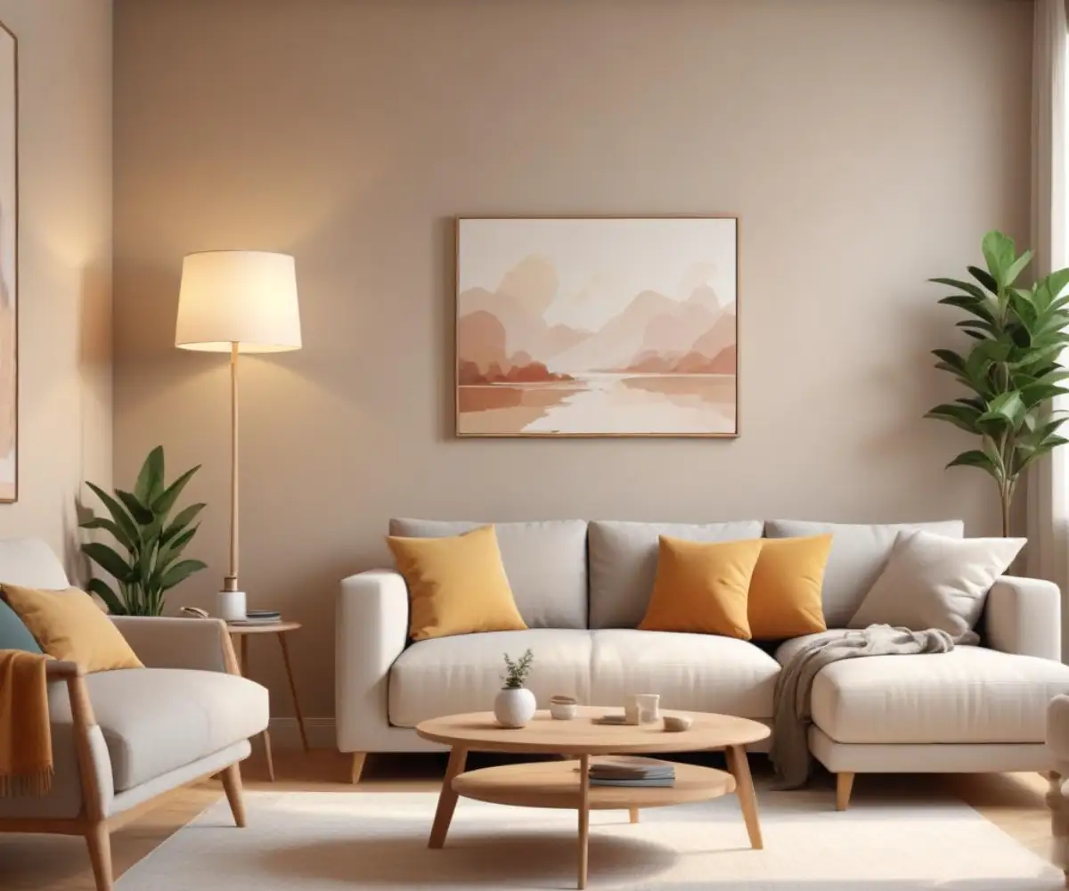
This color is a workhorse for main living areas. It excels in open-concept floor plans, living rooms, bedrooms, and hallways where you want a warm and inviting neutral that flows seamlessly from one space to the next. Its warmth makes it particularly well-suited for creating a cozy and restful atmosphere in bedrooms.
It can also be a beautiful choice for kitchen cabinets, especially when paired with warm hardware and countertops. This creates a sophisticated, timeless look that feels more custom than standard white. When thinking about cabinetry, it’s vital to choose the right wall color with dove gray cabinets or similar tones to ensure harmony.
Potential Problem Areas
The biggest challenge for Accessible Beige is in low-light environments. In dark hallways or basements without sufficient artificial light, its gray undertones can become more prominent, and the color can look flat or muddy. It relies on light to bring its warmth and complexity to life.
Additionally, be mindful of your existing finishes. If you have flooring with strong pink or yellow undertones, like some older carpets or tiles, they may clash with the subtle green-gray undertones in Accessible Beige. How a paint color interacts with your flooring is a critical consideration, something to keep in mind when reading up on COREtec Ravenswood Oak reviews or evaluating any flooring choice.
Avoiding Common Mistakes with Accessible Beige
Even with a popular and well-loved color, things can go wrong. A few key steps can help you avoid the most common pitfalls and ensure a beautiful result.
The #1 Mistake: Not Sampling!
The single most important step is to sample the paint in your space. Paint a large swatch (at least 2×2 feet) on several different walls to see how it looks as the light changes throughout the day. A small paint chip from the store is simply not enough to judge how the undertones will behave in your unique environment.
Observing the sample next to your trim, flooring, and furniture will reveal any potential clashes before you commit to painting an entire room. This step can save you from a world of regret. Sometimes, even when the color is “right,” the application can be flawed. If you find that my painter did a bad job, it can detract from even the most perfect color choice, so professional application is key.
The Final Verdict on Accessible Beige
Accessible Beige has earned its reputation as a top-tier neutral for a reason. It strikes a beautiful balance between the cozy warmth of beige and the modern sophistication of gray, creating a timeless and versatile backdrop that works in a multitude of design styles. The key to success is remembering that it is a proud Sherwin-Williams color (SW 7036).
By understanding its LRV, its complex undertones, and its best pairings, you can wield this color with confidence. Whether you choose the original or a close Benjamin Moore alternative like Revere Pewter, the principle remains the same: sample thoughtfully, consider your lighting, and create a space that feels both elegant and effortlessly inviting.