12×24 Tile Direction Bathroom: Stop Guessing, Start Designing
You stand at the doorway of your gutted bathroom, a box of beautiful 12×24 porcelain tiles at your feet. You know this choice is permanent, and a single question freezes you in place: which way do I lay them? It seems like a simple detail, but the direction of your tiles holds the power to make your bathroom feel spacious and serene or cramped and chaotic.
This decision paralysis is one of the most common and stressful moments in any bathroom remodel. A wrong choice isn’t just a cosmetic flaw; it’s a mistake cemented in place, a daily reminder of a design opportunity missed. This guide will demystify the process, transforming your uncertainty into confident, expert-level design choices.
You'll Learn About
Why Your 12×24 Tile Direction Dictates Your Bathroom’s Success
The visual impact of tile direction is rooted in simple psychology. Our brains are hardwired to follow lines. By laying your 12×24 tiles in a specific direction, you are essentially drawing lines on your floor and walls, telling your eyes—and your brain—how to perceive the space.
This isn’t just about aesthetics; it’s about spatial manipulation. The right direction can visually expand a narrow bathroom, raise a low ceiling, or create a seamless, spa-like flow. The wrong direction can accidentally highlight a room’s flaws, making it feel smaller and more cluttered than it actually is.
The Great Debate: Horizontal vs. Vertical Layout
The most fundamental choice you’ll make is whether to lay your tiles horizontally or vertically. Each orientation serves a distinct purpose, and understanding their effects is the first step toward a flawless design.
The Case for Horizontal: The Widening Effect
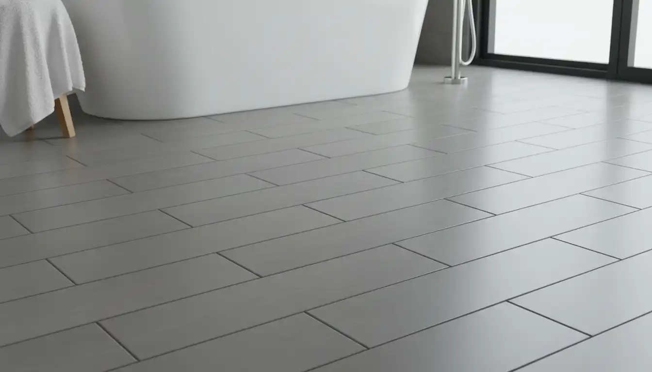
A horizontal tile layout is when the 24-inch side of the tile runs parallel to the longest walls. This is the most popular choice for a reason. Laying 12×24 tiles horizontally makes a room feel wider and more expansive.
The strong, horizontal lines draw the eye from side to side, visually stretching the space. This technique is particularly effective for narrow or galley-style bathrooms, as it counteracts the “bowling alley” effect and creates a sense of openness.
The Case for Vertical: The Heightening Illusion
A vertical tile layout, where the 24-inch side runs up the wall or along the narrower dimension of the floor, has a different kind of power. Laying 12×24 tiles vertically draws the eye upward, making ceilings feel higher.
This is a game-changer for bathrooms with low ceilings or in basement remodels where every inch of perceived height matters. On a shower wall, a vertical stack can feel modern and dramatic, creating a stunning focal point. Many wonder if you can use 12×24 tile on shower walls, and the answer is a resounding yes—it’s an excellent way to add visual height.
Beyond the Basics: Advanced Patterns for 12×24 Bathroom Tile
While horizontal and vertical orientations are the foundation, the pattern you choose adds another layer of design sophistication. For 12×24 tiles, three patterns dominate, each with its own distinct personality.
The Classic Choice: 1/3 Offset (Running Bond)
The 1/3 offset, also known as a running bond or brick pattern, is the industry standard for large format rectangular tiles. In this pattern, each tile’s end lines up with the 1/3 mark of the tiles above and below it. This staggered look is excellent at hiding minor imperfections in the subfloor and adds a timeless, dynamic feel.
It avoids the 50% offset (a true brick pattern) which is not recommended for tiles 15 inches or longer. This is because large tiles can have a slight natural bow in the middle, and a 50% offset can cause “lippage,” where one edge is higher than its neighbor.
The Modern Look: Stacked (Grid Pattern)
For a clean, contemporary, and minimalist aesthetic, the stacked or grid pattern is unparalleled. In this layout, all the grout lines form a perfect grid. The stacked pattern emphasizes linearity and order, creating a calm and uncluttered look.
Be warned: this pattern is the least forgiving. It requires a perfectly flat subfloor and meticulous installation, as any deviation in spacing will be immediately obvious. However, the serene, spa-like result is often worth the extra effort.
The Designer’s Secret: Herringbone Pattern
A herringbone pattern, where tiles are laid in a V-shape, introduces a sense of movement and luxury. Using 12×24 tiles in a herringbone layout creates instant drama and makes the floor a stunning feature.
This high-impact design comes with higher costs. It requires significantly more intricate cuts, leading to more material waste (typically 15-20% extra) and increased labor time. It’s a bold choice best suited for making a statement in a primary bathroom or a powder room.
The Ultimate Decision Matrix: Choosing the Right Direction for YOUR Bathroom
To simplify your choice, use this table to match your bathroom’s specific needs with the best tile direction and pattern. This framework will help you move from theory to a concrete, actionable plan.
| Bathroom Feature | Primary Goal | Best Direction | Recommended Pattern |
|---|---|---|---|
| Narrow Bathroom (e.g., 5′ x 8′) | Create width | Horizontal | 1/3 Offset or Stacked |
| Low Ceilings (Under 8′) | Create height | Vertical (on walls) | Stacked |
| Small Square Bathroom | Maximize sense of space | Horizontal (from entry) | 1/3 Offset |
| Large, Open Bathroom | Create a focal point | Horizontal or Herringbone | Herringbone or Stacked |
| Feature Shower Wall | Add drama and height | Vertical | Stacked or 1/3 Offset |
Critical Mistakes to Avoid with Your 12×24 Tile Direction
Knowing what to do is only half the battle. Knowing what *not* to do can save you from costly and irreversible errors. Here are the subtle mistakes that can undermine an otherwise perfect installation.
Mistake #1: Ignoring the Room’s Entry Point
The first view into your bathroom sets the tone for the entire space. The longest lines of your tile pattern should ideally run parallel to the main line of sight from the doorway. This draws the eye into the room, creating an inviting and expansive feeling from the moment you enter.
Laying tiles so the short side faces the door can create a “choppy” visual effect, making the room feel less welcoming and potentially smaller. Always do a dry layout first, standing in the doorway to see how each orientation feels.
Mistake #2: Forgetting About Lighting
Natural and artificial light sources can dramatically affect how your tile looks. A gloss or semi-gloss tile laid horizontally can catch light from a window, creating long reflections that enhance the feeling of width. Conversely, a vertical layout on a shower wall can be accented with a downlight to create dramatic shadows that emphasize height.
Before you commit, place a few tiles on the floor and wall at different times of the day. Observe how the light interacts with the surface and how the direction enhances or diminishes the effect you want to achieve.
Mistake #3: Creating Unintentional Chaos with Inconsistent Directions
Coordinating the direction of floor tiles with wall tiles is a professional-level consideration. A common question is whether you should be changing tile direction between rooms or surfaces. The wrong combination can make a space feel busy and disjointed.
A safe and cohesive approach is to maintain the same direction on both floors and walls (e.g., horizontal on the floor and horizontal on the main shower wall). A more advanced technique is to use opposing directions for a specific purpose, such as a horizontal floor to widen the room and vertical shower walls to heighten it.
Coordinating Floor and Wall Tile Direction: The Unspoken Rule
The relationship between your floor and wall tile is crucial for a cohesive design, especially in a compact space like a 7 x 6 bathroom layout where every surface is visible. The goal is to create harmony, not competition.
The Safe Bet: Maintain Consistency
For a seamless, unified look, lay the wall tiles in the same direction as the floor tiles. If your floor tiles run horizontally to make the room feel wider, continue that horizontal layout on the shower walls. This creates an unbroken visual flow that is calming and expansive, making it an excellent strategy for smaller bathrooms.
The Pro Move: Intentional Contrast
Creating contrast is a powerful design tool, but it must be intentional. Use a horizontal floor to ground the space and a vertical wall to lift it. This works best when you want to make a specific wall, like the one behind the vanity or in the shower, a distinct feature.
The key to success is balance. This technique is most effective when only one wall is tiled vertically as an accent, while the others are painted or tiled more subtly. This prevents the room from feeling visually chaotic.
Frequently Asked Questions (FAQs)
What direction should you lay 12×24 tile in a small bathroom?
For the vast majority of small bathrooms, the best direction is horizontal on the floor. This will make the room feel wider. On the walls, a vertical layout can help make a low ceiling feel higher, but if you have to choose one, prioritize making the floor space feel larger.
Should floor and wall tile go in the same direction?
It is not a requirement, but it is often the safest choice for a cohesive look. Laying them in the same direction creates a unified space. Using different directions can work for a deliberate design contrast, such as a horizontal floor and a vertical accent wall in the shower.
Does a 1/3 offset pattern make a room look smaller?
No, the effect is generally negligible. While it does create more grout lines than a stacked pattern, the staggered nature adds visual interest that can make a space feel more dynamic. It is chosen more for its classic aesthetic and its practical ability to hide subfloor imperfections than for its spatial effects.
Final Thoughts: Your Blueprint for a Perfect Bathroom
The direction of your 12×24 bathroom tile is far more than a minor detail—it is the silent architect of your space. It directs the eye, shapes perception, and lays the foundation for your entire design. By understanding the core principles of horizontal and vertical layouts and selecting a pattern that aligns with your goals, you can wield this powerful tool with confidence.
Don’t leave this critical decision to chance. Plan, perform a dry layout, and visualize the outcome from the doorway. With this strategic approach, your tile choice will not only be beautiful but will actively work to make your bathroom the spacious, serene retreat you’ve always envisioned.